← All work
OnVUE Remote Proctoring · Pearson VUE · Cross-device

Three platforms, three handoffs, ten journey anchors, one coherent check-in.

As founding designer, I led OnVUE from 0 to 1 and stewarded its experience through 300% growth. I designed across desktop web, mobile web, and native iOS / Android, including explicit handoff paths, state synchronization, recovery, and a shared journey model. The platform now serves 2.3 million exams annually, and the redesigned check-in contributed to approximately 25% fewer check-in failures.

Cross-device UXModernizationEnterprise platforms
// BEFORE / AFTER

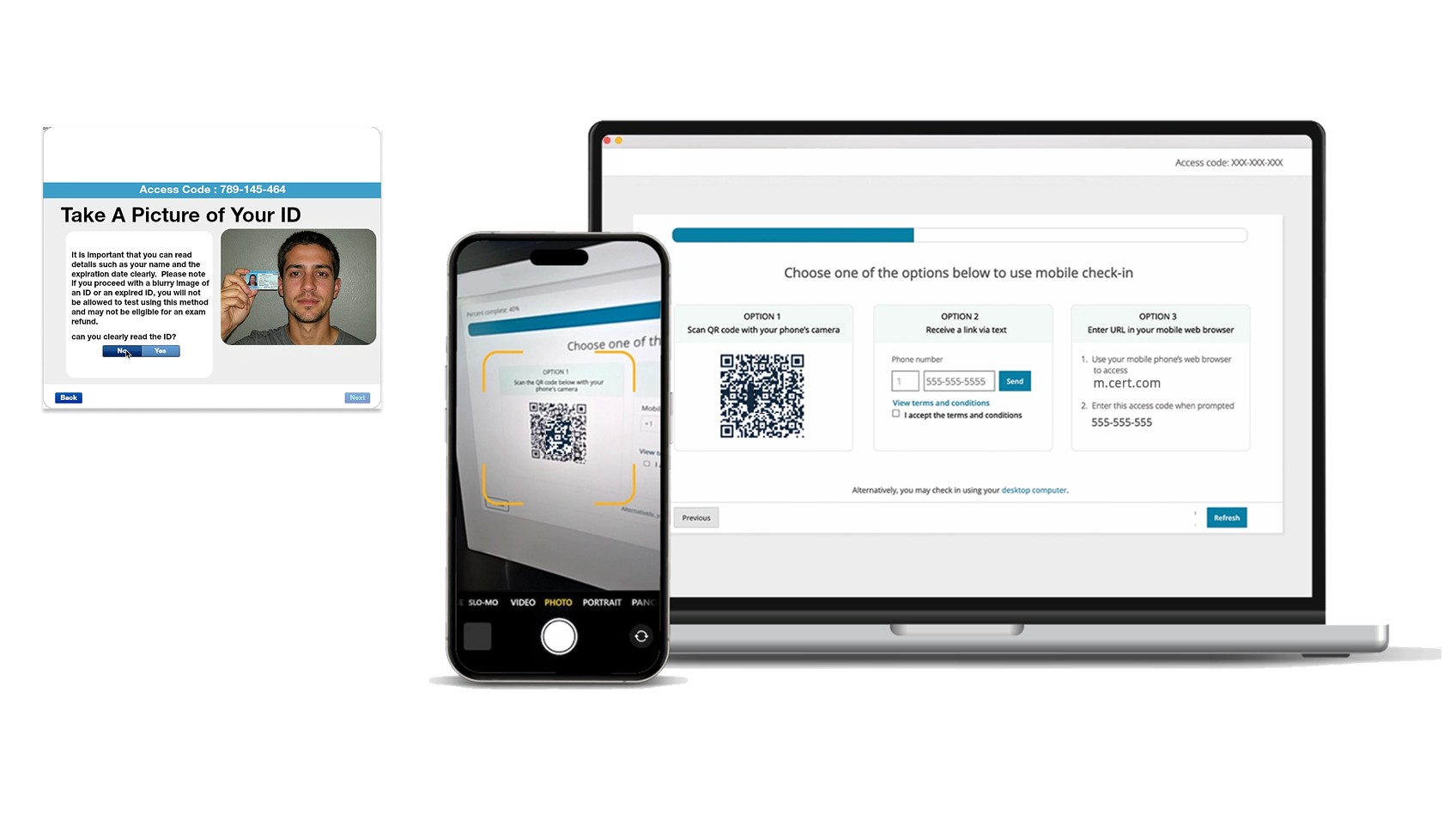
From brittle fixed-pixel check-in to a responsive cross-device handoff.

Fixed-pixel desktop check-in
Responsive cross-device check-in
BeforeAfter
// RoleSenior Product Designer · IC Lead
// ScopeEnd-to-end check-in UX
// SurfacesDesktop · Mobile Web · Native
// Scale2.3M exams annually
// UsersCandidates · Greeters · Proctors
// StatusShipped globally
300%Growth supported
through stewardship
~25%Fewer check-in
failures
2.3MExams served
annually
01

Three platforms coordinated through three handoffs, one presence endpoint, and one recovery rail.

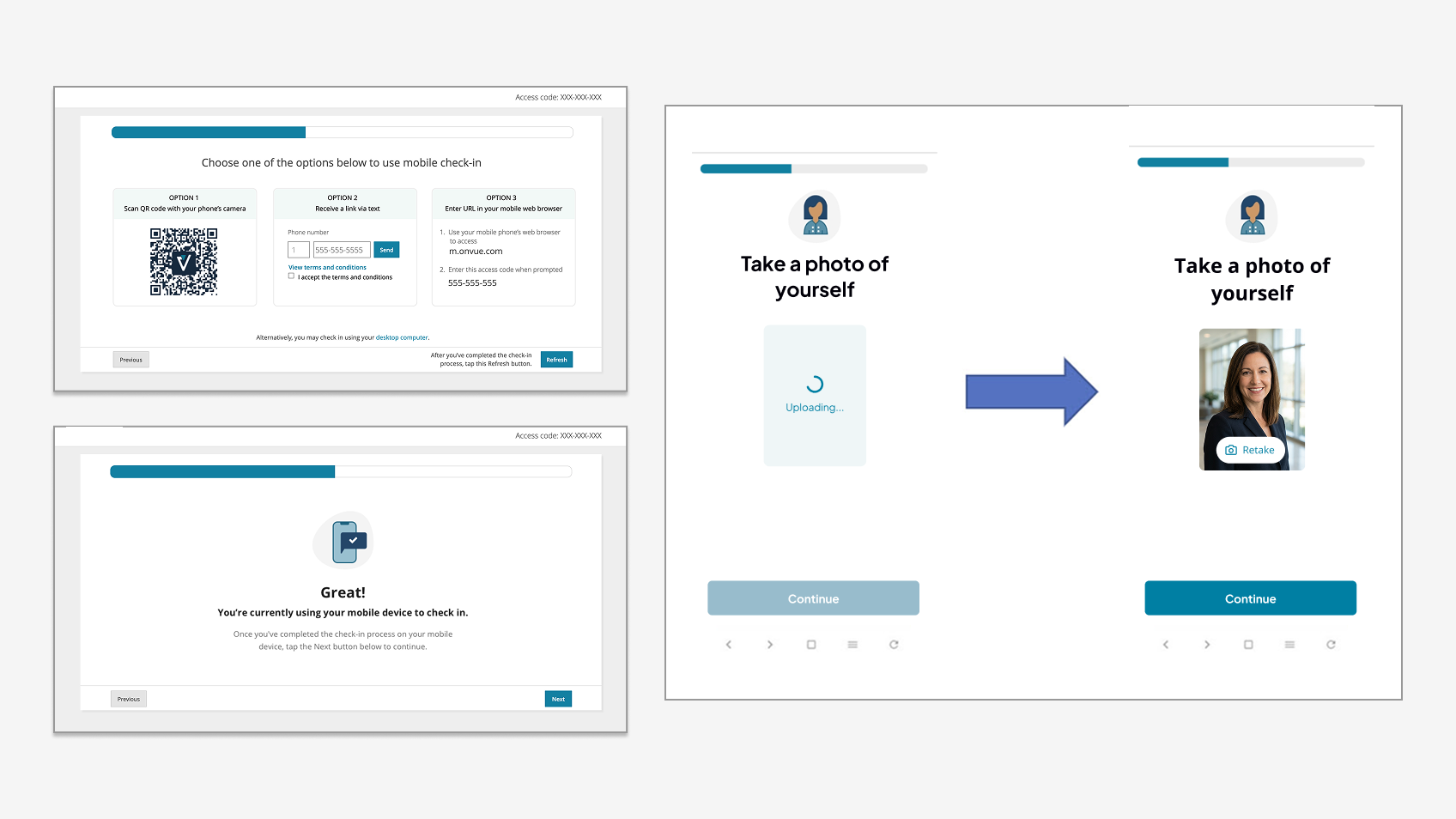
A candidate starts on desktop, authenticates identity using a phone, and may need to fall back to mobile web if the native app fails. Each transition is a state handoff. The system either synchronizes that state clearly or strands the candidate. The redesigned topology is below.

FIGURE 01 // Cross-device topology

The three-platform check-in topology

The topology connects three platforms, three handoff paths, one presence endpoint, and one manual-refresh fallback. Every fragile transition has a recovery route.

OnVUE check-in topology: desktop web at left, three handoff bridges (QR, SMS, App Store) at center, mobile web and native iOS/Android at right, with a presence polling endpoint and manual refresh fallback connecting the two sides. The diagram shows three vertical platform lanes, desktop web, mobile web, native iOS/Android, with three labeled handoff bridges (QR, SMS deep link, App Store search) connecting them and a presence-polling endpoint synchronizing mobile and desktop state. DESKTOP WEB HANDOFF MOBILE · NATIVE iOS / ANDROID DESKTOP SECURE BROWSER Access code · 893-094-7483 Choose mobile check-in path: → Scan QR · default → Send a text → Search app store [Refresh status] · manual fallback DESKTOP STATE Waiting for mobile presence-polling endpoint advances candidate when mobile posts in If polling fails: manual refresh PATH 1 · QR CODE · DEFAULT, FASTEST Candidate scans → Branch.IO interstitial → If app installed: opens native app → If not: app-store install, then deep link PATH 2 · SMS DEEP LINK · CAMERA / QR FAIL Candidate provides number + T&Cs → Branch.IO deferred deep link via SMS → Same handoff destination PATH 3 · APP STORE SEARCH · FINAL FALLBACK Candidate searches "OnVUE" → Installs, then enters access code manually → Tolerates camera + deep-link failure NATIVE iOS/AND App opens Candidate identity ID capture Workspace photos Posts state → presence endpoint MOBILE WEB Fallback Same UI states Same endpoint PRESENCE ENDPOINT Mobile posts access code + stage to signal desktop → desktop advances → no manual sync needed Resilient to mid-flow disconnect // PRESENCE-POLLING ENDPOINT · MOBILE → DESKTOP STATE SYNC DESIGN INVARIANTS A · Three paths, same destination B · Mobile web parity with native C · Manual refresh always available
Platform / surface Handoff bridge State sync · recovery
// READ AS

The presence-polling endpoint is the architectural difference between "coordinated check-in" and "two disconnected products". The manual-refresh button is the architectural difference between "coordinated check-in" and "stranded candidate". Both had to exist.

02

Adding steps was easy. Reducing cognitive load while enforcing non-negotiable security was not.

Remote check-in had to succeed for any candidate, anywhere in the world, regardless of age, occupation, technical proficiency, or familiarity with digital testing. Candidates typically arrived under strict time constraints, concerned about device or network failure, and anxious that a single misstep could invalidate the exam they were paying for.

Each step in the existing flow served a legitimate security or compliance need. Together, those steps created friction, confusion, and anxiety that drove failed check-ins, support escalations, and abandoned exams. The hard tradeoff was reducing cognitive load without compromising exam integrity or regulatory requirements.

The core design move was not adding functionality. It was making required steps feel intentional rather than punitive, helping candidates understand where they were and what came next, and ensuring every screen earned its place in the journey.

03

Mapping the journey before redesigning the screens.

The work started with a synthesized end-to-end journey map covering ten stages (Setup & Launch · Explore · Register · Commit · Prepare · Check-in · Test · Certify · Support) across three swimlanes (Candidate · Client · Employee). For each stage I documented goals, actions, sentiment, failure points, contextual systems, current data metrics, and prioritized opportunities.

The check-in segment surfaced ten distinct candidate failure modes. They ranged from access-code issues and country-list ordering on the ID-upload page to SSO-client candidates being unable to use self-service reschedule and drop-offs in unhappy paths with no clear recovery instruction. Each failure was traceable to a specific upstream cause.

"Remote proctoring is inherently stressful. The challenge was not adding steps. It was helping candidates feel confident navigating unavoidable ones. By reframing the check-in around progress, preparedness, and clear transitions, we reduced failure and anxiety while preserving exam integrity across a global platform." Design summary, in-house portfolio review
Remote check-in journey map
04

Ten anchors that turn ten interruptions into one coherent experience.

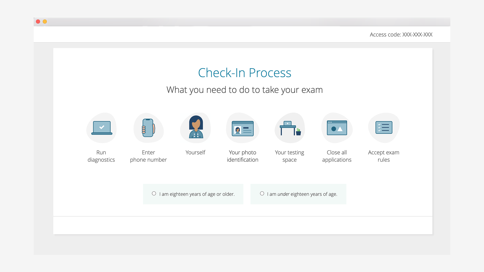
Each anchor was treated as a phase, not a screen. Some anchors compressed multiple existing screens; others split a single screen into clearer transitions. The journey map below is the artifact I used to align stakeholders.

FIGURE 02 // Journey model

The 10 check-in journey anchors, with failure points called out

Each anchor has an intent, a transition, and a recovery path. Red annotations mark the highest-risk failure points from research.

Ten check-in journey anchors arranged vertically with intent, transition, and failure point annotations. A vertical journey map showing the ten check-in anchors from Download & Launch through Exam Completion, with failure points and recovery surfaces highlighted. # ANCHOR INTENT · TRANSITION FAILURE POINT 01 Download & Launch Trust at first touch, reinforce legitimacy of secure app Access-code issues Candidate cannot resolve, abandons 02 Check-in Overview Replace anxiety with clarity, set expectations before commitment Low risk 03 System Diagnostics Prevent failure before it happens, pass/fail clarity Tech requirement fails Candidate cannot self-resolve 04 Mobile Check-in Selection Bridge desktop security with mobile flexibility, three paths QR / camera fails SMS fallback engages 05 Identity Capture Verify the person before the paperwork Medium risk 06 Government ID Compliance without confusion, select, capture, confirm as one phase ID name mismatch Localized-name gap 07 Testing Space Enforce integrity while maintaining dignity, explicit progress Workspace fails See AI-Guided Environment Validation 08 Rules Acceptance Explicit commitment before live monitoring begins Low risk 09 Proctor Queue From self-service to human oversight, transparency about wait Premature exit Long wait → SSR or drop 10 Exam Completion Closure, not uncertainty, calm visual language Low risk ● HIGH-RISK ANCHOR
// READ AS

Six of ten anchors are high-risk failure surfaces. The redesign gives those moments more attention and keeps low-risk moments simple by not over-designing them.

Remote check-in mobile capture design
05

Six interaction decisions made cross-device check-in survivable.

01

Three handoffs, one destination.

QR (default), SMS deep link (camera-fail fallback), and app-store search (final fallback) all converge on the same native or mobile-web check-in flow. Failure in any one path does not end the check-in.

02

Presence polling makes the handoff invisible.

Mobile posts to a presence endpoint as it advances. Desktop polls. The candidate sees one continuous flow rather than two products talking past each other.

03

Manual refresh is always available.

If polling fails because of a flaky network, browser quirks, or sleep state, a labeled refresh button on desktop lets the candidate force-sync. The system tolerates its own failure modes.

04

Mobile web has parity with native.

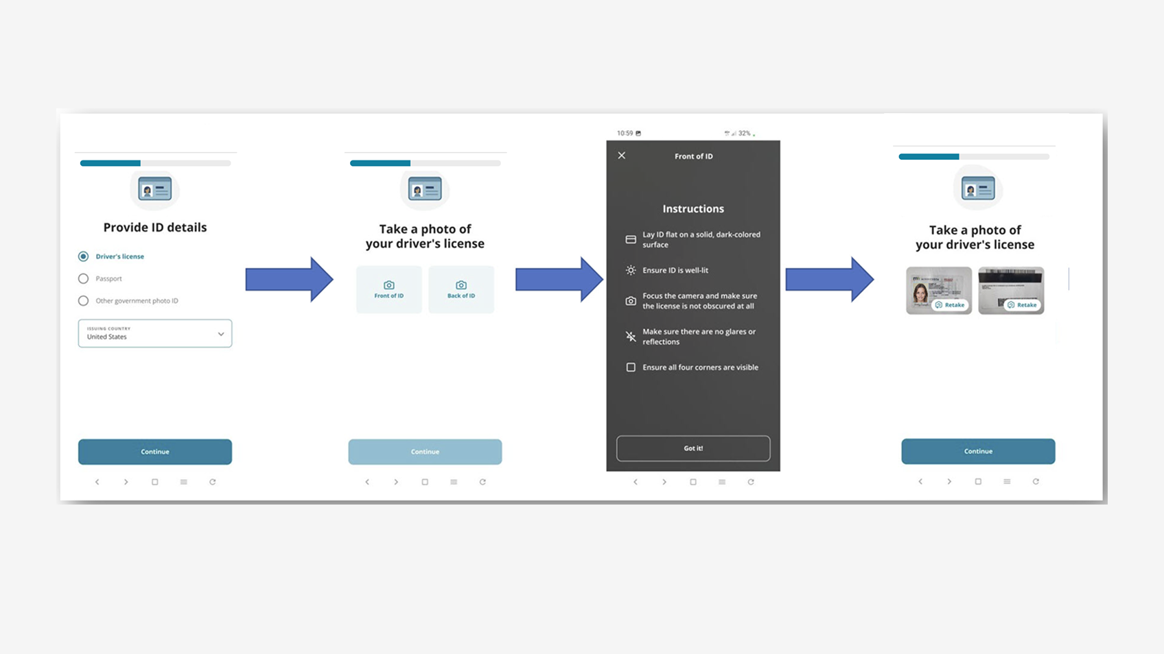
The same UI states cover camera permissions, orientation, framing, identity capture, ID capture, workspace, upload, and errors. A candidate who cannot install the app can still finish check-in.

05

Anchors compress; anchors split.

Government ID became one phase that moved from select to capture to confirm, rather than three disconnected screens. Diagnostics split into specific pass/fail readouts so candidates could self-resolve rather than escalate.

06

Self-service reschedule preserved as a recovery rail.

Self-service reschedule is available throughout check-in. Candidates who hit an unrecoverable issue can rebook themselves instead of abandoning entirely.

Remote check-in cross-platform process
06

What each system has to do at each anchor.

AnchorDesktop surfaceHandoffMobile surfaceBackend
LaunchAccess code · download CTANot applicableNot applicableSecure browser auth
OverviewRequirements listNot applicableNot applicableNot applicable
DiagnosticsPass / fail per checkNot applicableNot applicableDiagnostic agent
Mobile selectThree-path picker · refresh fallbackQR · SMS · App storeInterstitial or native app launchBranch.IO interstitial + deep link
IdentityWaiting stateNot applicableSelfie capturePresence endpoint posts state
Government IDWaiting stateNot applicableSelect → capture → confirmID validation service
Testing spaceWaiting stateNot applicableWorkspace photos / scanAI vision (see AI-Guided Environment Validation)
RulesAcceptance modalNot applicableConfirmationAudit log
QueueWait indicator + SSR optionNot applicableNot applicableCapacity queue
CompleteClosure screenNot applicableNot applicableResult / RTEN
07

Shipped and measured at global scale.

// PRODUCTION · OUTCOME → IMPLEMENTATION → STATUS
// SurfaceDesktop + Mobile Web + Native
// Scale2.3M exams annually
// Growth300% supported
// Check-in~25% fewer failures
// Outcome// Implementation// Status
Coordinated cross-device check-in
Three handoff paths · presence endpoint · manual refresh fallback
Shipped
Reduced failed check-ins from confusion / missed steps
Re-anchored journey · clearer transitions · explicit progress
Shipped
Lower support escalation during exam day
Self-service reschedule available throughout check-in
Shipped
Reusable journey framework
10-anchor model with per-anchor failure surface; foundation for AI-assisted guidance
Shipped
Localized ID upload ordering
Country list re-sorted to local alphabetical order; gaps documented
Roadmap
Remote check-in recovery and shipped states
08

The journey model became the canonical reference for everything downstream.

The shipped platform grew 300% and now serves 2.3 million exams annually. The redesigned cross-device check-in contributed to approximately 25% fewer check-in failures. Beyond the screens, the shared journey model gave adjacent product teams a reference for accommodations, proctoring features, and support modernization.

// THE LESSON I CARRY FORWARD

A coordinated cross-device experience works when state synchronization, recovery paths, and graceful fallback are designed together. Without all three, the product behaves like two disconnected products pretending to be one.

09

The check-in journey became the spine of every adjacent product.

// PATTERN

Anchor-based journey design

The model treats phases as the design unit, not individual screens. Each anchor has intent, transition, and recovery designed together.

// PATTERN

Three-path handoff

Default, fallback, and final fallback paths can be reused for any cross-device step where the primary path has friction.

// PATTERN

Presence polling + manual refresh

State sync is designed alongside its own failure mode. The user always has a way to force a resync.

// PATTERN

Mobile-web parity with native

The app install is never required. Mobile web carries the full check-in.

Next case study · Certiport North Star

Certiport North Star

A tested multi-persona prototype and phased three-year direction for learners, educators, professionals, and administrators.

Read case study
// Have a complex product problem?

Get In Touch