Designing one exam‑day experience across devices, security rules, and failure states.
I owned the original 0→1 UX/UI for OnVUE and continued shaping it as the platform scaled. Candidates move across web, desktop software, and phone while identity, device readiness, workspace security, and proctoring state stay synchronized under exam-day pressure.
OnVUE · Shipped global platform
// My roleOriginal 0→1 end‑to‑end UX/UI
// ScopeCross‑device candidate experience
// StewardshipLaunch → scaled evolution
// Scale2.3M annual exams
Visual executive summary
Product states, ownership, and evidence at a glance.
OwnershipFounding design, cross-device check-inContributionService model, interaction, prototype, validation, accessibility, stewardshipCollaboratorsProduct, engineering, operations, greeters, proctors, compliance, accessibilityDecision authorityLed UX; delivery and scale were team outcomes
// 01Founding design problem
Remote testing only works when the candidate experiences many systems as one product.
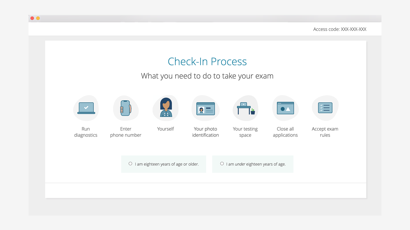
OnVUE began as a 0→1 remote-proctoring experience. I defined how candidates prepare, prove device readiness and identity, capture their environment, enter proctoring, and recover when dependencies fail.
Candidates are already under pressure, but security and technical rules still have to protect exam integrity. That made state transitions central: what the candidate believes is happening, which system owns the state, and what happens when phone connection, desktop detection, system tests, photos, or scheduling fail.
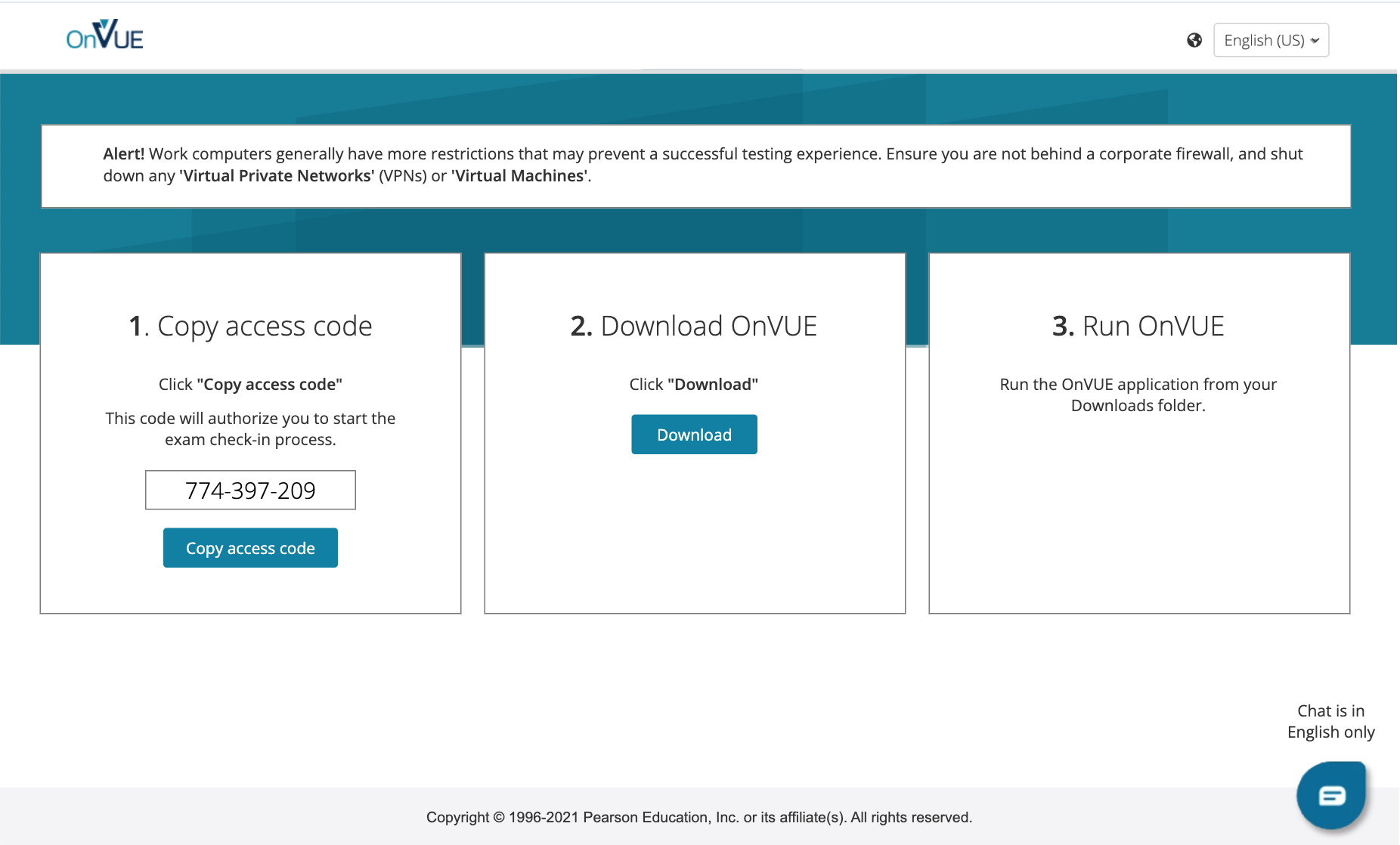
I organized the journey around prepare, diagnose, identify, capture, wait, and test. Security and usability resurfaced in each step, so I decided what guidance belonged in the moment, earlier preparation, or on demand while translating product, engineering, operations, and security constraints into candidate-facing rules. More guidance could reduce photo failures but lengthen check-in; more policy could improve preparedness but raise cognitive load; more automation could reduce effort yet make recovery harder when synchronization failed.
01PrepareRules, expectations, device readiness02DiagnoseSystem requirements and recoverable failures03HandoffDesktop ↔ mobile transition04VerifyIdentity and workspace evidence05QueueState synchronization and proctor connection06TestSecure exam session
Legacy testing was far less integrated.Orchestration across a dependency-heavy journey.
// 02Cross‑device architecture
Design the handoff, not just the endpoints.
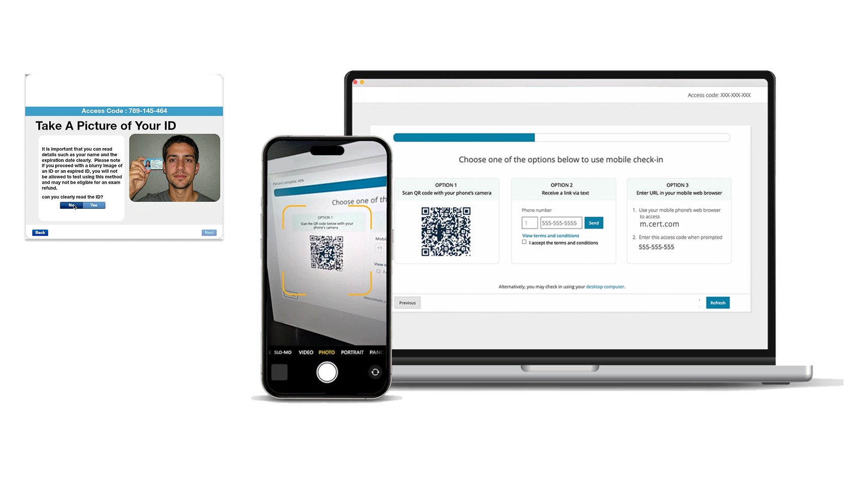
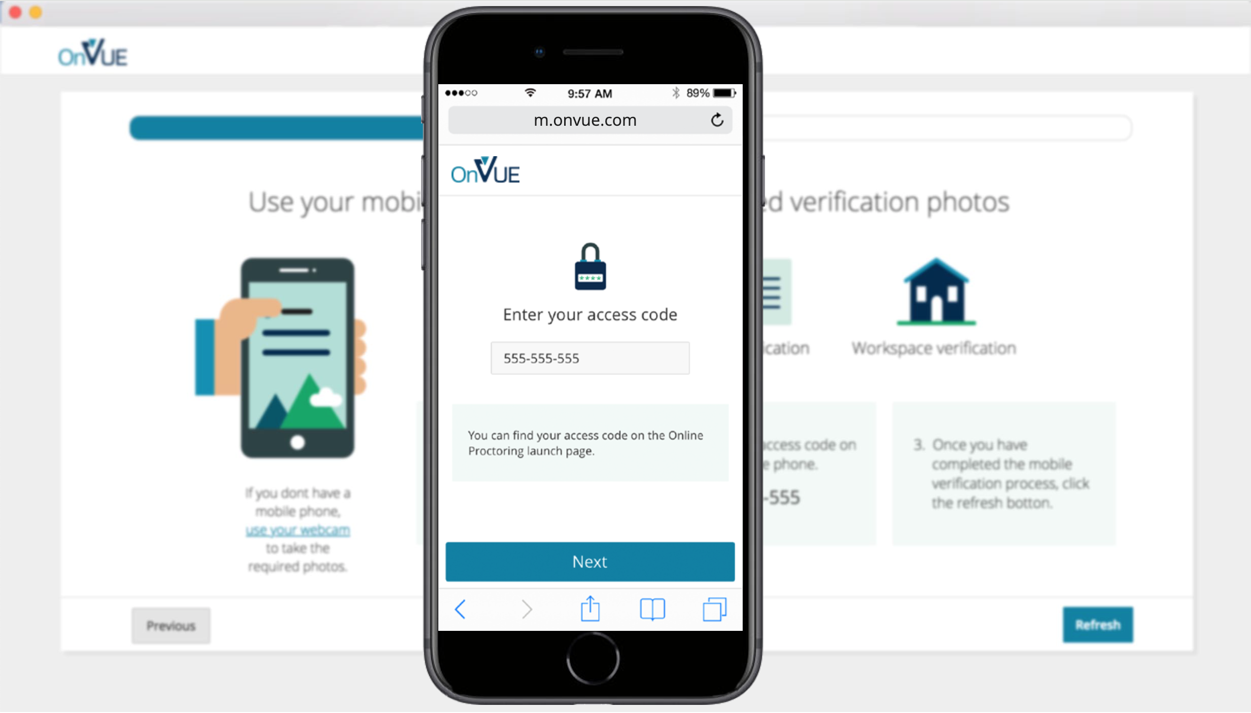
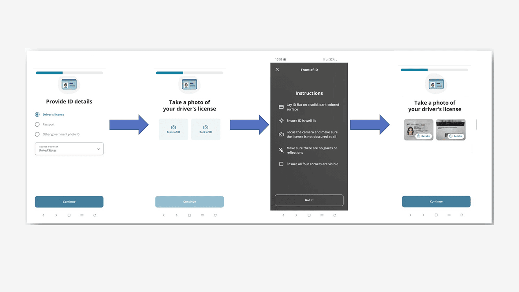
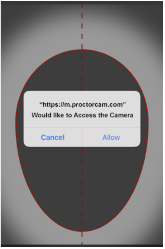
Desktop and phone had to behave as one experience. A candidate could start on desktop, enter mobile through QR or SMS/deep link, complete capture, then expect desktop to recognize completion.
I designed each handoff with an expected transition, alternate route, and recovery action. QR was fastest but not a single point of failure; SMS/deep links and app-store/search paths provided alternatives, mobile web reduced installation risk, and desktop polling could advance automatically with manual recovery if synchronization lagged. Mobile web parity mattered because native installation itself could otherwise become a terminal dependency on exam day.
The principle was simple: automation should remove work when it succeeds without trapping the candidate when it fails silently.
One sequence across systems.Desktop/mobile share state.
01
QR first, alternatives always available
Optimize the most efficient path while acknowledging camera, messaging, device, and installation failures.
Tradeoff: more paths increase product complexity, but reduce catastrophic abandonment.
02
Automatic state sync + manual recovery
Let desktop advance when mobile activity is detected, while giving the candidate an explicit way to recover from a missed signal.
Tradeoff: the UI has to acknowledge an implementation detail because silent automation is worse when it fails.
03
Mobile web cannot be second‑class
The candidate should not be blocked because a native app cannot be installed or located in the moment.
Tradeoff: maintaining parity costs more, but exam access is too consequential for a brittle single dependency.
// 03Designing the exam‑day journey
Every step needed a clear purpose, a visible state, and somewhere to go when the dependency failed.
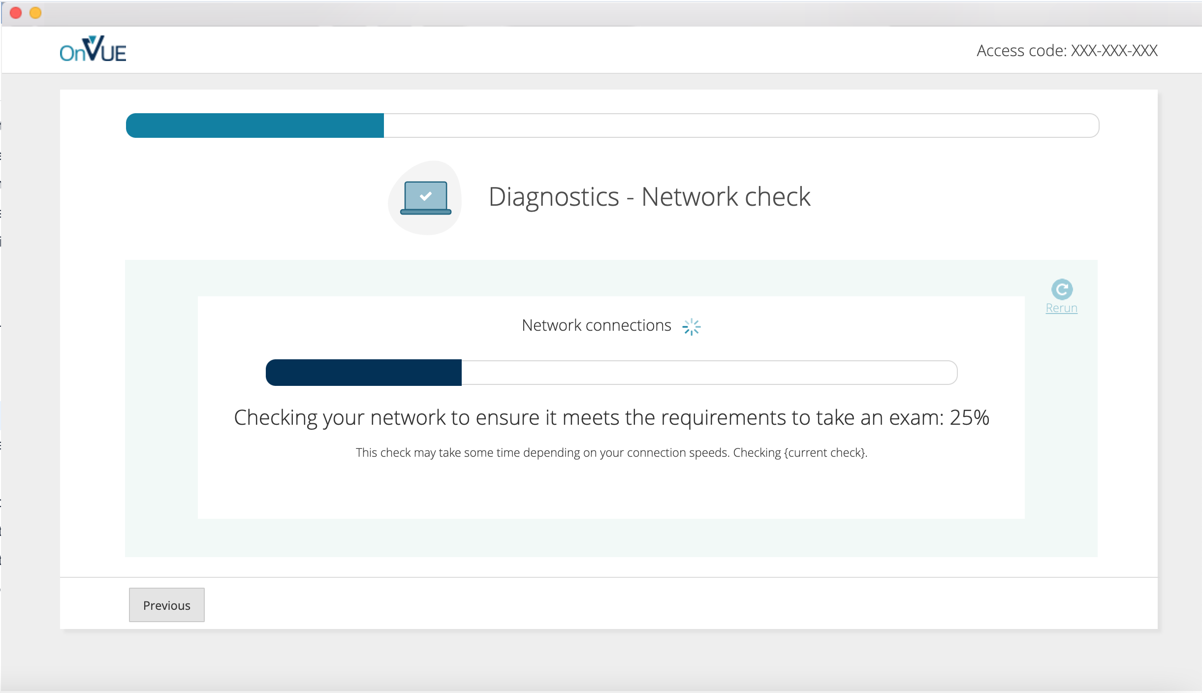
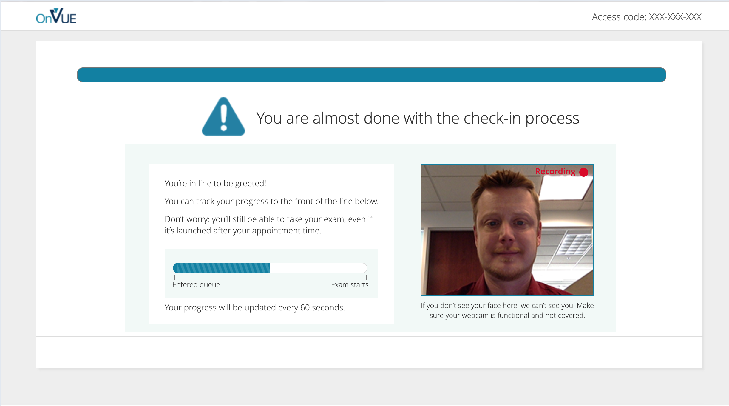
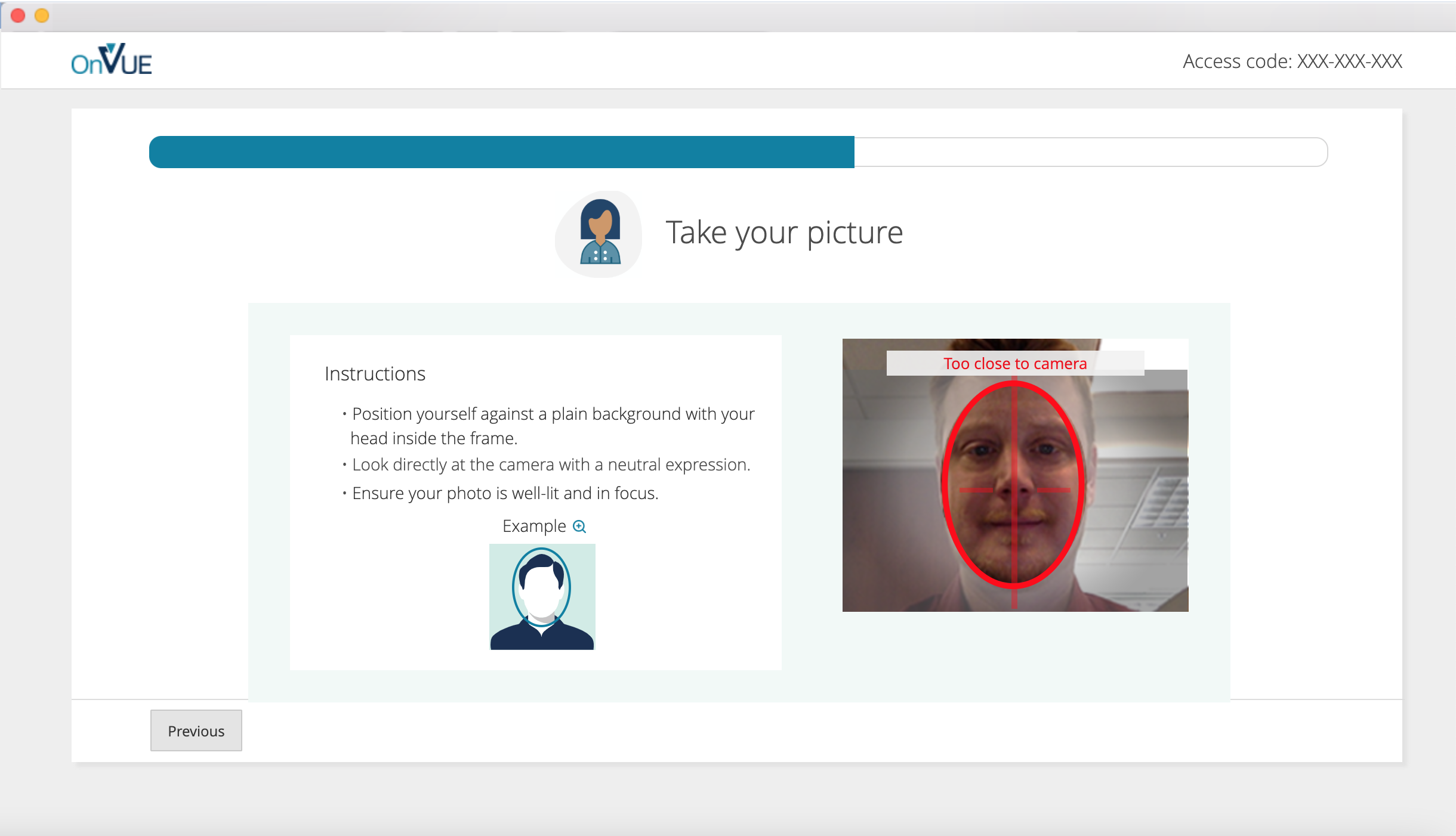
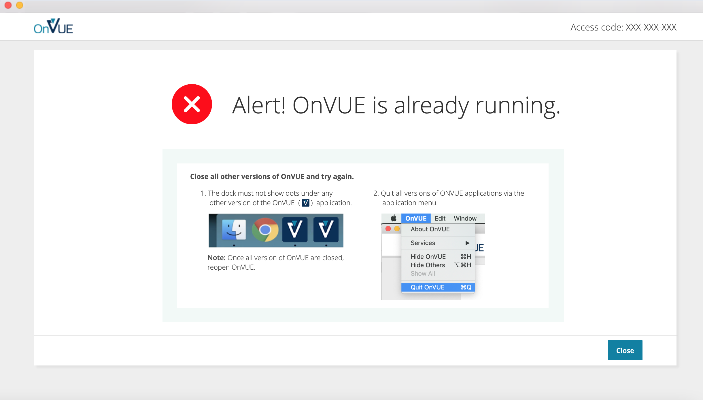
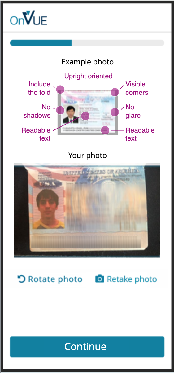
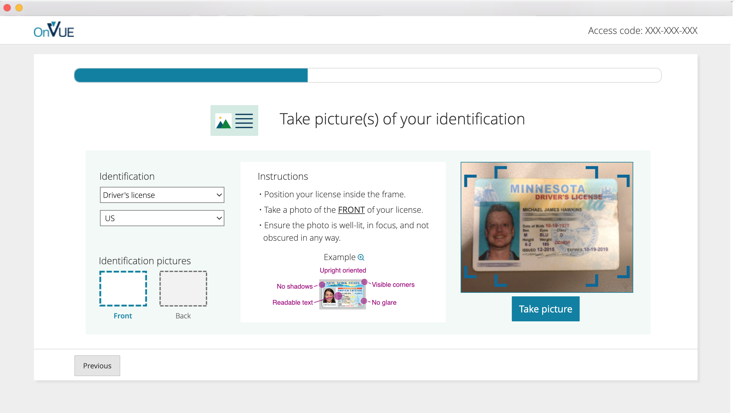
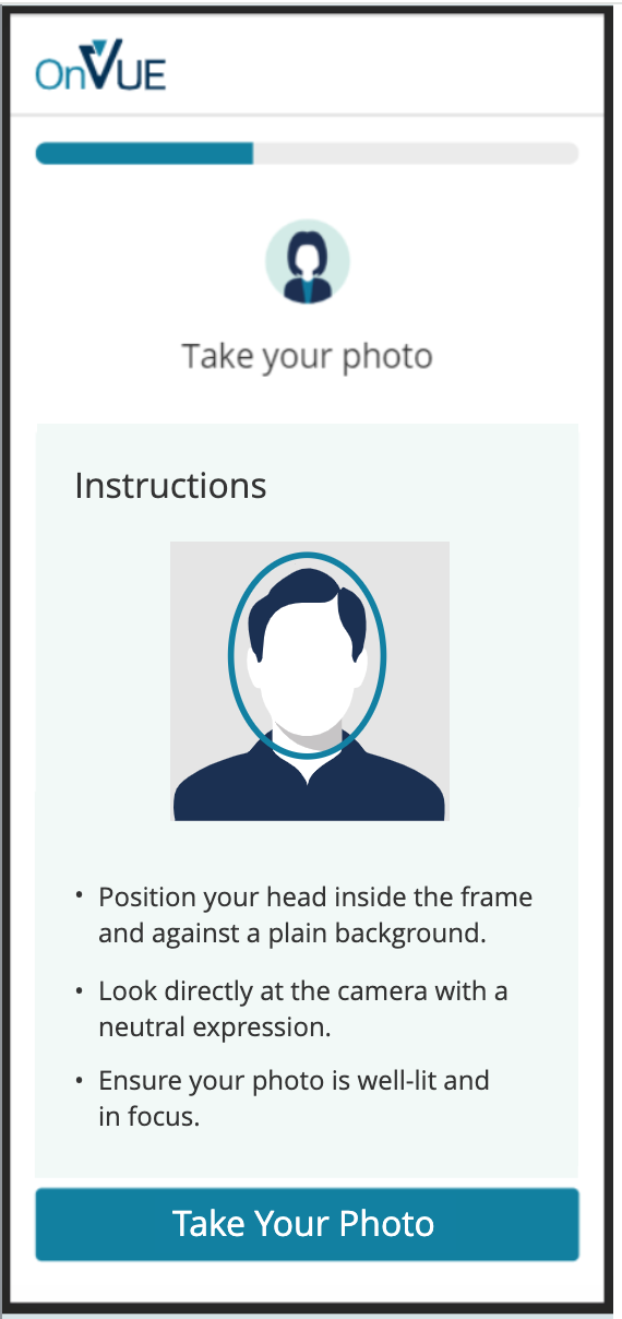
I designed success and failure together from diagnostics through identity and workspace capture. System tests needed plain-language pass/fail and next steps; identity needed precise guidance without unexplained surveillance; workspace capture had to explain requirements and image use; and the proctor queue had to reduce ambiguity while waiting for a person.
Progressive disclosure kept policy detail available without turning each step into a document. Because mobile is mainly a better camera for ID and room capture, it had to feel like a temporary extension of the desktop journey rather than another product to learn.
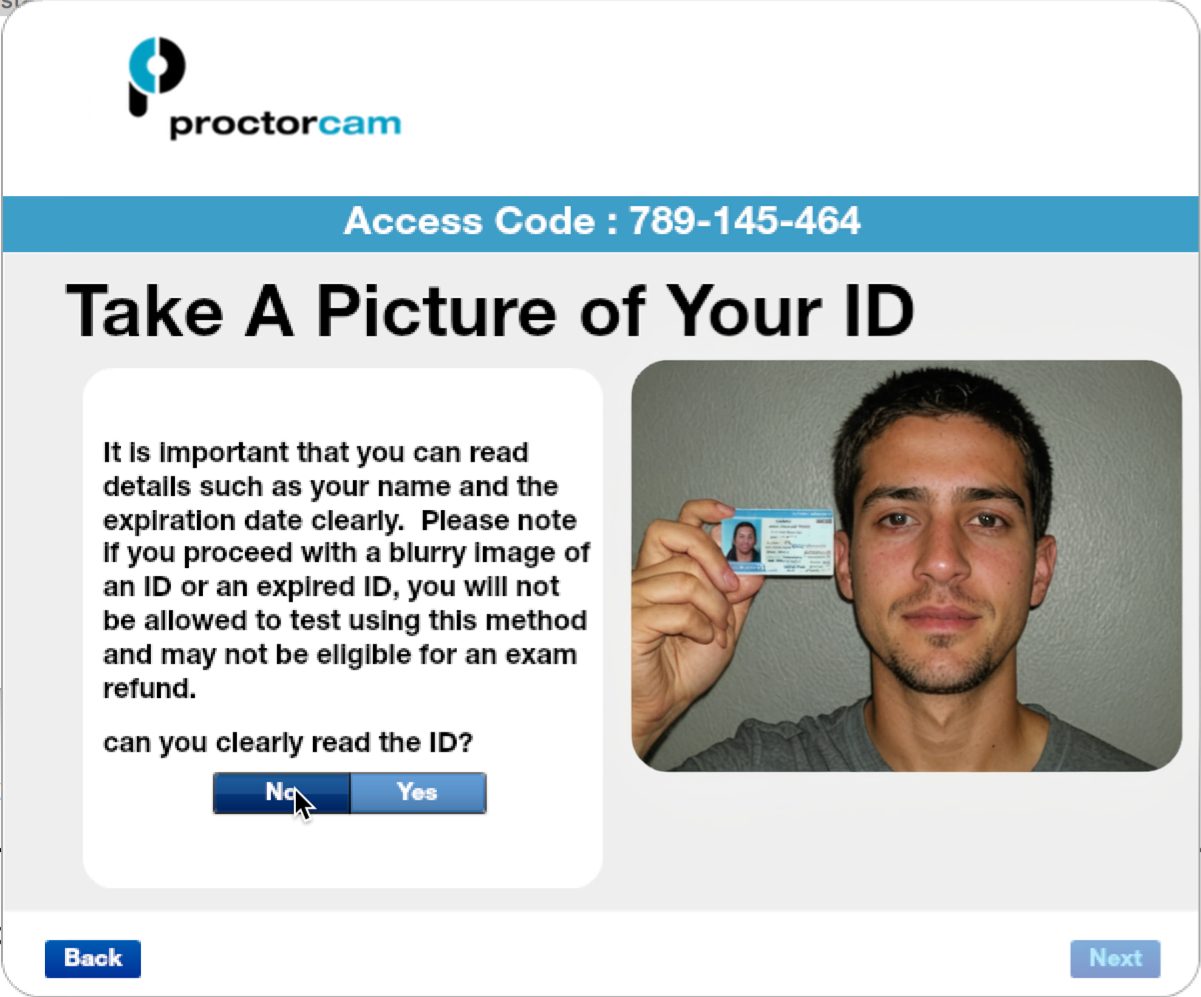
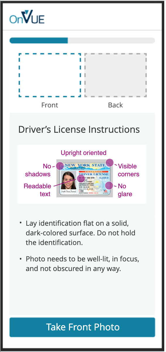
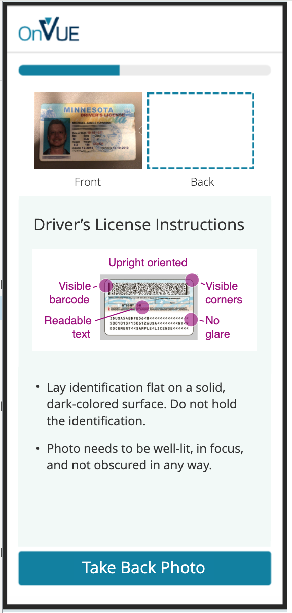
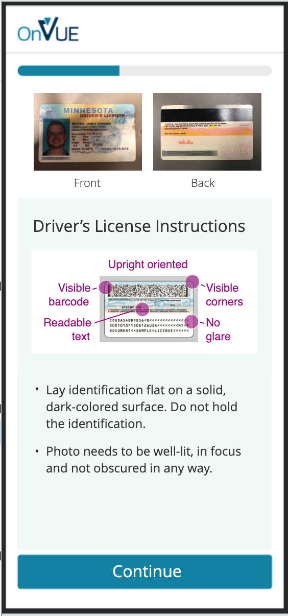
Clear entry into dedicated check-in.Identity guidance balances security/confidence.
The phone is temporary. Context cannot be.
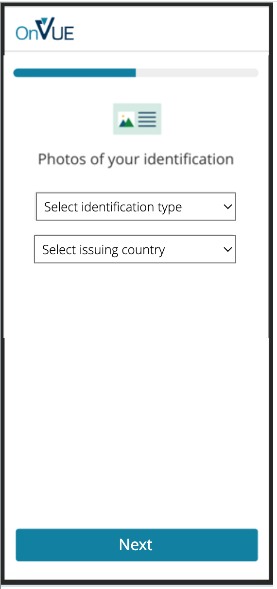
Mobile is used because cameras are better suited to capturing IDs and the room. The product should therefore make the phone feel like a temporary extension of the desktop journey, not a new application the candidate has to understand.
// UI evidence12 additional product states
More of the cross-device check-in
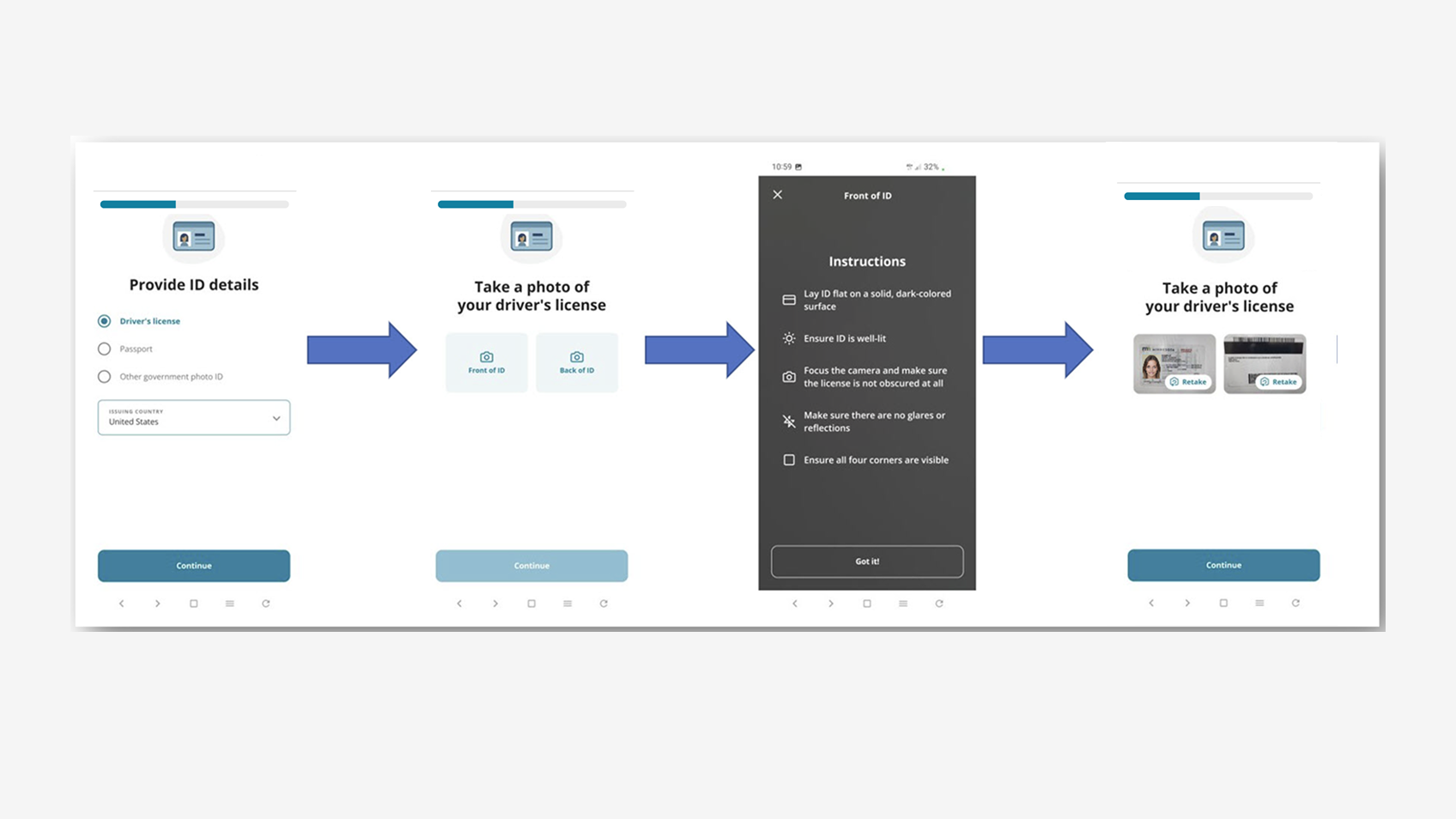
Mobile identity and capture states that complete the desktop-to-phone journey.
Scaling exposed problems that were no longer visible from the candidate UI alone.
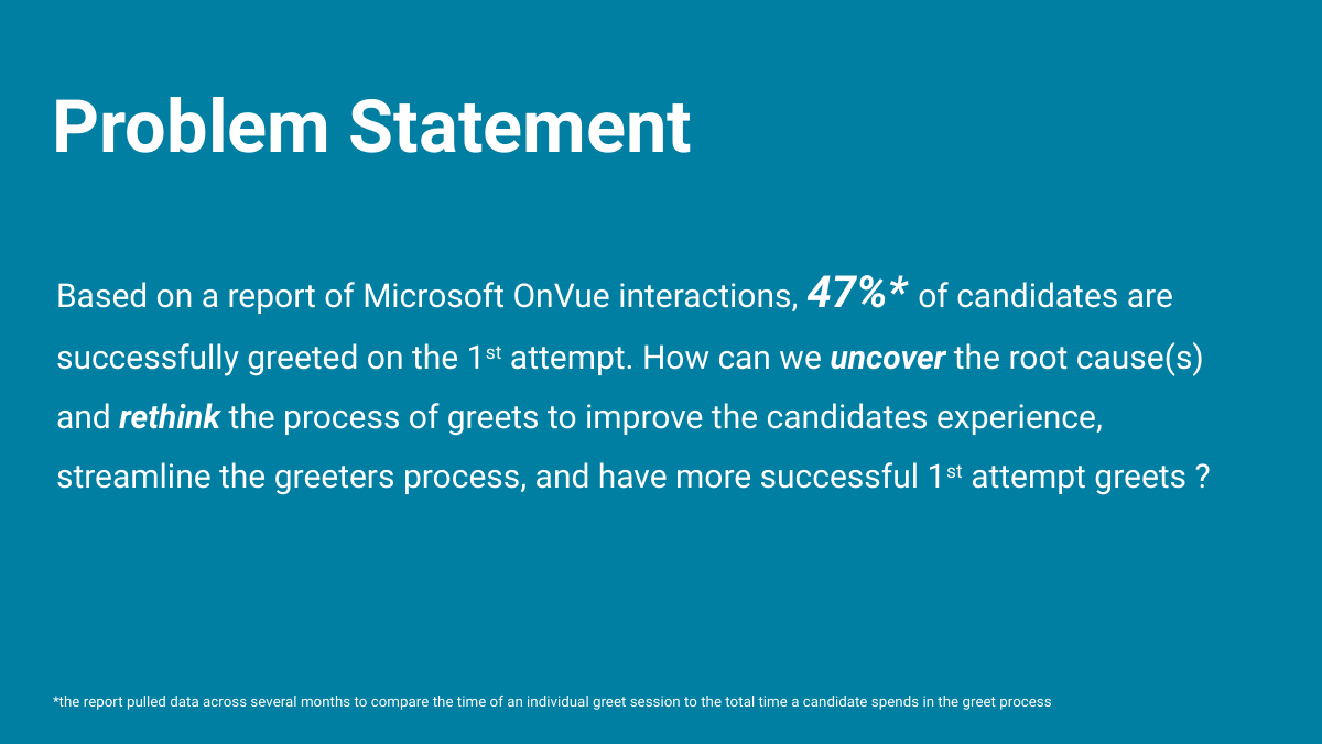
After launch, broader team research examined Greet using a Microsoft OnVUE dataset where about 47% of candidates were greeted successfully on the first attempt. I use this as later stewardship evidence, not as research that created the original product.
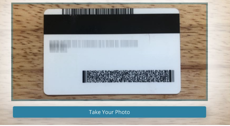
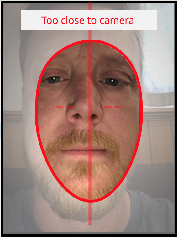
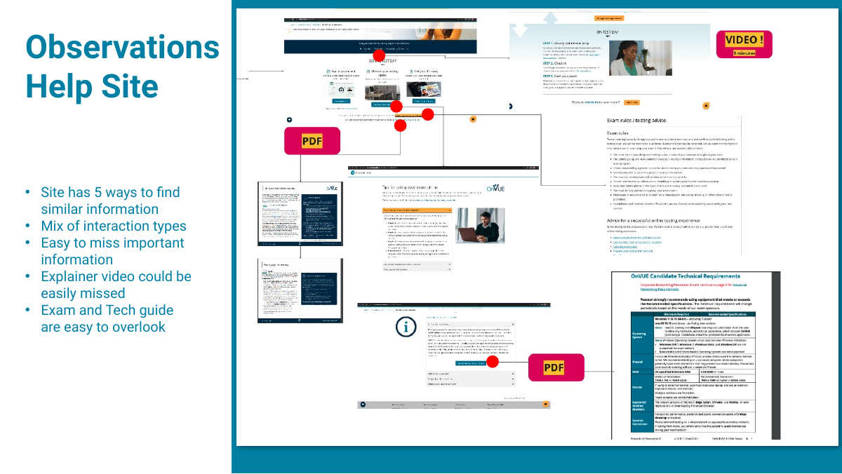
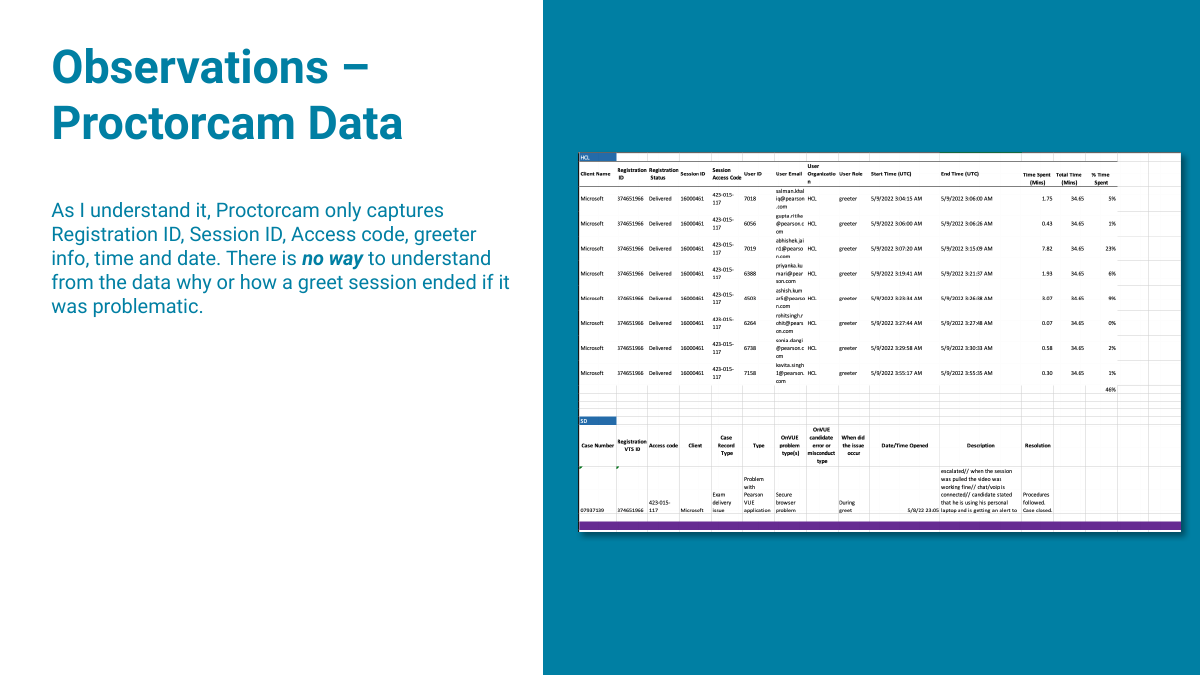
Greeter shadows, a focus group, quick Intellivue analysis, journey review, Microsoft Azure exam walkthrough, and a cross-functional workshop showed friction started before the greeter screen. Confirmation emails were policy-heavy but weak on preparation; help had overlapping entry points; environment, technology, and language guidance were easy to miss; the mobile viewfinder did not match the resulting photo; greeters zoomed browsers to inspect IDs/rooms, lacked history, and reused external chat notes; and Proctorcam timing data could not reliably explain failures. Greeters also relied on browser zoom for ID and room inspection, had limited candidate history, and used external notes for repeated chat responses, showing that operator tooling and candidate preparation were part of the same service problem.
The failure rate crossed product boundaries, so improvement required preparation content, mobile capture, greeter tooling, diagnostics, instrumentation, and policy to move together.
Sample data showed low first-attempt success.Viewfinder/photo mismatch created candidate and greeter work.Greeter pain: language, photos, history, messages.
Why this belongs in the case: the original 0→1 work proves I can create a platform. The Greet evaluation shows the other half of senior product design—continuing to interrogate the system once real operational behavior reveals where the next bottleneck lives.
// 05Product stewardship
Later candidate testing kept challenging assumptions in the broader journey.
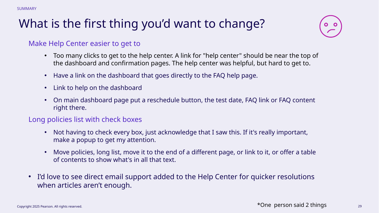
A later six-participant study of registration, scheduling, rescheduling, and help provided supporting evidence for the wider journey, not the original OnVUE research.
It reinforced that dashboards should surface next actions; OnVUE and private access codes need point-of-choice explanation; repeated policy sequences feel redundant; confirmation should lead with consequential exam information; and useful help still fails when its entry point is buried. These findings matched the Greet work: upstream preparation and in-context support can prevent later operational friction.
Help and policy friction dominated.
// 06Outcome
A 0→1 experience became infrastructure for millions of high‑stakes exams.
The platform supported about 300% growth, reached roughly 2.3 million exams annually, and the redesigned check-in experience is associated with about 25% fewer check-in failures.
I keep those approved portfolio outcomes separate from the research artifacts. The decks and screenshots substantiate the cross-device architecture; the metrics describe business and operational results. The through-line is stewardship: establish the 0→1 system, then use operational and user evidence to improve new bottlenecks as scale changes the problem.
300%Growth supported
2.3MAnnual exams
~25%Fewer check‑in failures
// TradeoffsConstraint · limitation · next test
The direction is strongest when its limits stay visible.
Tradeoff
What had to be balanced
Each new handoff adds failure risk. Shared state and explicit ownership reduce that risk without pretending device switching is effortless.
Limitation
What remains unresolved
The public case compresses years of platform evolution and cannot attribute every later feature to the founding design phase.
Next test
What I would learn next
Keep reducing recovery time and measure where candidates still need a human to re-establish shared context.
// Reflection
In high‑stakes products, recovery is part of the primary path.
OnVUE taught me to treat recovery as a primary path. A candidate who cannot complete a handoff, take an acceptable photo, understand a security rule, or reach a greeter is experiencing the product at its most consequential moment.
It also taught me to follow problems beyond the interface. Confirmation content, help architecture, instrumentation, mobile capture, and operational tooling can defeat clear screens. The founding design created coherence; later Greet and candidate studies exposed new bottlenecks as usage and scale changed what good meant.