AI-Guided Environment Validation·Computer vision · validated proof of concept
When the first attempt failed, recovery became the product.
I designed and tested a guided mobile workspace scan that detected room issues, explained corrections, bounded repeated failure, and guaranteed a human-greeter path. Model uncertainty was a workflow state, never a reason to block the candidate.
AI-Guided Environment Validation · Validated POC
// My roleLead product design · UX/UI + validation
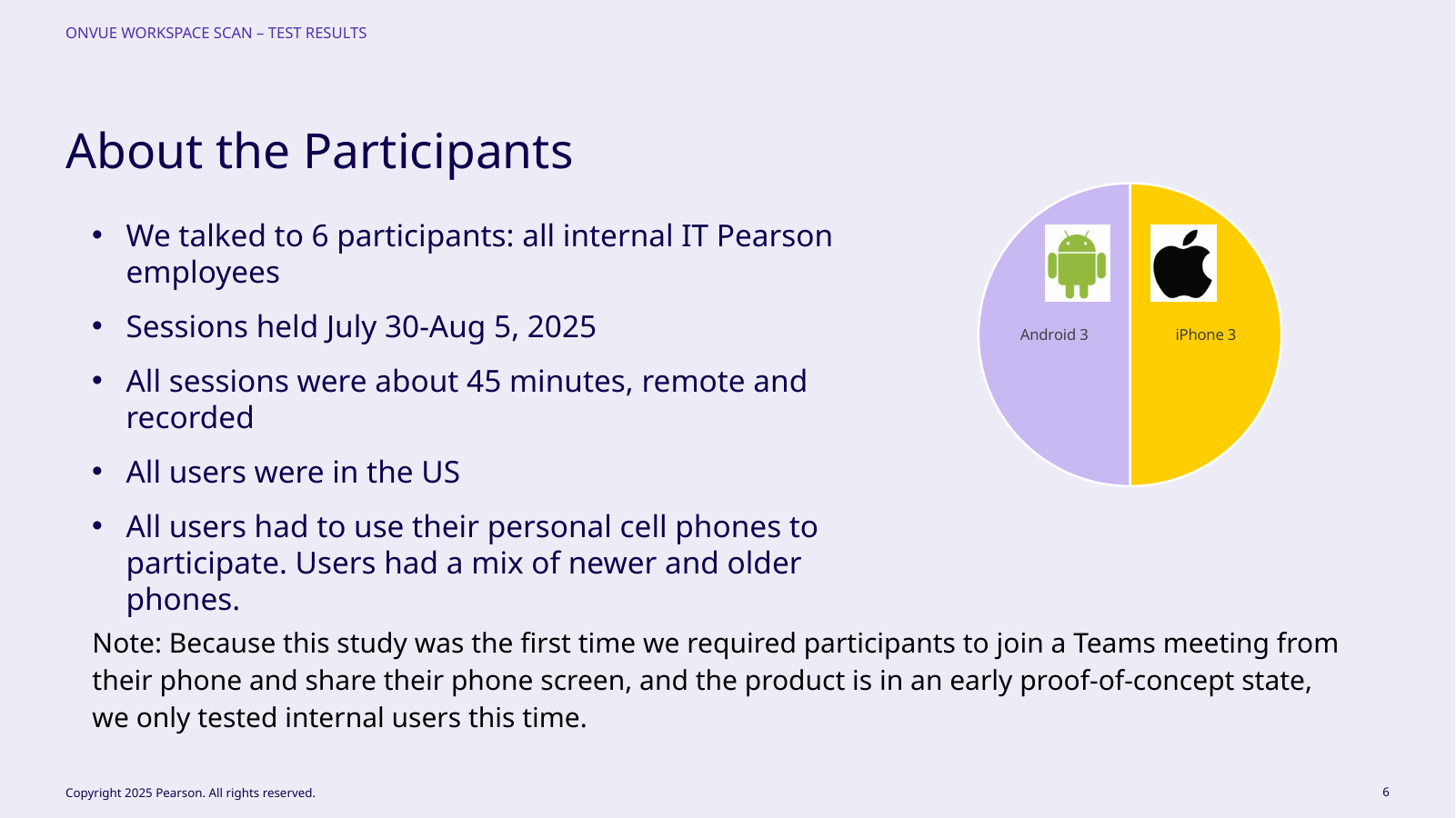
// Research6 participants · 3 Android / 3 iPhone
// Test result3.8/5 overall · 4.1/5 issue results
// StatusValidated proof of concept
Visual executive summary
Product states, ownership, and evidence at a glance.
OwnershipLead design, scan + recovery modelContributionFlow, mobile UX/UI, prototype, research synthesis, iterationCollaboratorsProduct, computer vision, engineering, operations, participantsDecision authorityLed experience/validation; model performance shared
// 01Why replace four photos?
The easier candidate task was creating expensive downstream work.
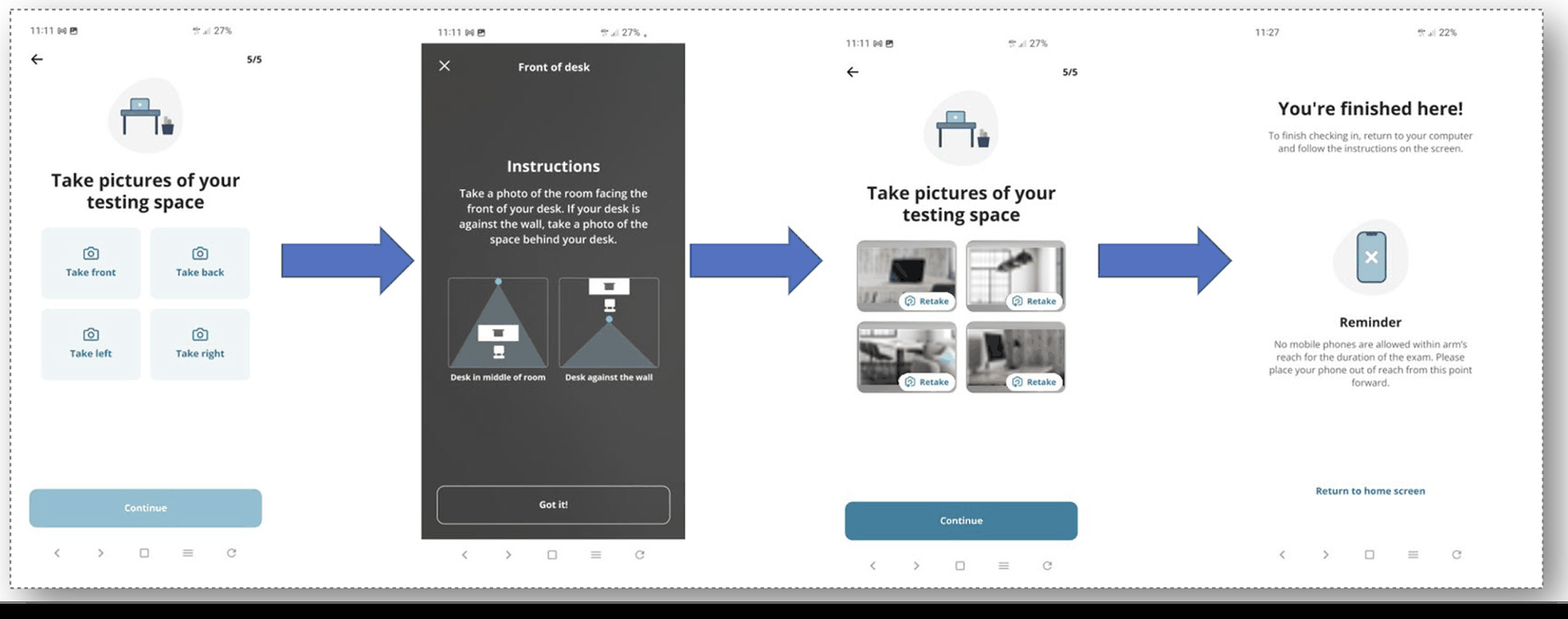
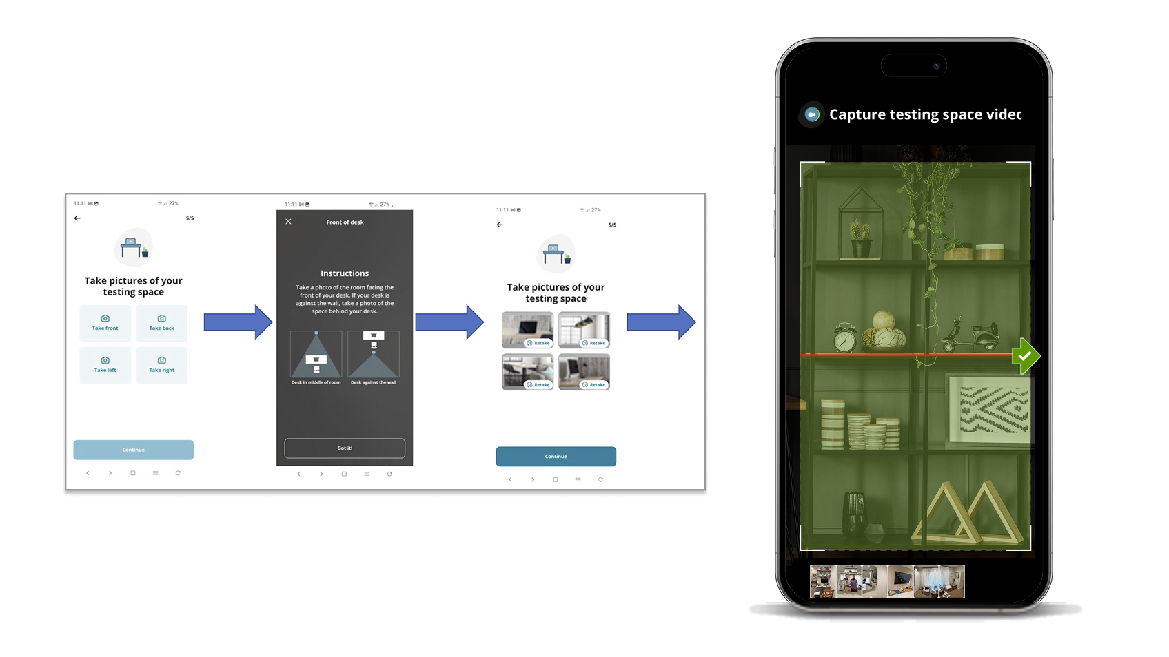
Four still photos were easy to take but often left gaps in 360° coverage, so candidates reached the greeter before obvious workspace issues were resolved. Proctors then spent time asking for new views, removals, or clarification during the most stressful part of check-in.
The 360° scan deliberately moved more effort earlier in exchange for better coverage, earlier issue detection, self-correction, less manual intervention, and more automatic admission. Because the scan was harder than four photos, it had to repay that effort across the whole service, not just look technically impressive.
I owned the end-to-end experience and integrated product requirements, technical constraints, and stakeholder approval. I worked from the physical task outward: sensors, interpretation, thresholds, greeter evidence, and policy when automation stayed uncertain. A slightly longer self-service step could still be better if it prevented a longer, stressful intervention later. That success model intentionally allowed a slightly longer local task if it reduced later proctor intervention, candidate stress, and operating cost across the service.
Four photos were easy but left room blind spots.Earlier detection with human fallback for uncertainty.
// 02Designing around an imperfect model
The UX policy mattered as much as the computer vision.
The POC checked workspace suitability, monitor/laptop setup, and prohibited items from a 360° mobile capture. Experiment targets were about 70% issue-detection accuracy and no more than 20% noise/false positives; these were targets, not production outcomes.
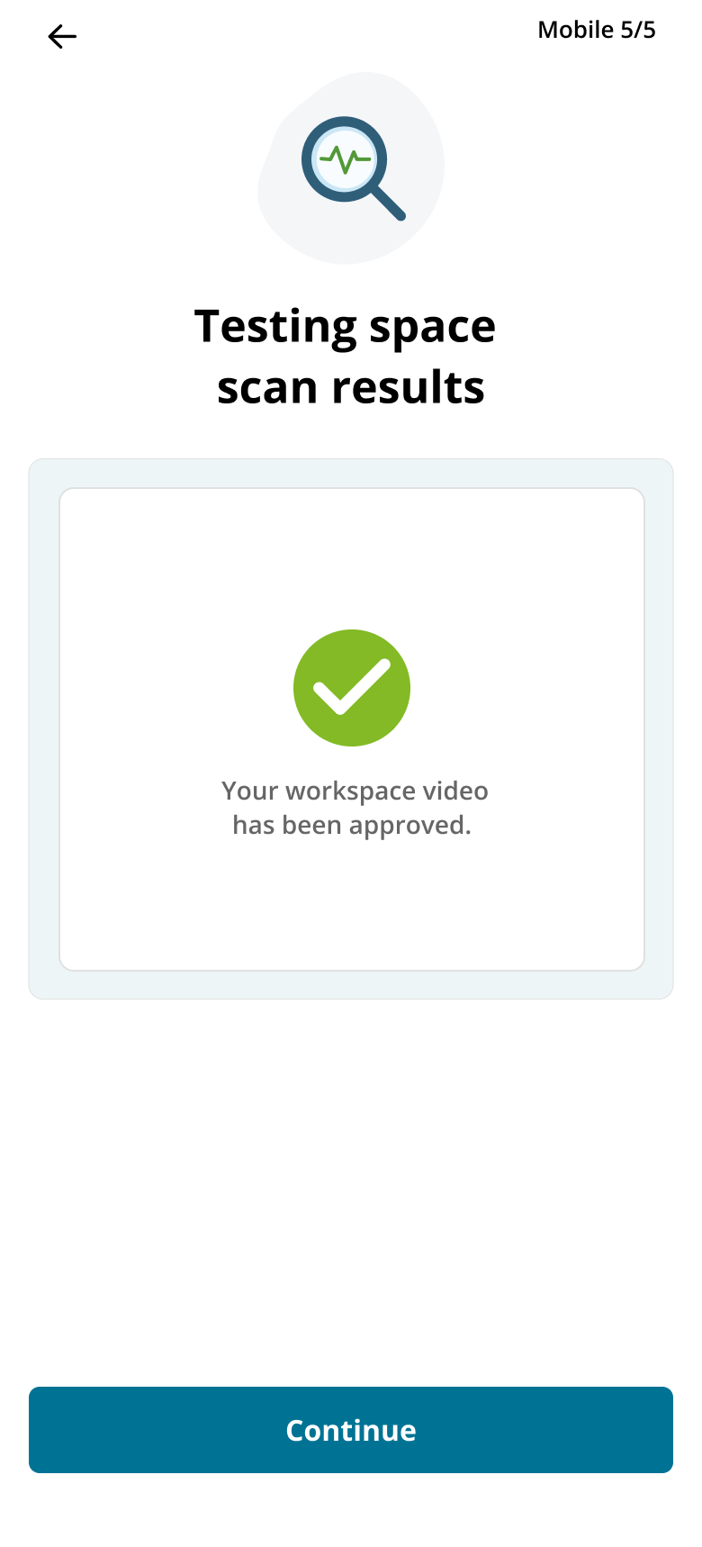
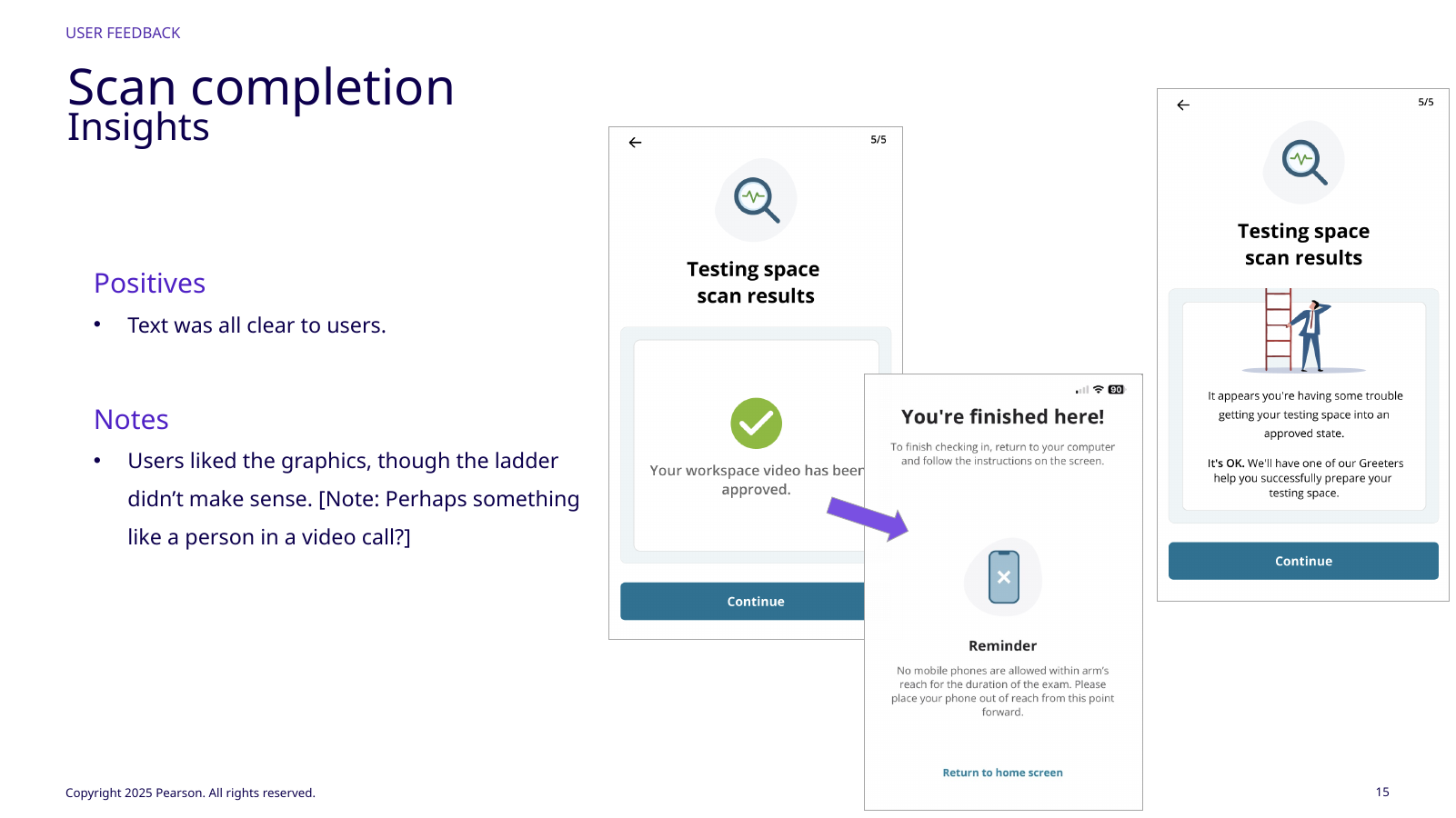
I designed three result states: Green approved the scan; Yellow represented uncertainty, inability to process, or opt-out requiring human review; Red represented persistent issues. Persistent AI failure could never permanently block the exam: the flow handed off to a greeter or carried a flag for human handling.
Greeters could mark AI outcomes true or false, supporting operational learning without asking candidates to interpret model confidence. Automation changed routing and evidence while accountable human resolution remained available.
GREENApprovedWorkspace scan satisfies the current policy and can continue.YELLOWUncertain / opt‑outThe model cannot reliably conclude; route to human review.REDPersistent issueCandidate can retry, correct, or proceed flagged for human handling.FEEDBACKHuman true/falseGreeter confirmation provides operational evidence about the model output.
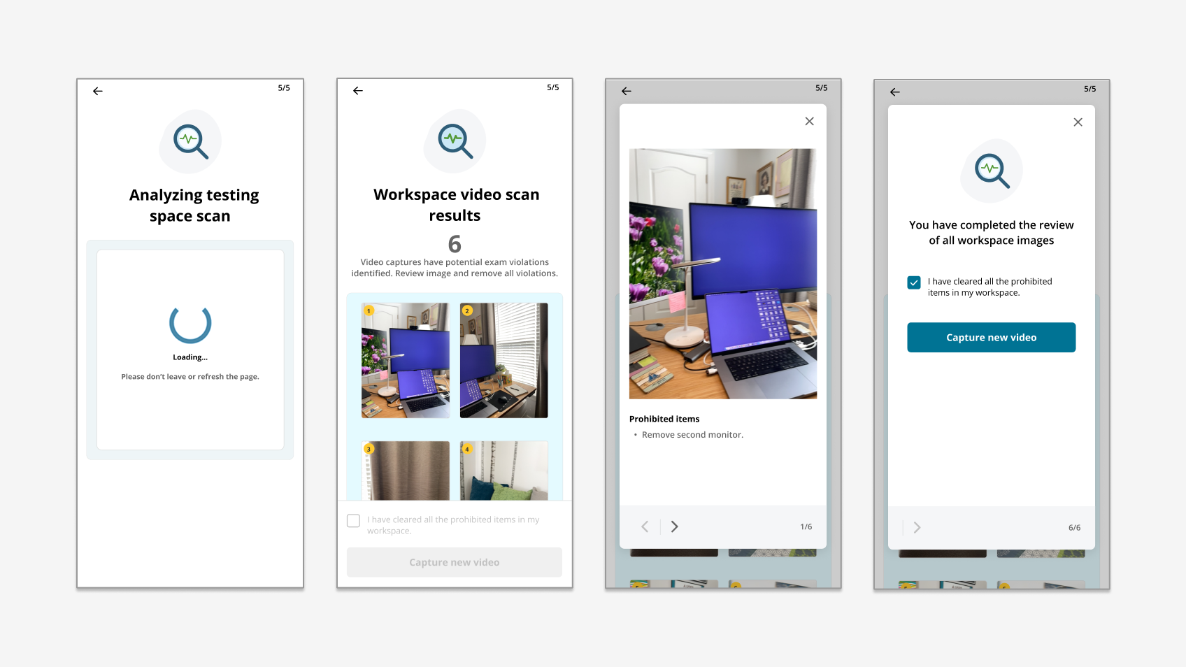
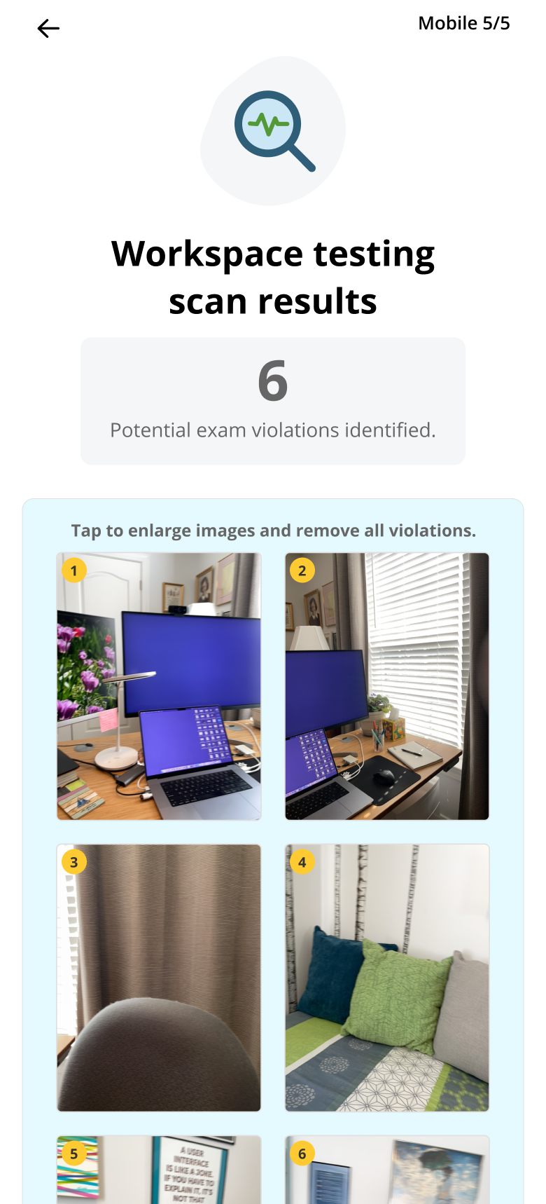
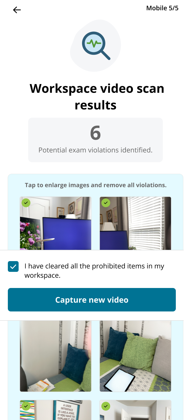
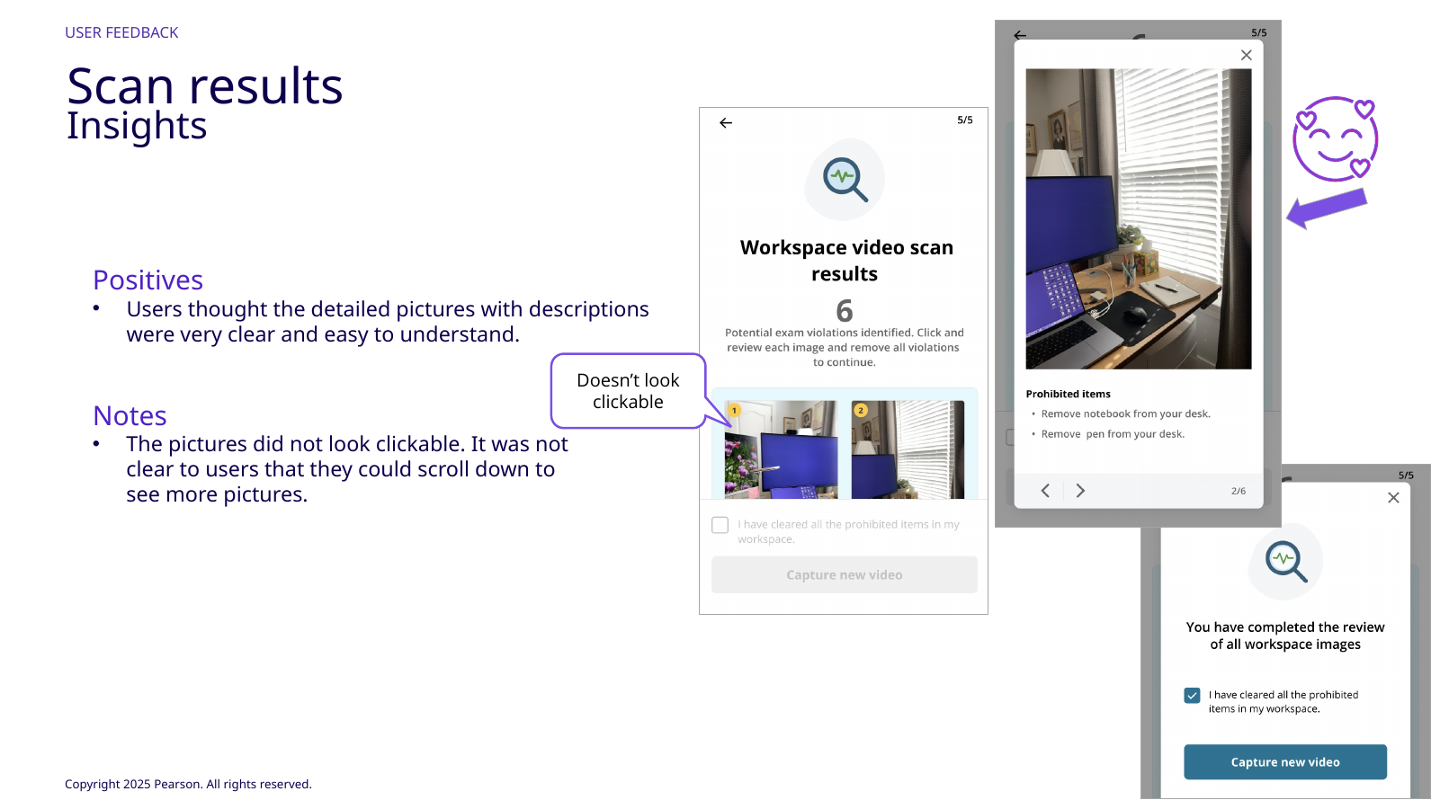
Issues pair evidence, explanation, and correction.
// 03The guided scan
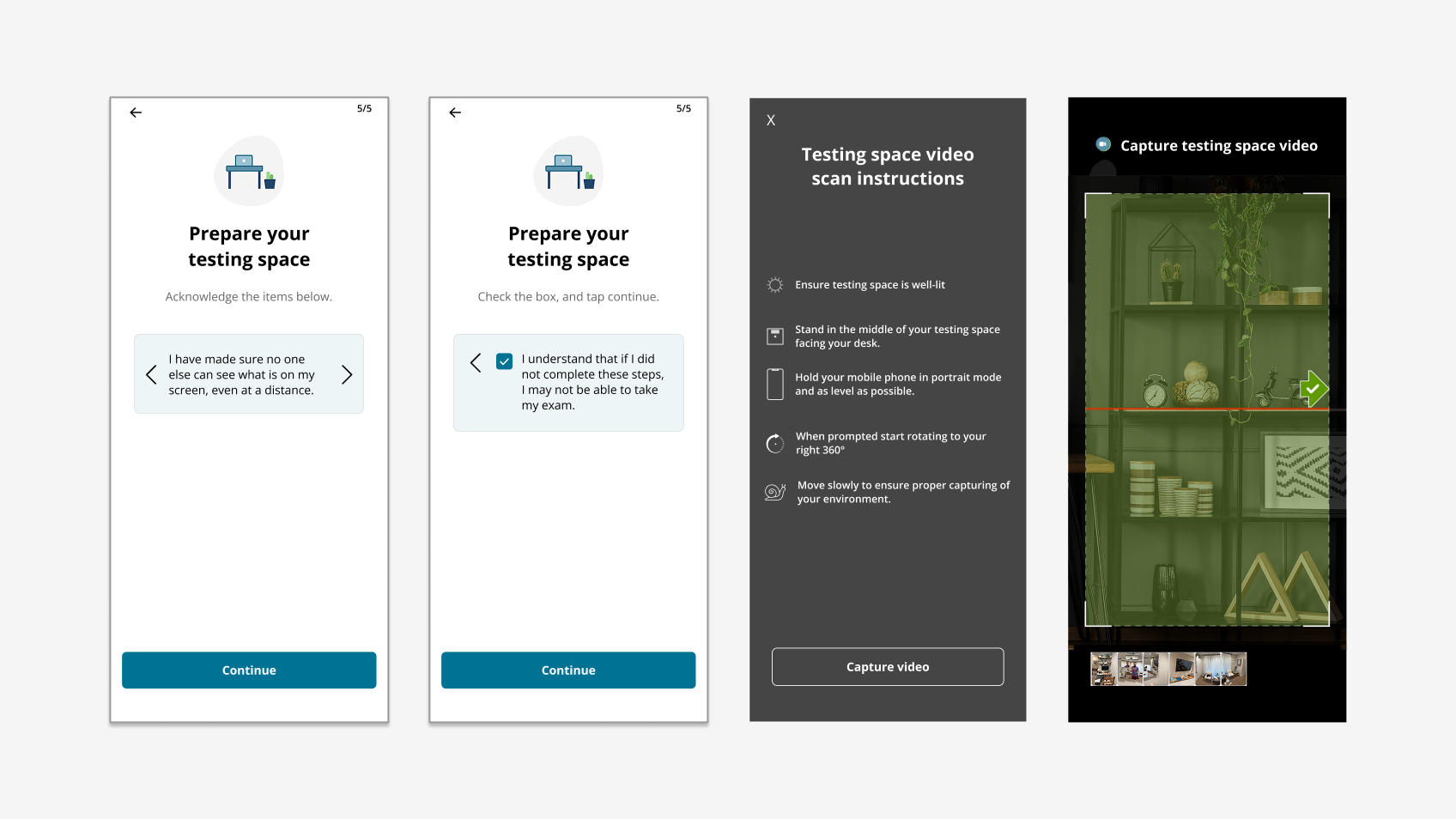
The scanner had to teach a physical motion through a small screen.
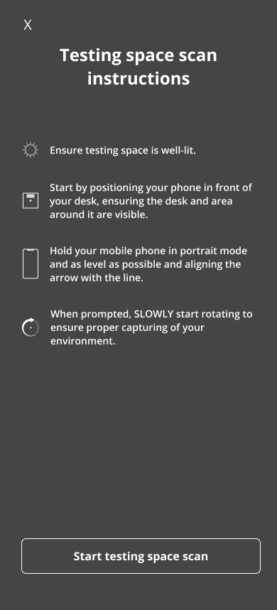
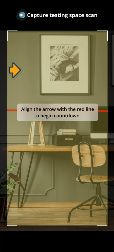
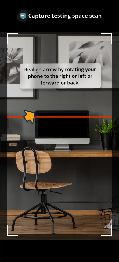
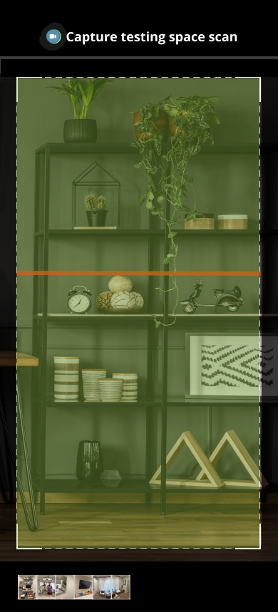
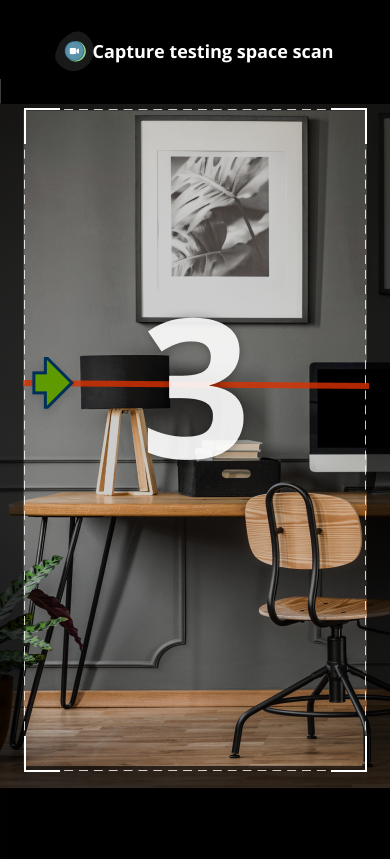
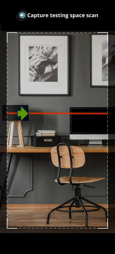
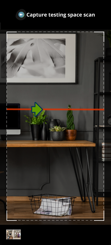
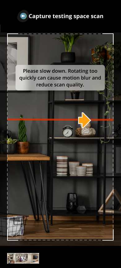
The task was physical: hold the phone at the right angle, move at an acceptable speed, keep it level, and rotate far enough. The UI could only shape that motion through real-time cues.
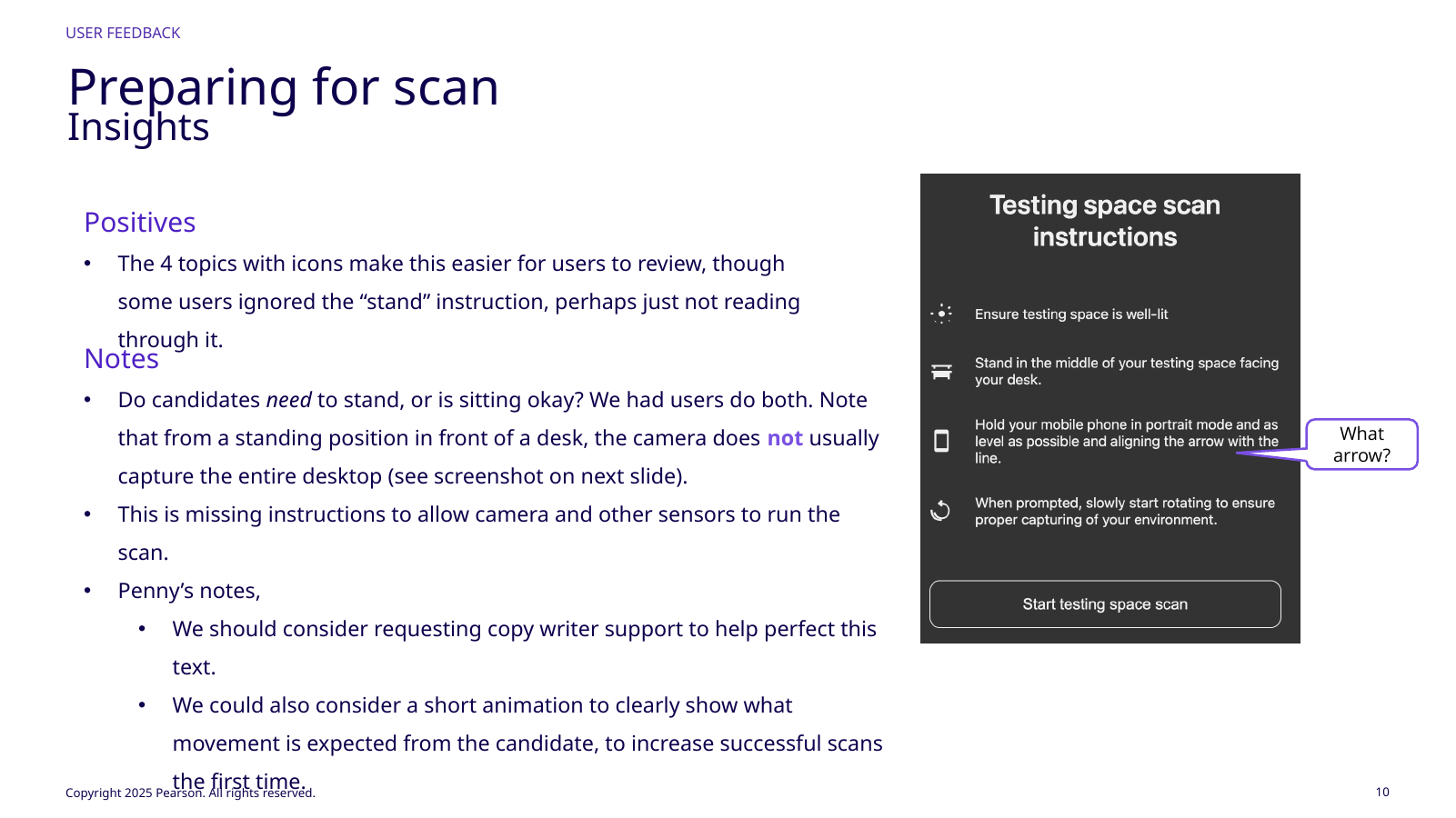
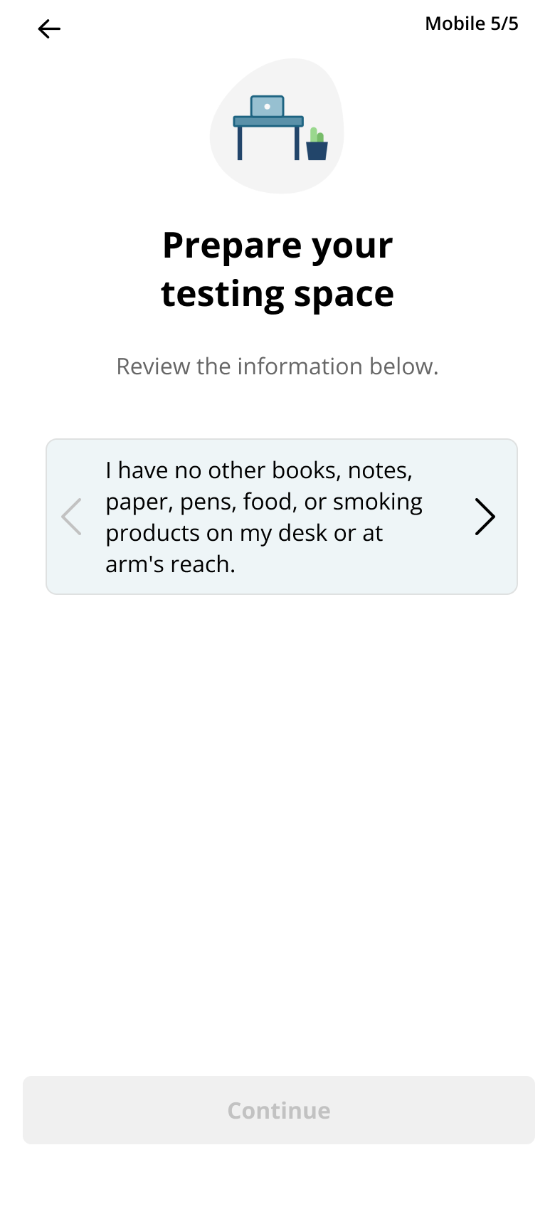
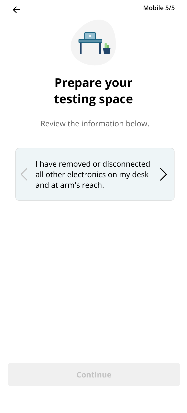
Preparation set expectations, then live guidance distinguished keep going, slow down, adjust level, restart, and complete without requiring paragraphs during a 360° turn.
Copy, visuals, and sensitivity were one interaction system. Strict thresholds could defeat good instructions; looser thresholds could improve completion but reduce image quality. The prototype therefore evaluated the physical motion, sensor thresholds, guidance, and copy together rather than treating screen comprehension as the whole experience.
Completion must clearly signal when to stop.
Icons helped; posture and sensor permissions needed clarity.
// UI evidence12 additional product states
More of the guided scan experience
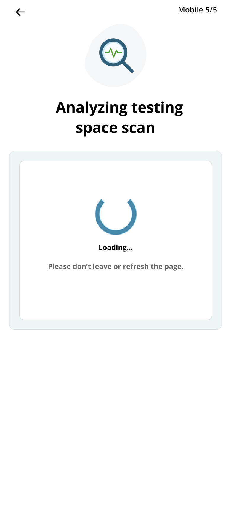
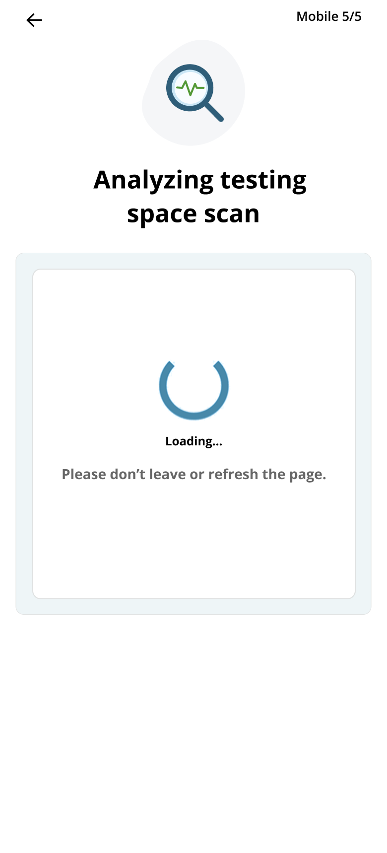
Preparation, live scanning, analysis, results, and retry states from the workspace-validation prototype.
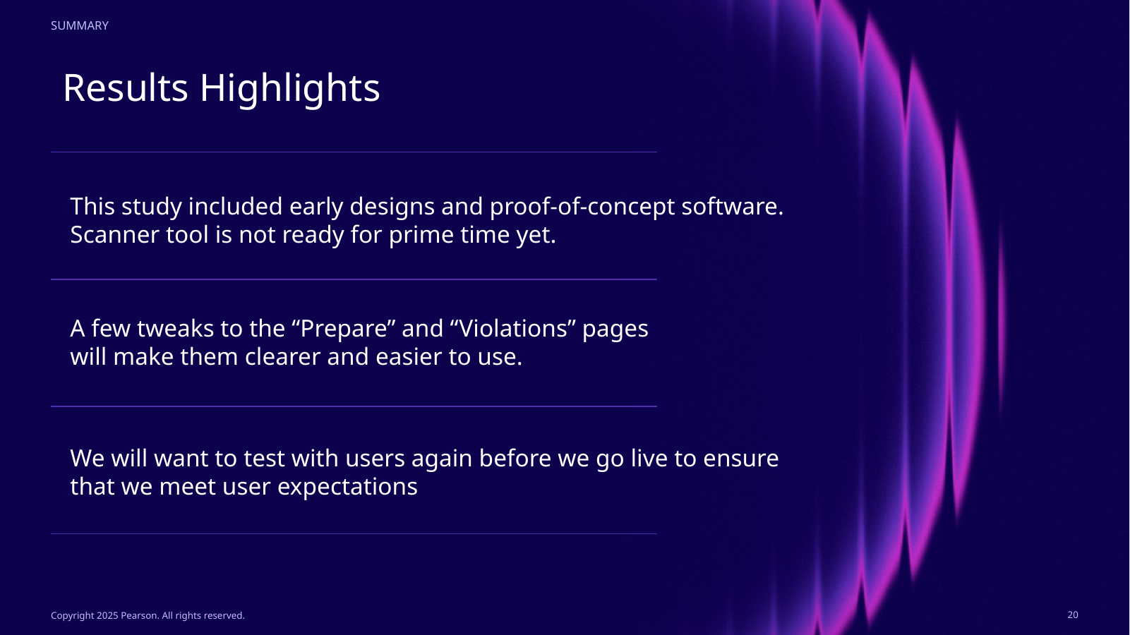
Zero of six people completed the first scan successfully. That was the most valuable result.
Six internal participants used their own phones, three iPhone and three Android across newer and older devices, in recorded remote sessions of about 45 minutes.
No one completed the first scan successfully; participants restarted one to four times. Sensitivity was too high, “You’re doing great” could remain visible after failure, some users did not know when they were finished, and some followed the motion but still missed the full desktop. Several participants also failed to realize they were done, while others followed the guidance yet still missed part of the desktop; both findings showed that success criteria and sensor tolerance were misaligned with normal movement.
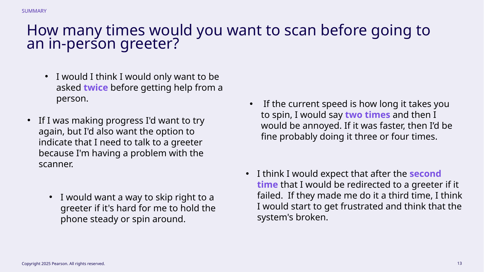
Multiple participants converged on about two failed attempts before expecting human help. Some would retry more if scans were fast and progress visible; others wanted immediate greeter access when steadiness or rotation was difficult.
The concept itself still had value: participants liked object recognition, understood requirements, and found issue-result images/descriptions clearer than the scanner. The weak link was physical capture plus system sensitivity.
0 / 6First‑attempt scan success
1–4Restarts before first success
~2Retries before human help expectation
Three iPhone + three Android participants.Scanner sensitivity and feedback mismatched user state.Participants defined when failure should reach a human.Issue explanations outperformed capture interaction.Results/explanations were stronger than scanning.
// 05What changed
The correct fix was partly UI—and partly changing the system underneath it.
Very little visual UI needed to change. The main usability failure came from sensitivity: how level the phone had to stay and how quickly the candidate could rotate.
I worked with stakeholders and technical constraints to relax those levels so normal movement triggered fewer failures while retaining real-time guidance, and we clarified preparation and restart behavior.
Because the overall flow and issue explanations scored well and the primary cause was understood, the team did not run a second formal study before development. We tuned the system and moved forward. The lesson was to follow usability failure to the layer causing it, not assume every finding requires new screens. The team chose not to repeat a formal visual study because issue explanations and the overall flow were already performing; the known failure mechanism was system sensitivity.
// 06Explainability + recovery
When the system says the room is wrong, it has to show the candidate how to make it right.
Detection only helps when candidates understand what is wrong, why it matters, and how to fix it. Results therefore paired the detected issue with a representative image and corrective guidance.
I avoided making abstract AI confidence the primary explanation; candidates needed an actionable workspace task, not model probability. Recovery was bounded too: correct and retry, then transition to a human rather than loop indefinitely.
// Outcome integrityValidated proof of concept
The research supports the workflow direction, not a production efficiency claim.
Participants rated issue results 4.1/5, the overall POC 3.8/5, and the scanner 3.4/5. None succeeded on the first scan; restarts ranged from one to four.
The 70% detection and 20% false-positive figures remain experiment targets, not production outcomes. The next gate is improved guidance and retry behavior followed by renewed experience and model validation before any launch or efficiency claim.
3.4 / 5Scanner
4.1 / 5Issue results
3.8 / 5Overall POC
// TradeoffsConstraint · limitation · next test
The direction is strongest when its limits stay visible.
Tradeoff
What had to be balanced
More retries may improve capture quality but increase anxiety and time. The design sets a boundary and offers a human route.
Limitation
What remains unresolved
The 70% detection and 20% false-positive figures are experiment targets, not achieved production results.
Next test
What I would learn next
Retest the scanner guidance and retry threshold before making a production efficiency claim.
// Reflection
Sometimes the most important UX variable is not visible on the screen.
The highest-leverage fix was recognizing that system tolerance was part of the interaction. New arrows or instructions would not solve a scanner that still rejected normal human motion.
I also evaluate burden across the service. Four photos are locally easier than a 360° scan, but can be worse if they create minutes of stressful proctor intervention. In AI products, model behavior, thresholds, human fallback, copy, and timing all shape the experience, even when only some are drawn in Figma. That is why model behavior, product policy, and human fallback belong in the UX specification alongside screens.