Replacing a legacy voucher tool with faster, clearer work for enterprise administrators.
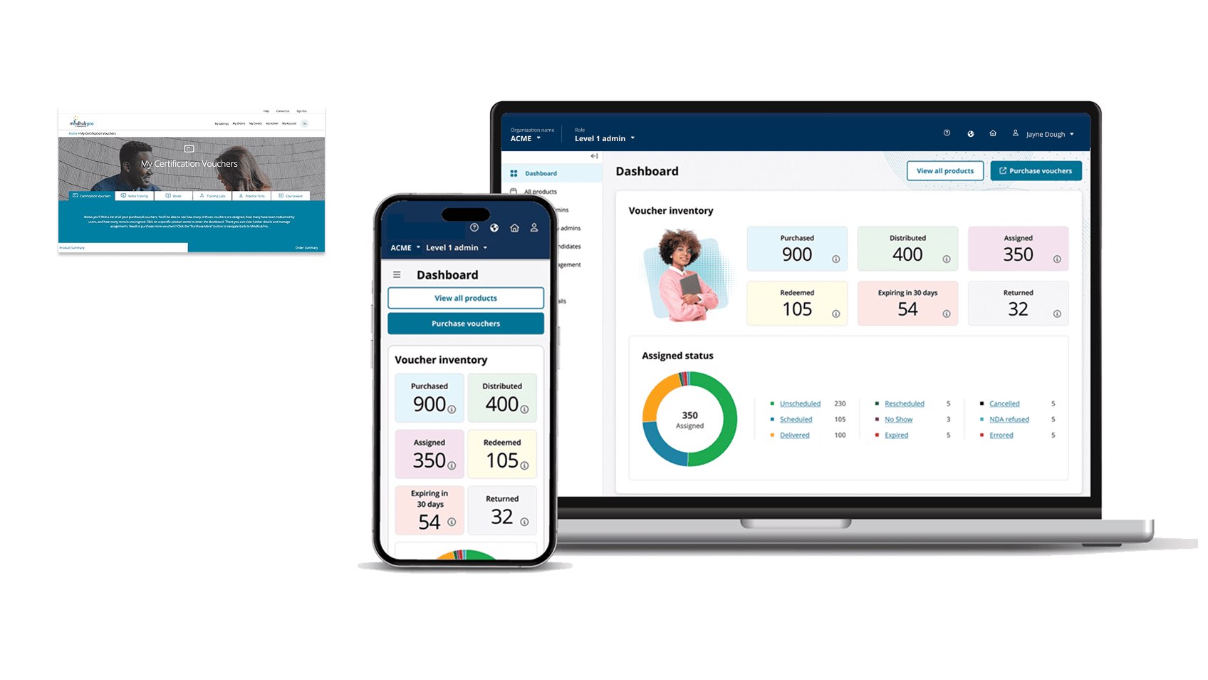
I owned end-to-end UX/UI, development handoff, and development-environment QA for modernizing My Product Manager (MPM), an enterprise voucher and digital-product tool. The redesign focused on distribution, role/user management, and assignments, and shipped 100% of committed scope on time and budget.
OwnershipLead design, role-tiered enterprise redesignContributionDiscovery, role model, prioritization, workflows, responsive UX/UI, handoffCollaboratorsProduct, engineering, global partners, admin stakeholdersDecision authorityLed design; roadmap and delivery decisions shared
// 01Legacy problem
The product could move vouchers. It made administrators work too hard to understand what to do next.
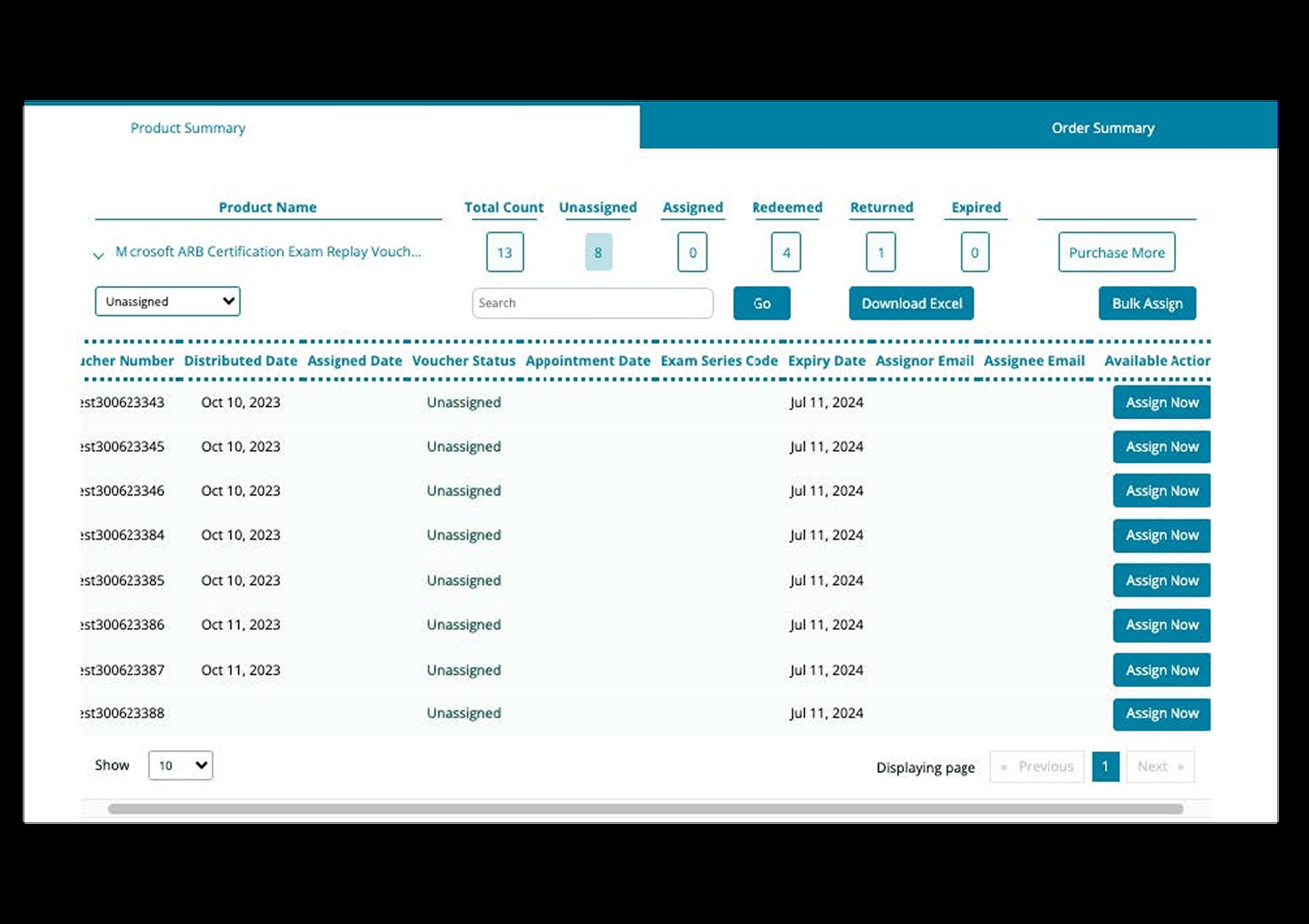
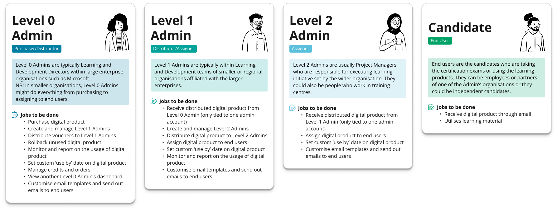
MPM served clients buying 100+ vouchers and digital products. Administrators managed inventory, distributed assets through an organizational hierarchy, assigned candidates, managed users, and tracked what happened after assets left their control.
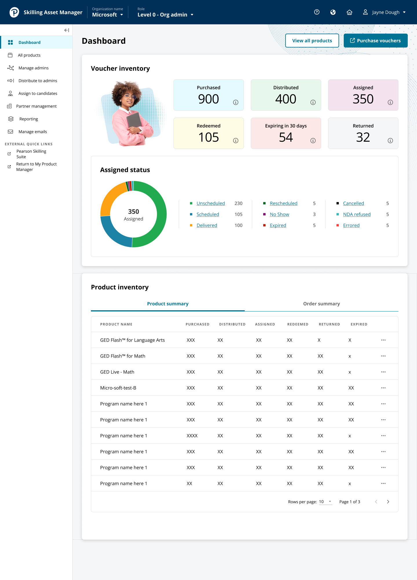
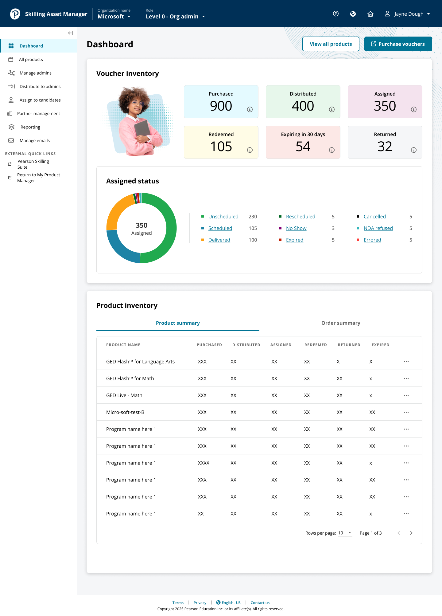
Research showed more than a cosmetic problem: long journeys, inconsistent terminology, unclear admin hierarchy, fragmented inventory, and a dashboard that did little to guide action. I owned discovery synthesis, IA, workflows, product design, prototypes, testing, revisions, handoff, and development QA.
Ambiguity carried real risk because products have quantity, ownership, expiration, and recipients. Distribution, role, or assignment mistakes could create waste or wrong authority. The redesign therefore exposed confirmation, remaining quantity, recipient context, and hierarchy where they prevented errors, while reducing navigation and showing results without forcing administrators to verify elsewhere.
Legacy UX exposed admin complexity.Multi-level model moves inventory/authority between roles.
// 03Prioritization
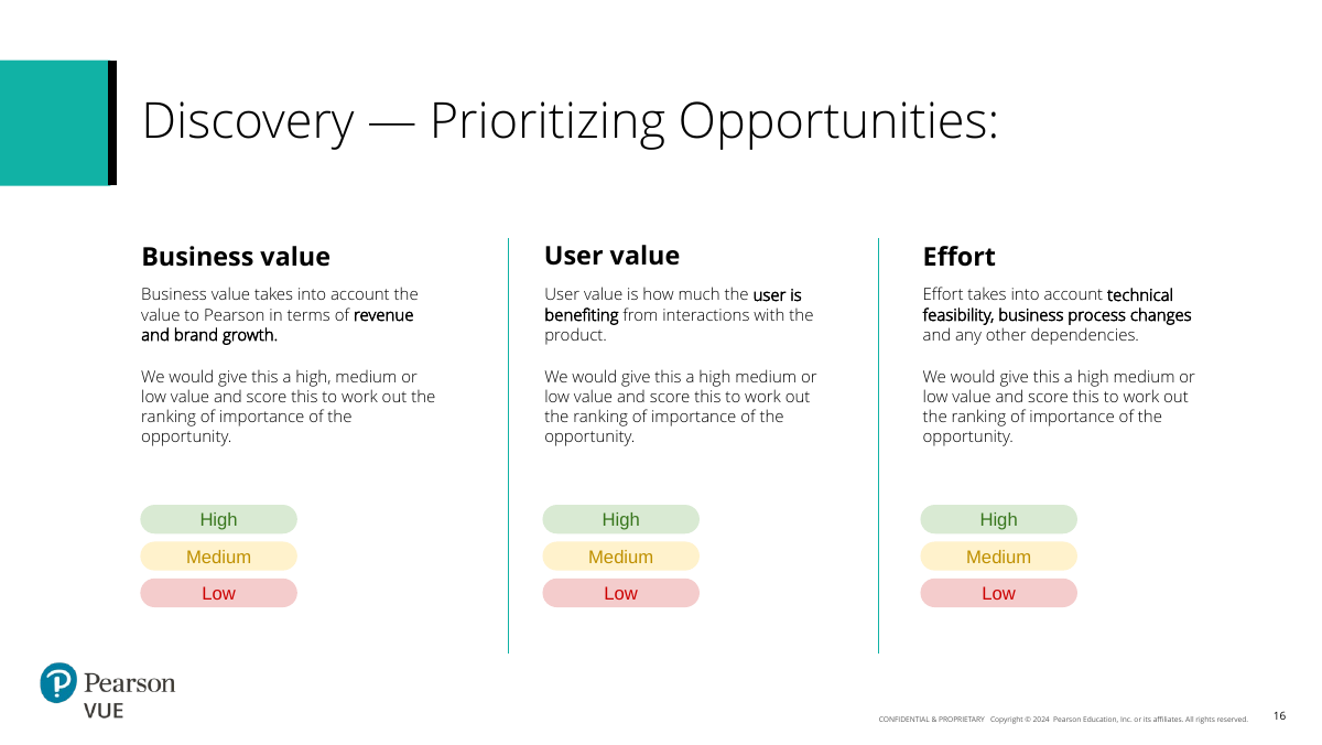
We scored opportunities on business value, user value, and effort—then narrowed the redesign to work that could change daily behavior.
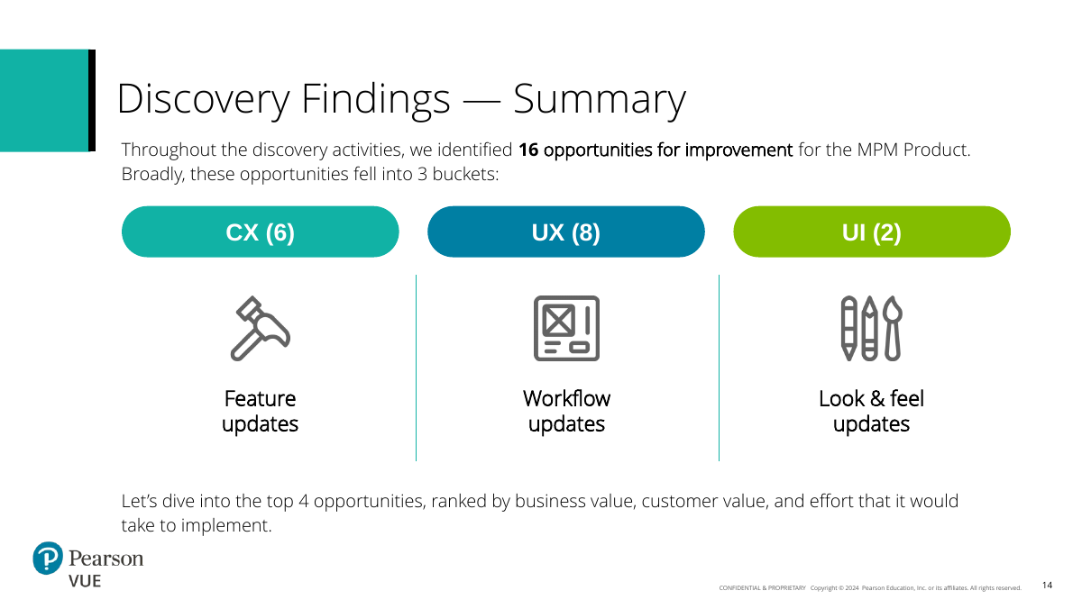
We ranked 16 opportunities by business value, user value, and effort. Voucher-waste minimization, pass/fail visibility, admin hierarchy, and design-system consistency all mattered, but the dominant UX problem was action orientation: users hunted for information before acting.
I focused on clearer entry, completion, and verification for repeated workflows. Advanced reporting stayed out of scope, and I rejected one universal wizard after workflow exploration showed different administrative jobs would become cumbersome. Shared patterns were useful only where they reduced cognitive load. Protecting that scope was part of how the team could deliver the committed modernization completely.
Prioritization: business value, user value, effort.
KEEP
Step‑by‑step guidance where the task benefits from it
Distribution, assignments, and role creation each get a clear sequence that matches the job rather than a generic wizard.
A structured flow reduces ambiguity without pretending every enterprise task is the same.
REJECT
One universal workflow for everything
A single end‑to‑end wizard looked systematic but became cumbersome as task logic diverged.
Consistency is useful only when it reduces cognitive load.
DEFER
Advanced reporting
Reporting opportunities remained valuable, but they were deliberately kept outside the committed modernization scope.
Protecting scope helped the team ship the core workflow redesign completely.
// 02Discovery
Before changing screens, I needed to understand how value and work moved through the system.
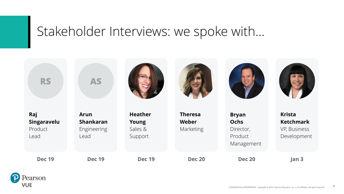
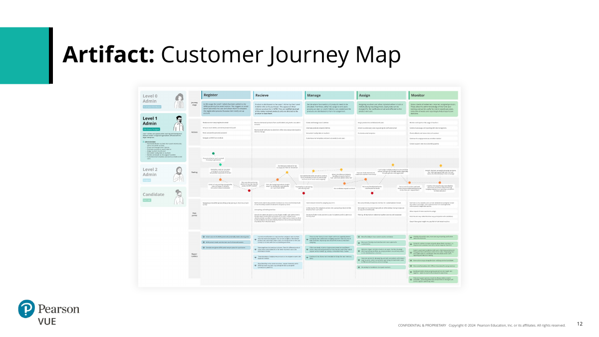
Discovery documented the sitemap, customer journey, key flows, persona archetypes, and product relationships, plus seven structured stakeholder interviews across product, engineering, sales/support, operations, vouchers/business development, and marketing.
That produced 16 CX, UX/workflow, and UI opportunities including voucher waste, pass/fail visibility, two-way requests, admin visibility, inventory IA, localized support, notifications, navigation, action-led dashboards, and design-system modernization. The working board kept analytics, architecture, personas, jobs, flows, workshop decisions, sketches, and prototype states together because the problem crossed all of them.
Seven stakeholder interviews established context.Journey map connected admin tasks to business/user outcomes.16 opportunities across CX, workflow/UX, UI.
// 04Product design
Three workflow families became the backbone of the redesigned product.
I organized the redesign around repeated work rather than pages.
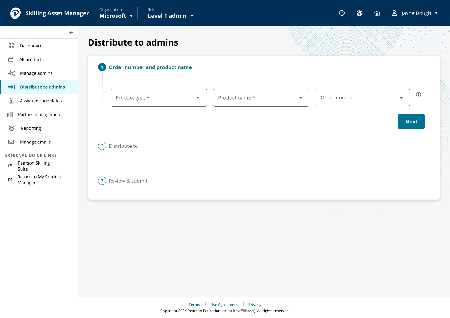
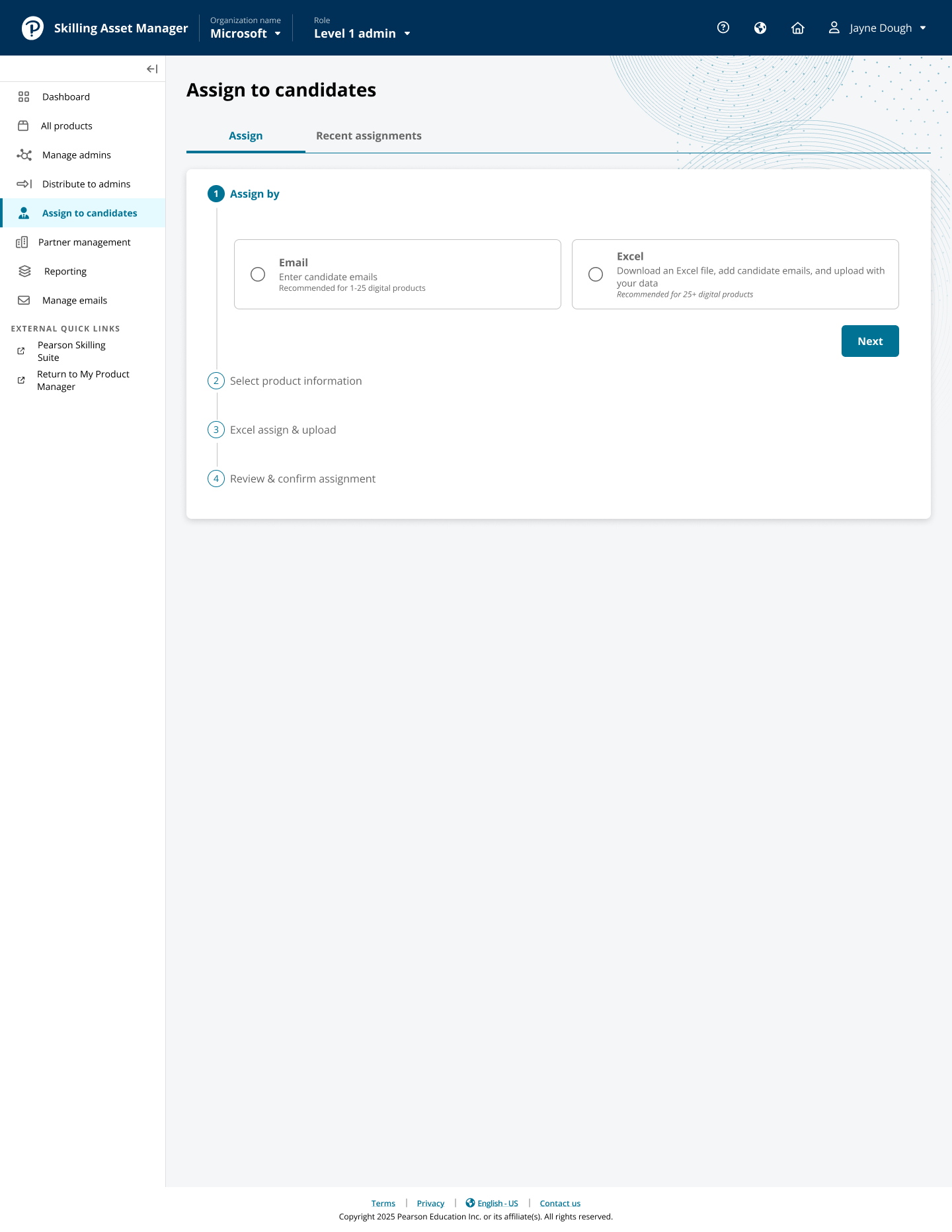
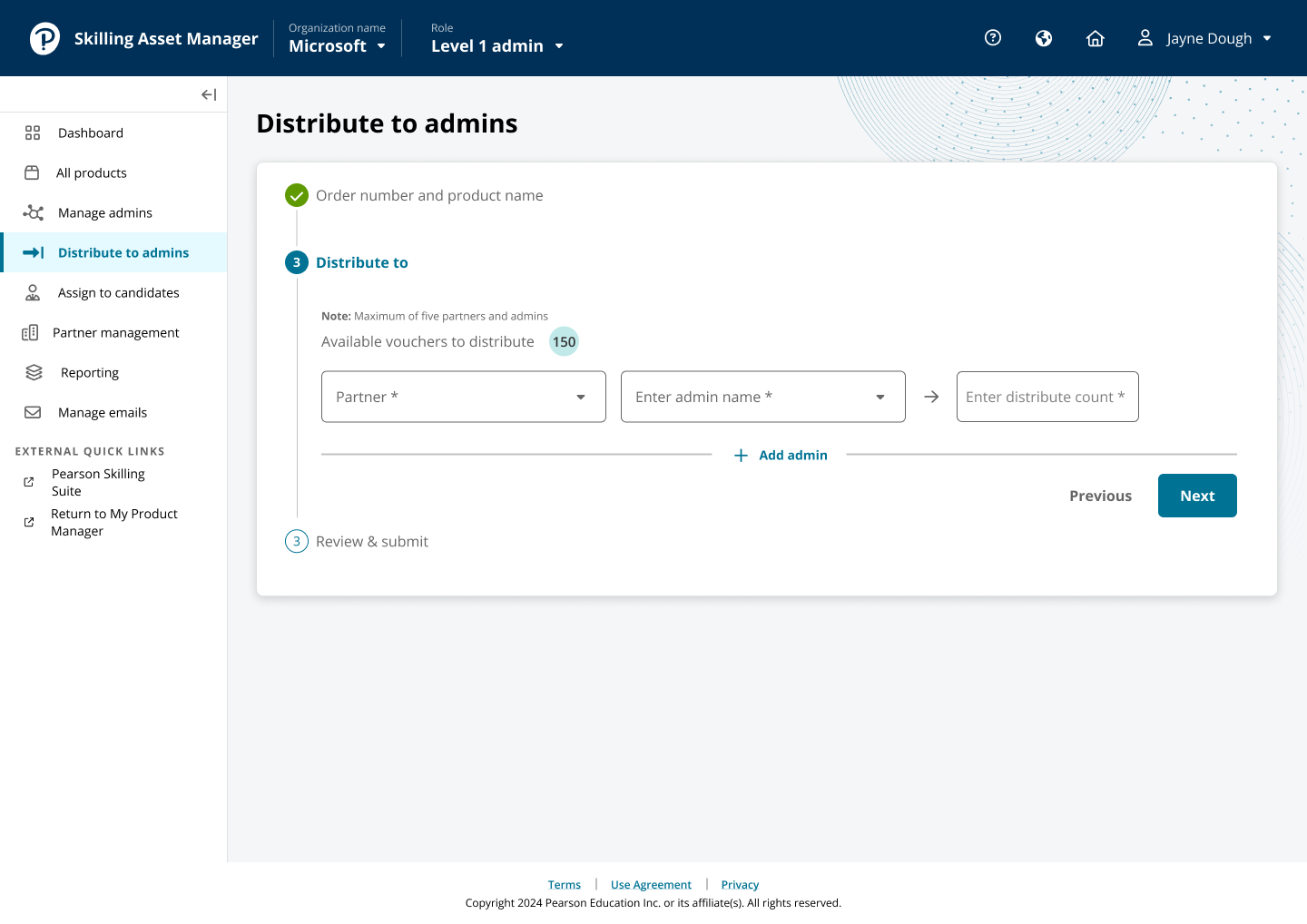
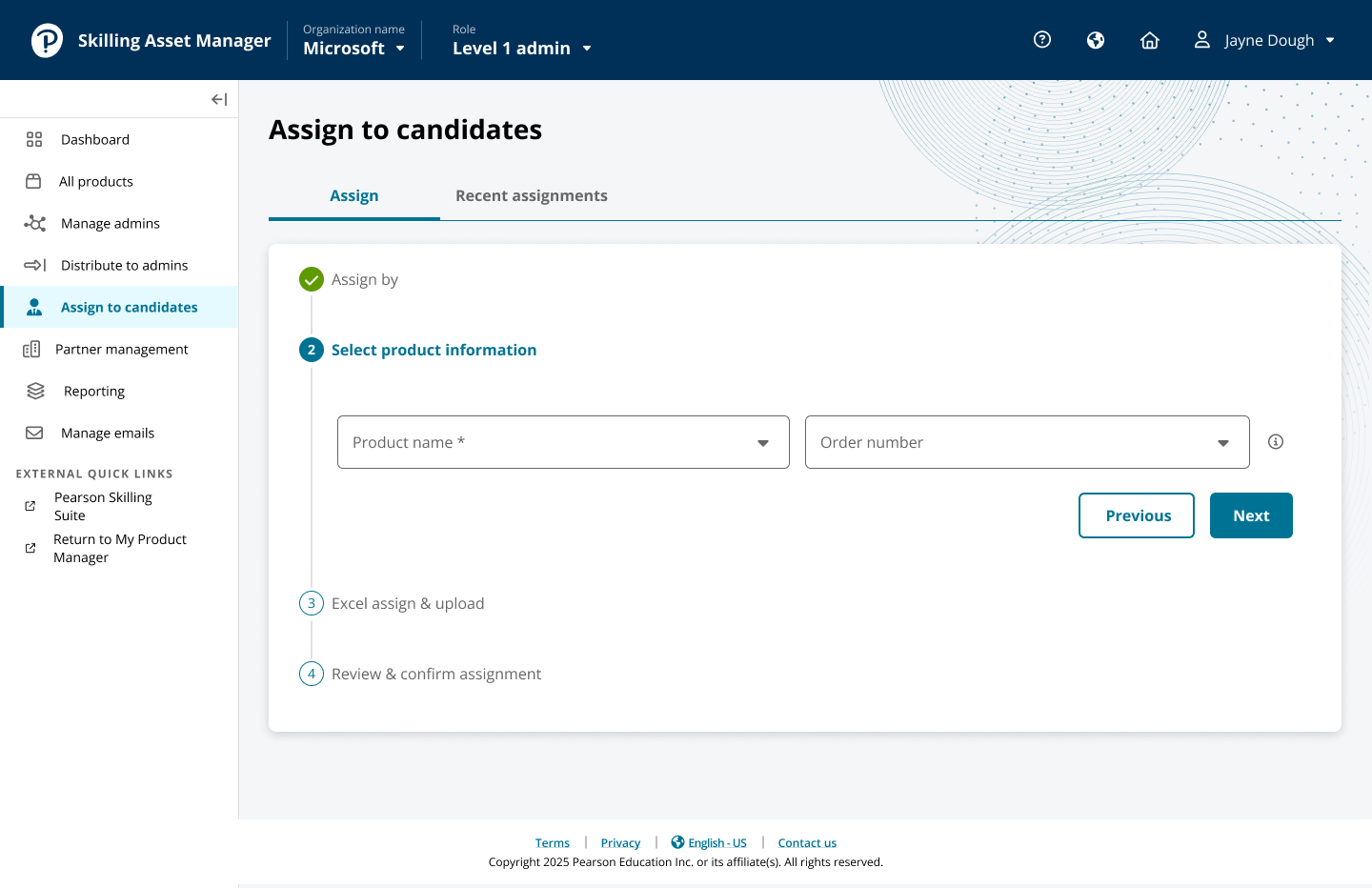
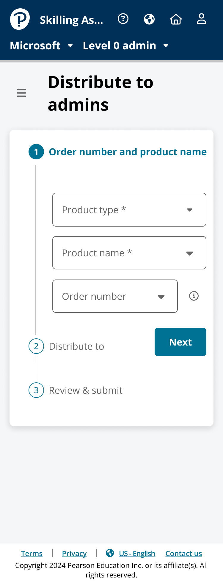
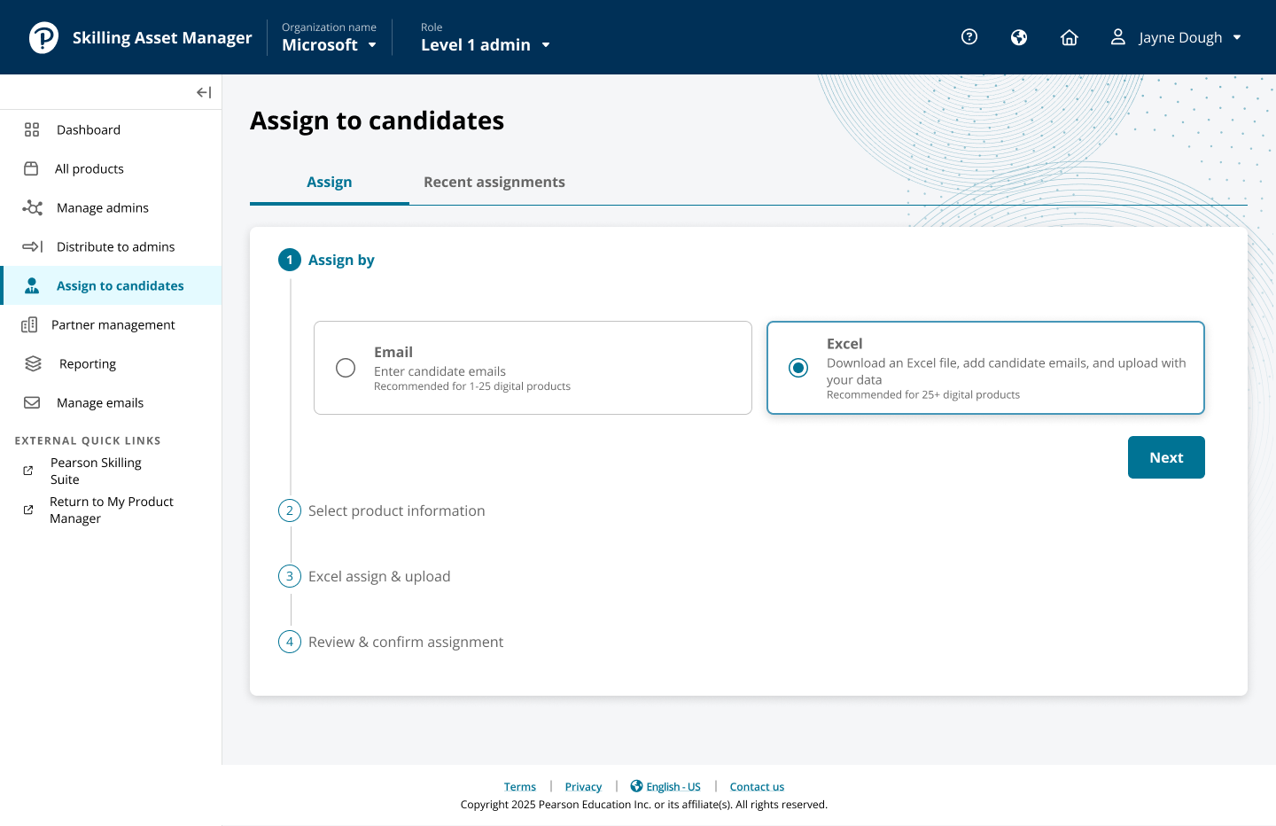
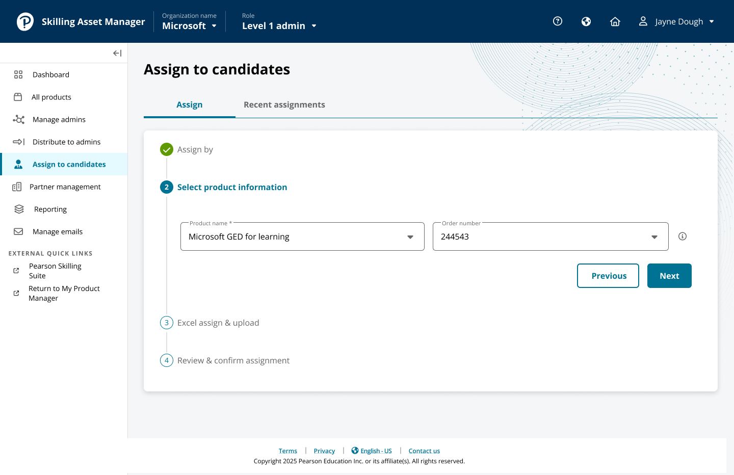
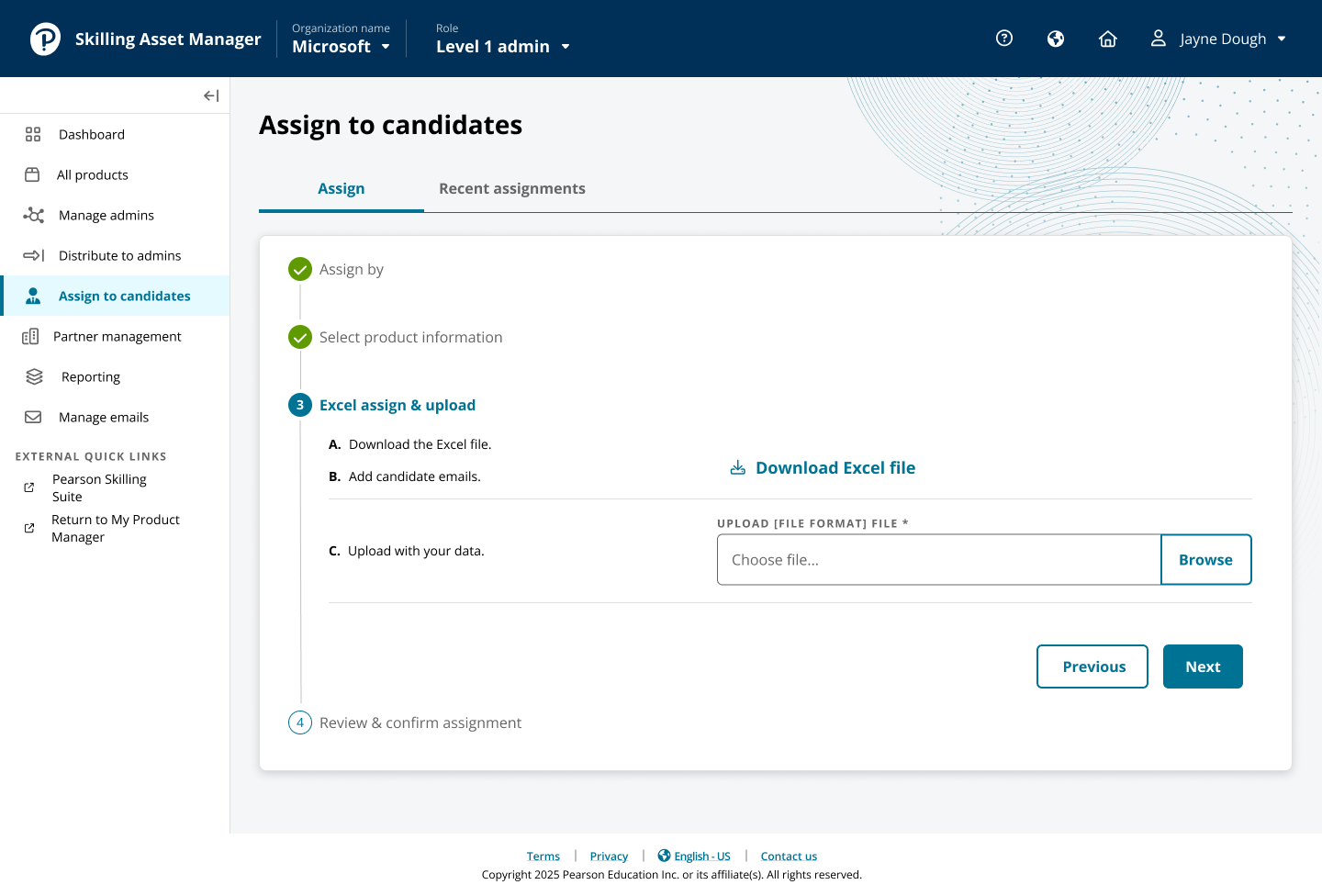
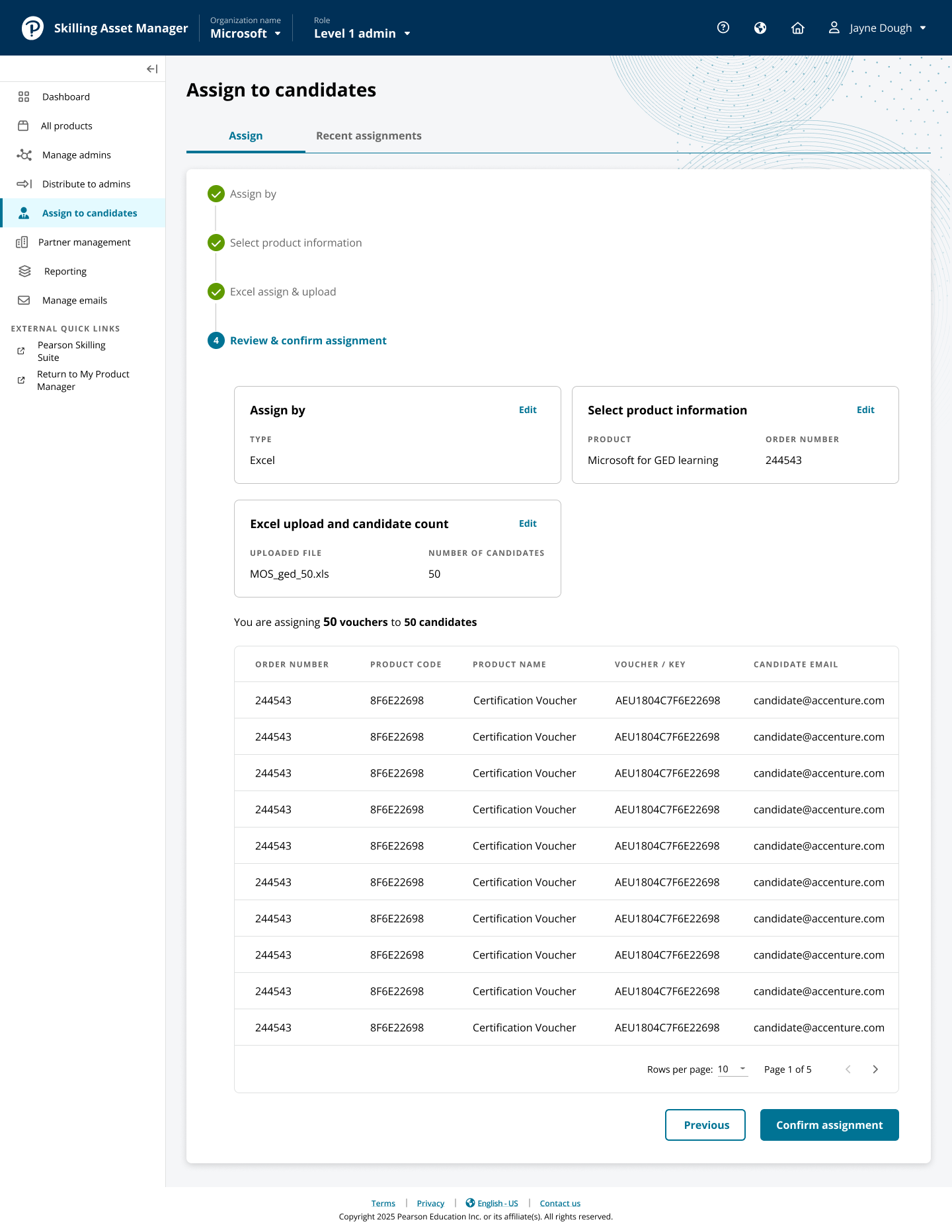
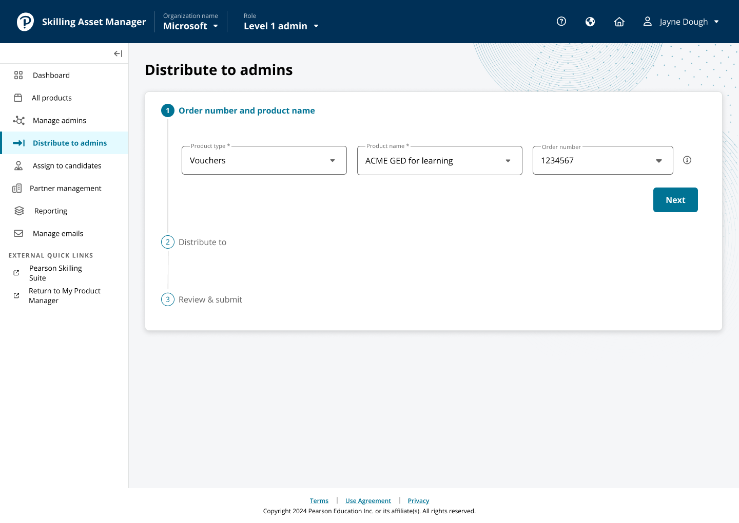
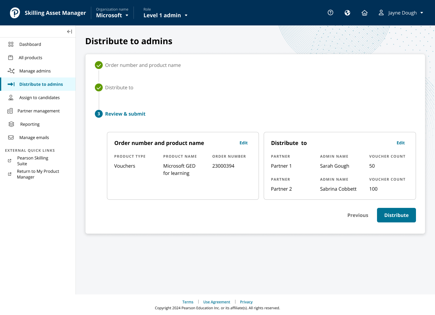
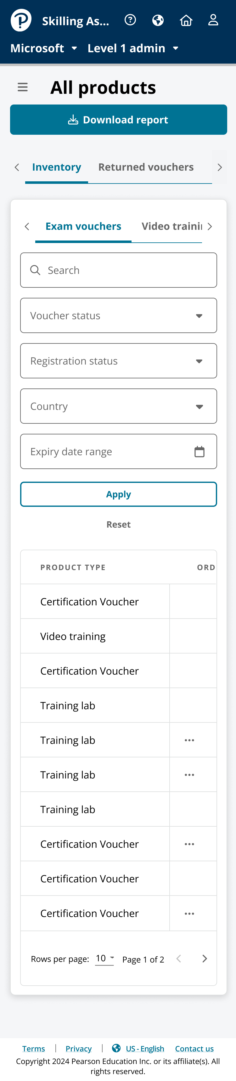
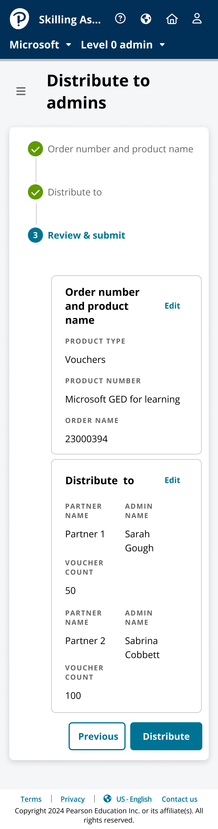
Distribution lets admins choose inventory, recipient/level, and quantities while seeing what remains. Role creation and user management expose admin relationships so authority and inventory flow are clear. Assignment reuses shared patterns but preserves its different recipient and consequences. Mobile variants prioritize the current decision and collapse secondary desktop-table detail instead of simply shrinking it.
01 · DISTRIBUTE
Move inventory through the organization
Administrators need to choose inventory, identify the receiving admin or level, verify quantities, and understand what will remain after distribution. The redesigned flow surfaces context and confirmation without sending the user through unrelated inventory screens.
02 · USERS + ROLES
Make hierarchy understandable while creating it
Role creation and user management are connected to the organization model. The design exposes the relationship between administrators so the user understands where authority and inventory will flow.
03 · ASSIGN
Get products to candidates efficiently
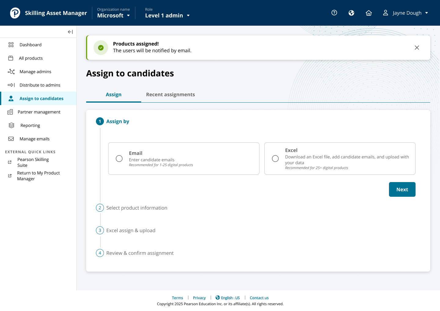
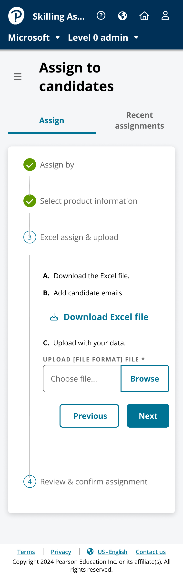
Assignment has different recipients and downstream consequences than distribution. Its step‑by‑step sequence uses shared interaction patterns without collapsing the distinction between those jobs.
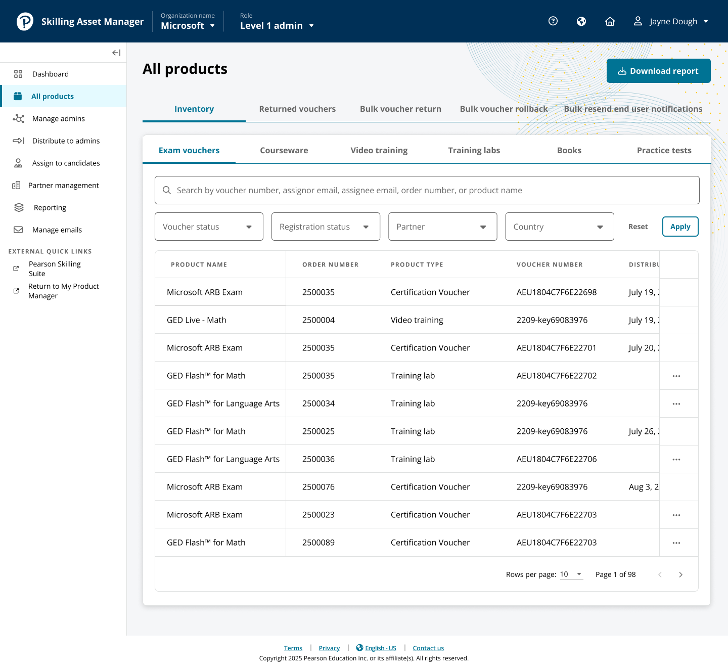
Actionable inventory view.Context persists through confirmation.Review/confirmation reduce digital-inventory mistakes.
Responsive did not mean shrinking the desktop table.
Mobile variants prioritize the current decision and collapse secondary information rather than reproducing dense desktop layouts at a smaller size. That mattered because administrators still needed to complete high‑confidence actions away from a primary workstation.
Mobile preserves quantity and recipient context.
// UI evidence12 additional product states
More of the enterprise workflow
Prototype flow, information architecture, dashboard, inventory, and responsive admin states.
Complete flows were tested with real administrators from multiple client companies.
Actual administrators from multiple client companies tested end-to-end flows, important because clients differ in hierarchy, volume, and operating habits.
The model received high marks and required minimal change. The most important revisions were terminology, so I changed product language instead of adding instructions. Testing validated shared step-by-step patterns with workflow-specific logic and confirmed that the rejected universal wizard would have been less usable.
The evidence supported carrying the complete scope forward. I finalized prototypes, delivered implementation-ready designs, worked through handoff, and QA’d the development environment against intended behavior.
Testing result: the interaction model required minimal structural change. Terminology was refined where user language differed from the product language; the core workflow architecture was approved with very high usability feedback.
// 06Delivery + migration
I stayed through the point where the product behavior—not just the design file—had to be correct.
My ownership continued through development QA, checking sequence, interaction behavior, terminology, responsive design, and state handling so implementation preserved what testing validated.
100% of committed scope shipped on time and budget. Old and new applications were planned to overlap for three months, but adoption was faster than expected and the legacy tool retired after two. That mattered because enterprise redesigns can test well yet still fail against habits and change costs; users switched sooner than planned.
// 07Outcome
Measured task time dropped, adoption accelerated, and the old product disappeared.
Google Analytics measured task completion from old to new, supporting the portfolio outcome of about 50% lower administrator task time.
That result matches the design strategy: less navigation, visible context before action, guided high-risk inventory operations, and clearer terminology reduced the work required to complete tasks.
~50%Lower administrator task time
100%Committed scope shipped
2 monthsLegacy retirement vs 3 planned
// TradeoffsConstraint · limitation · next test
The direction is strongest when its limits stay visible.
Tradeoff
What had to be balanced
Permission clarity can add visible structure. The design exposes the boundary when it affects action and removes it when it does not.
Limitation
What remains unresolved
Enterprise workflows vary by partner and contract; the public case shows the shared product model rather than every client exception.
Next test
What I would learn next
Measure which exception paths still force administrators to leave the system or rely on manual reconciliation.
// Reflection
The best enterprise pattern is not always the most universal one.
A single guided workflow for everything looked consistent but would have slowed different administrative jobs. Testing reinforced that enterprise consistency should live in the mental model, interaction language, and reusable decisions, not forced sequences.
Staying through implementation protected that logic, and the accelerated migration added behavioral evidence: clients did not need the full three-month overlap before the redesigned system became the easier way to work.