Modernizing palm identity without making the test‑center check‑in harder.
I owned the end-to-end UX/UI and coordinated with Redrock, Pearson’s biometric vendor, to move a retiring desktop palm-ID step onto Android tablets without disrupting test-center check-in.
The technology had to change. The check‑in rhythm did not.
Palm ID is used in some exam programs during admission and around testing-room breaks. The Test Administrator (TA) operates the flow while the candidate physically interacts with the device.
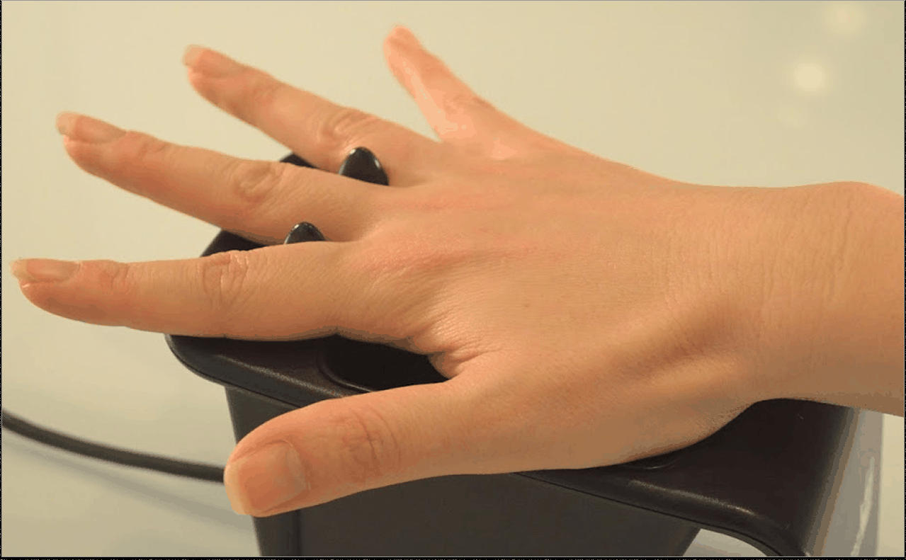
The retiring desktop workflow was cumbersome and tied to specialized hardware. Android tablets offered flexibility and newer biometric technology, but introduced physical questions: who holds the device, where it sits, what each person sees, and how it works in a secure center without Wi-Fi.
My goal was to make the technology change feel like a natural admissions step while improving satisfaction and preserving security.
Legacy hardware constrained station layout.Tablet flow combines lookup, identity, and capture.
// 04Interaction design
Guidance had to work for two people looking at the same physical action from different roles.
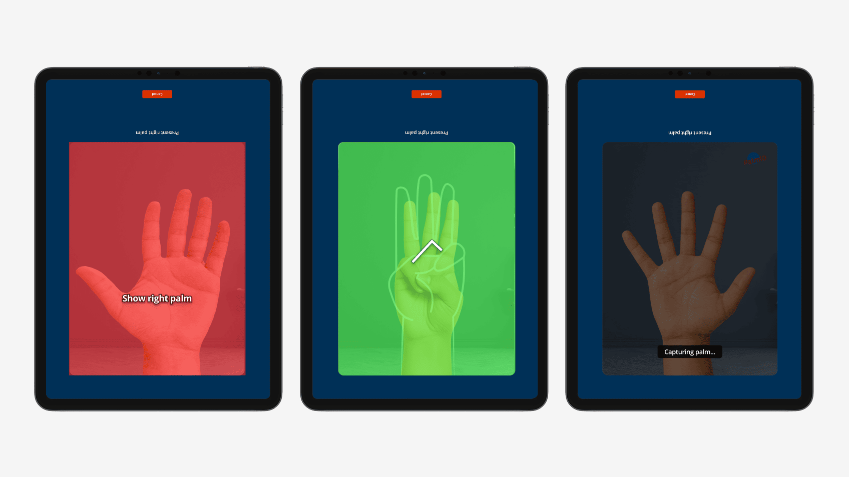
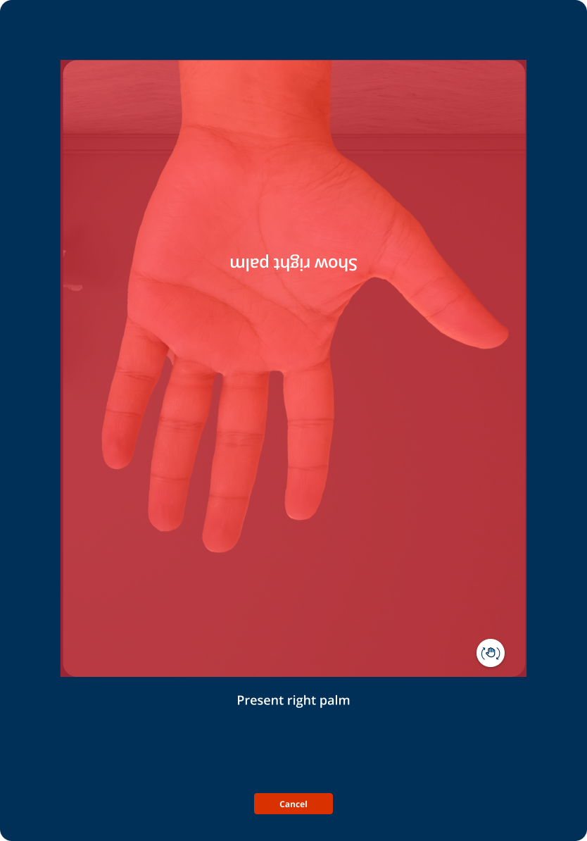
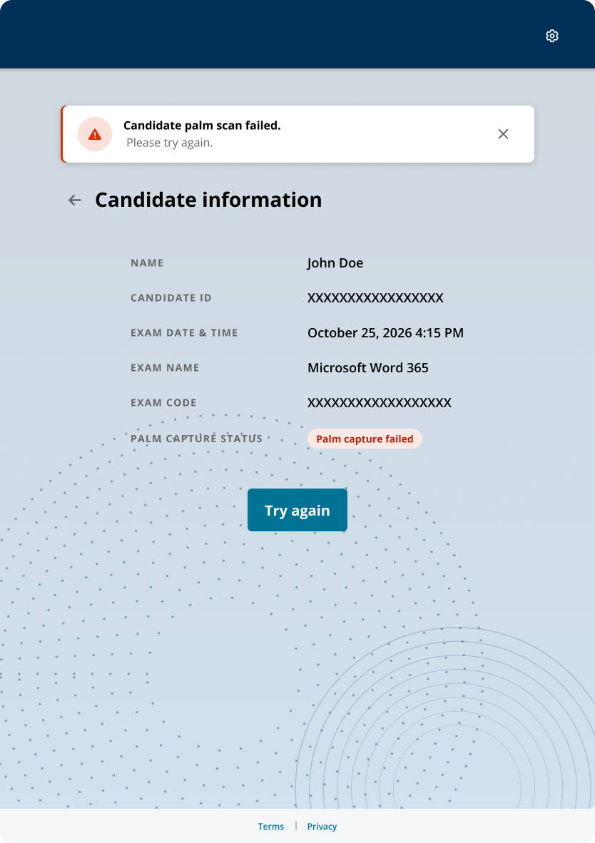
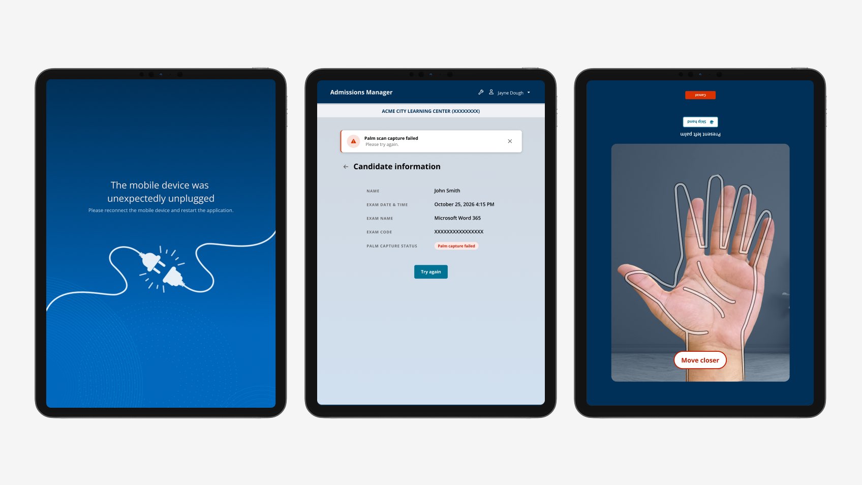
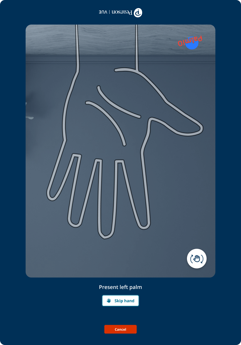
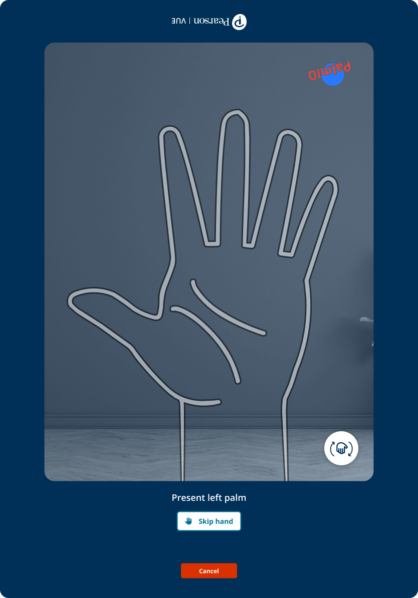
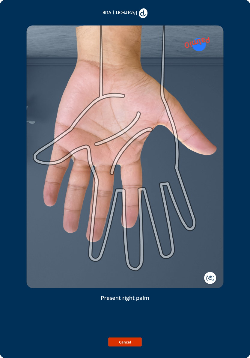
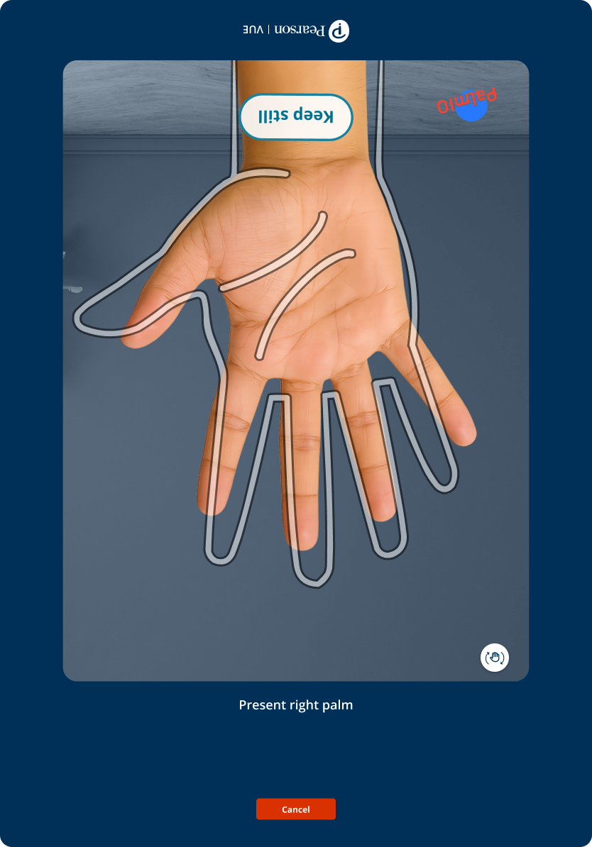
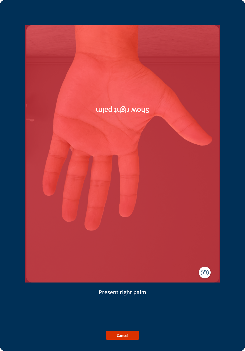
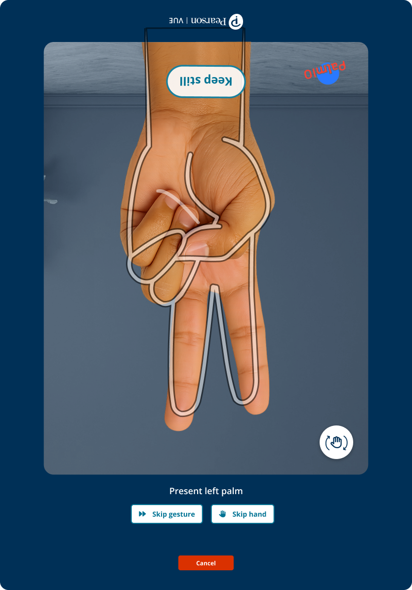
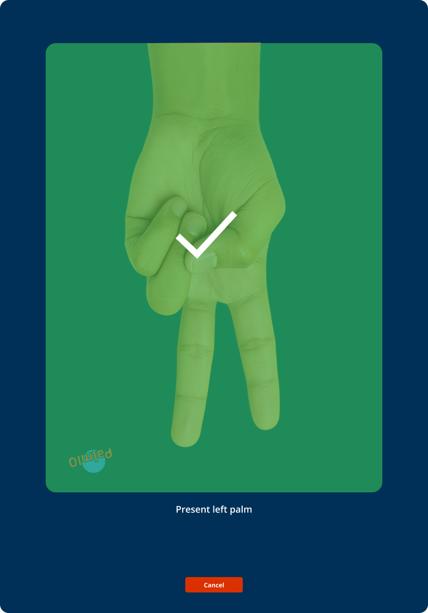
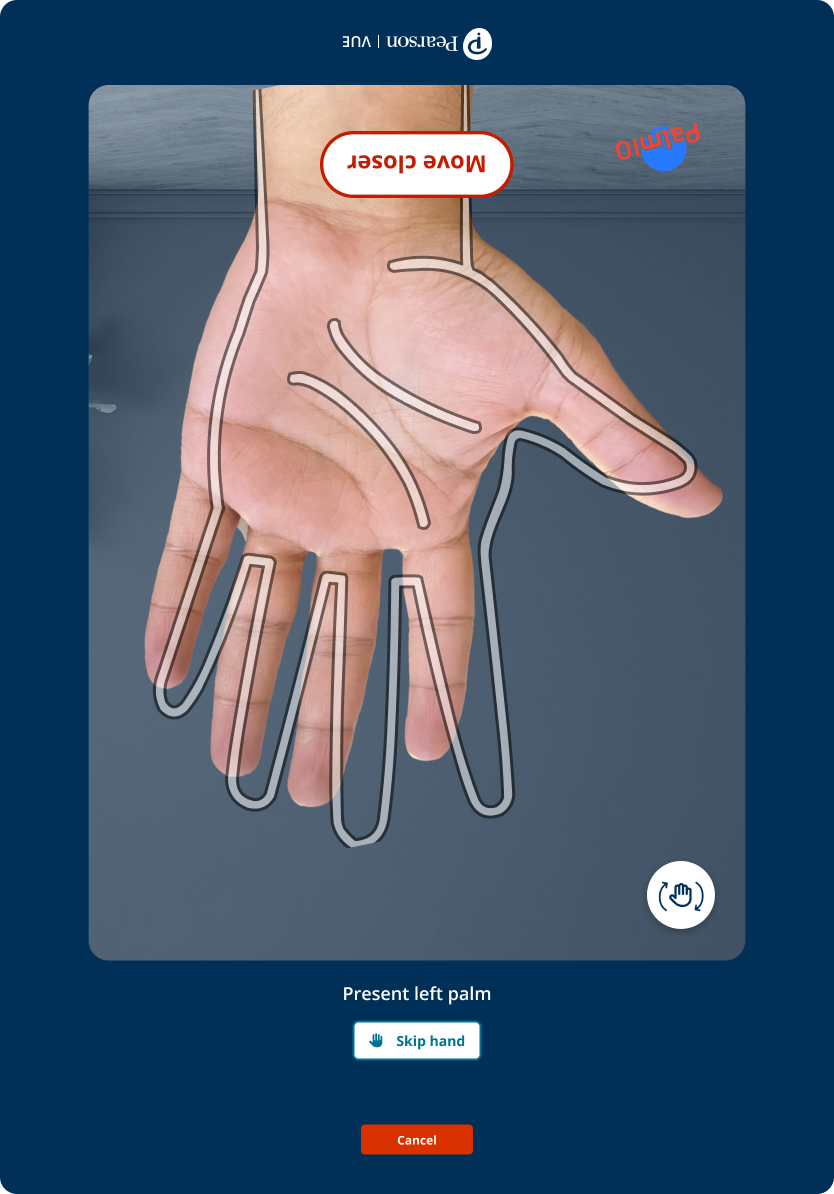
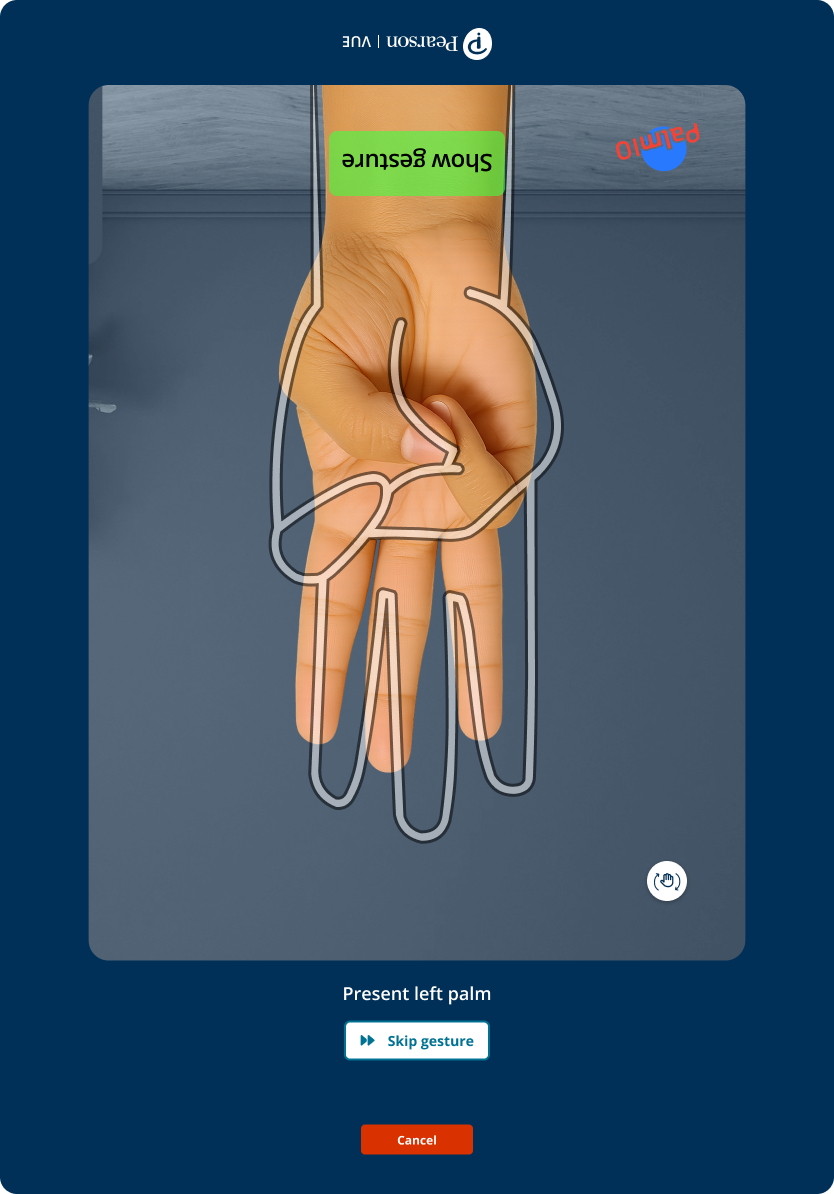
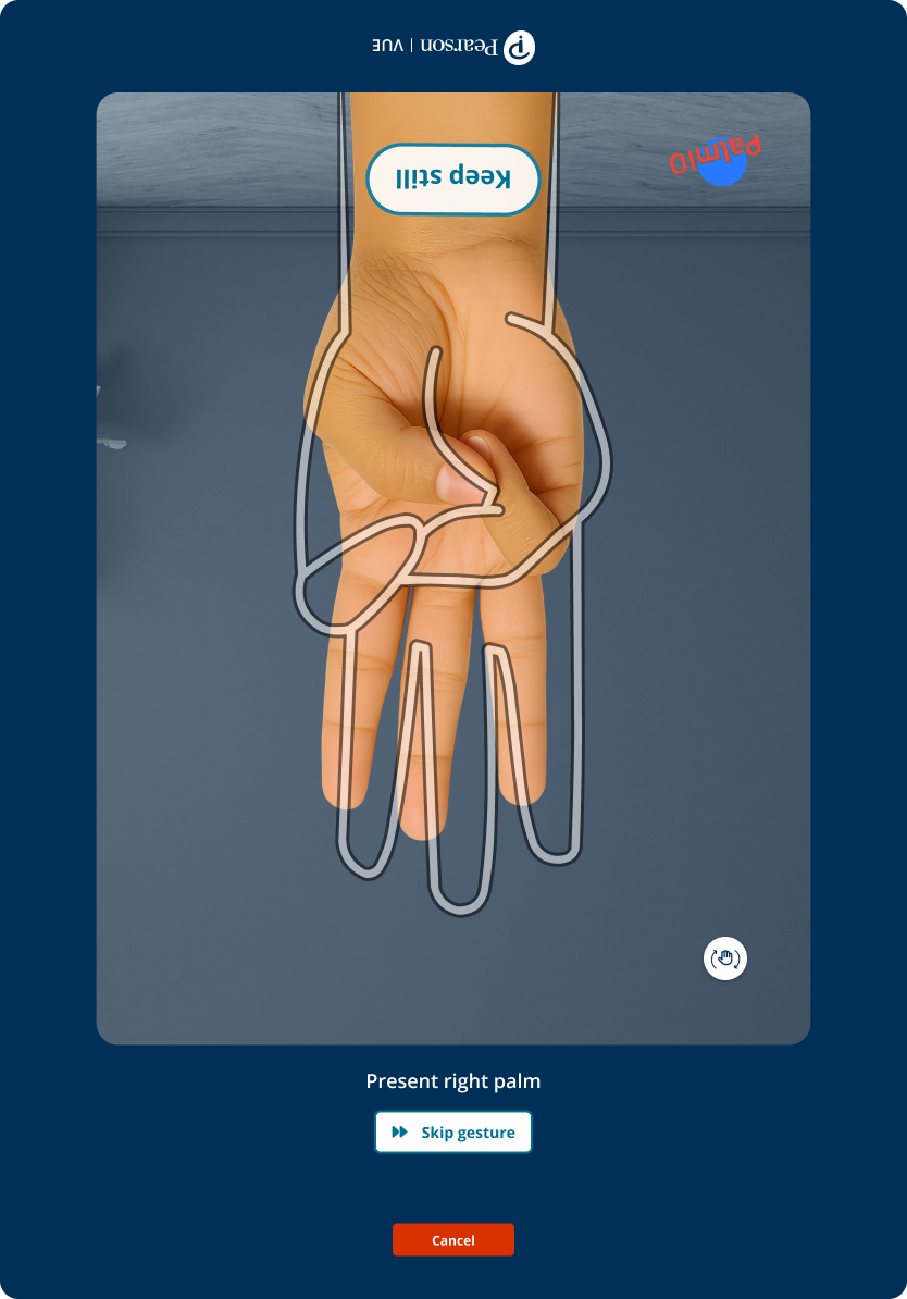
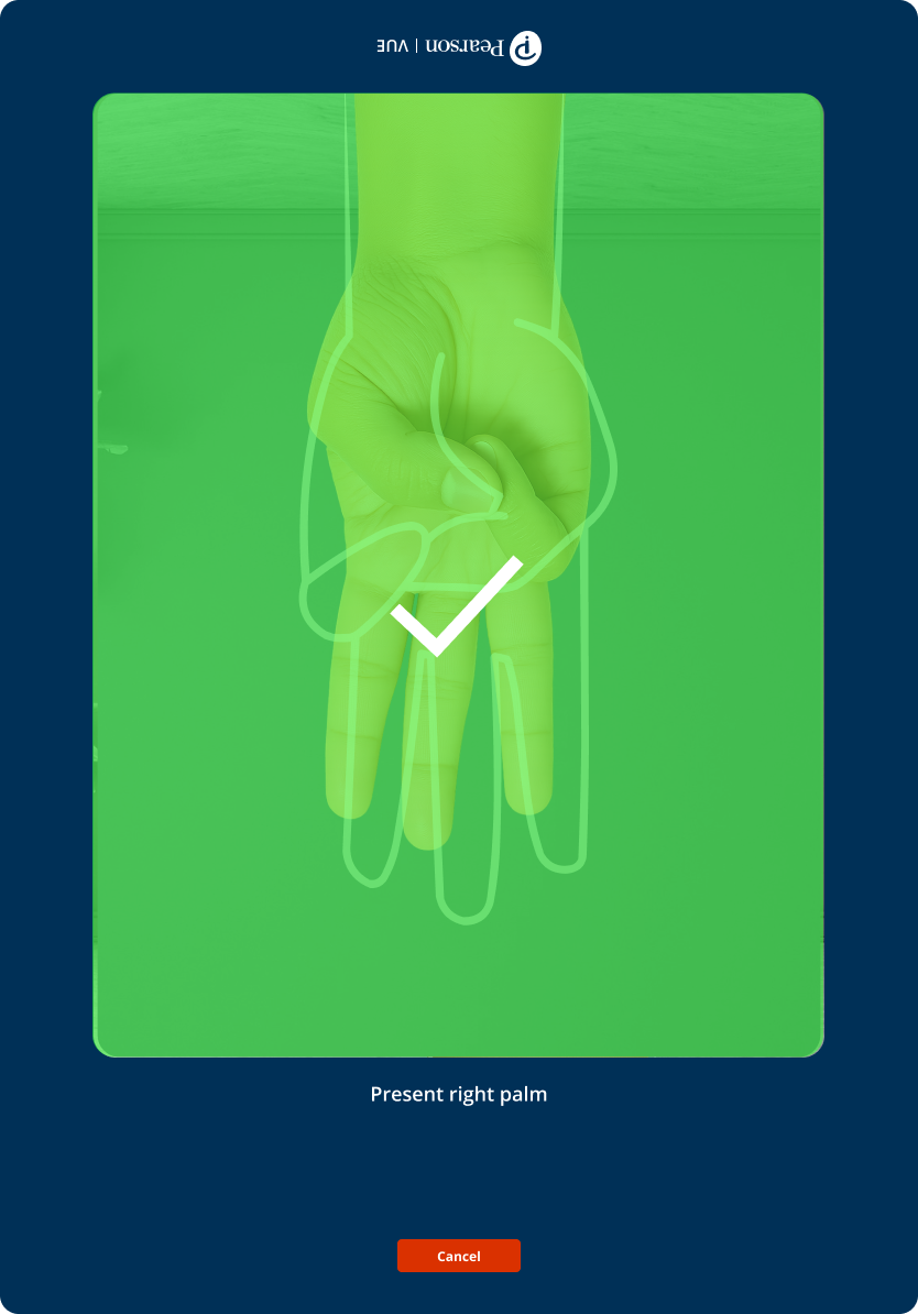
The candidate sees a hand outline while the TA guides position and orientation. Success and failure are explicit operational states with an immediate next action, so neither person needs to understand biometric technology.
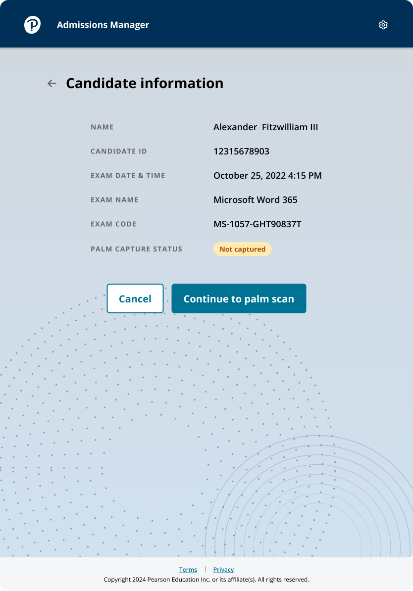
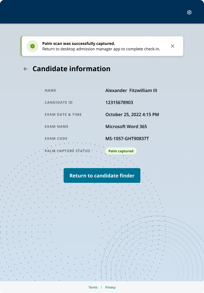
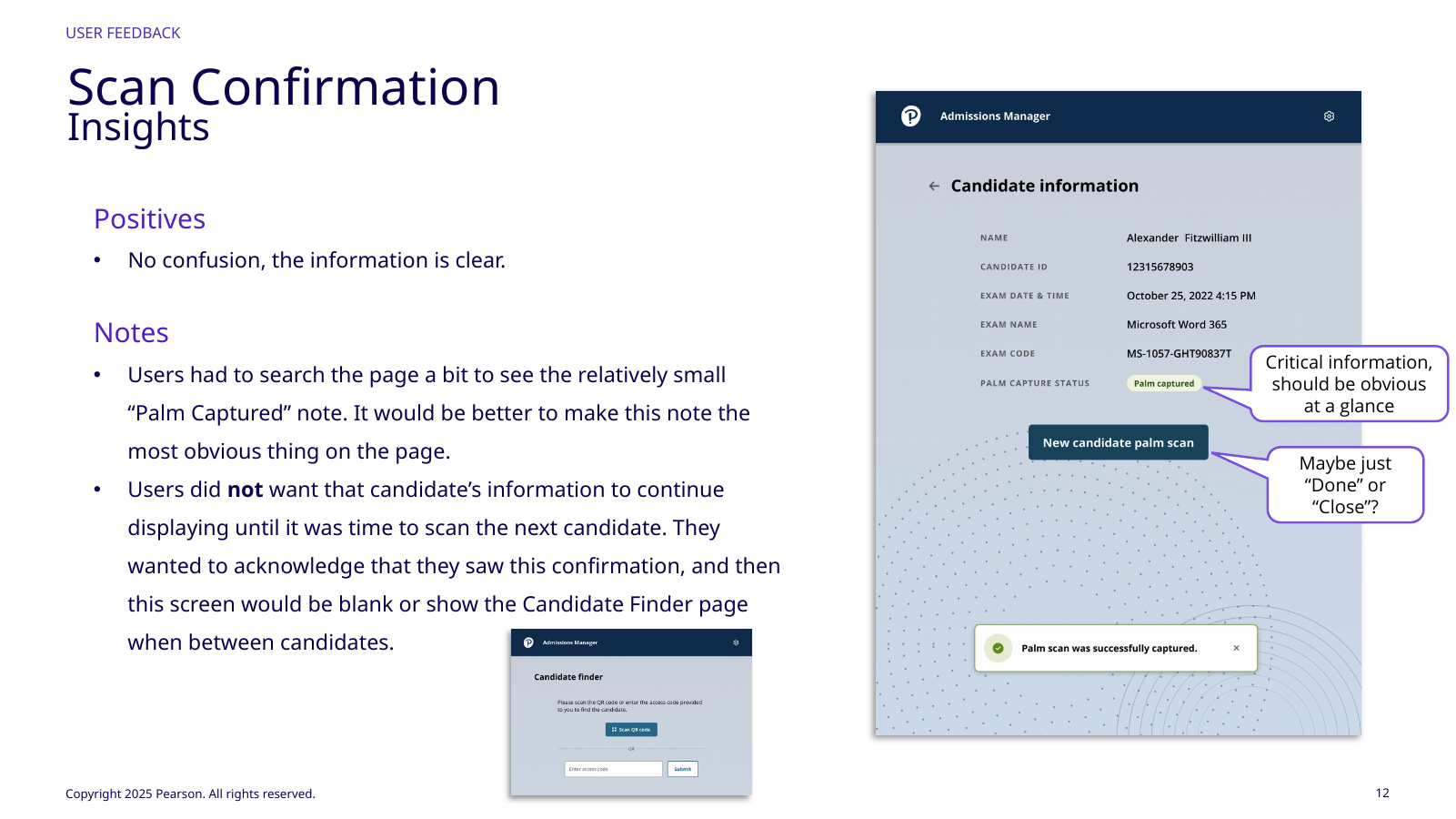
Candidate information remains visible long enough to verify identity, then the post-scan state acknowledges completion and returns toward a neutral finder so PII is not left on screen between candidates.
The flow also exposes “Skip Gesture” and “Skip Hand” for candidates who cannot make the expected position, keeping accessibility visible without disrupting dignity or flow.
Success must clearly end the shared task.
// UI evidence12 additional product states
More of the palm-capture flow
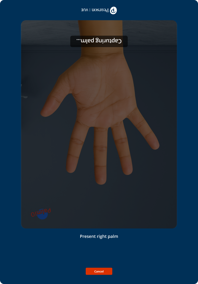
A continuous capture sequence showing guidance, acquisition, validation, and recovery states.
I designed from the test‑center workflow, not from the biometric SDK.
I walked the full check-in process and interviewed administrators because palm capture is one step among identity checks, workstation tasks, document handling, candidate guidance, and preparing the next person. Repeated posture changes, awkward device handling, or re-entry would multiply across every candidate. The check-in walkthrough mattered because the TA may be verifying identity, moving between workstation tasks, guiding the candidate, handling documents, and preparing the next person; even small ergonomic costs repeat all day.
I coordinated directly with Redrock’s owner and designer. Their capture states, gesture rules, success conditions, and technical limits had to fit Pearson’s admissions sequence, candidate model, security expectations, training practices, and hardware constraints. Joint reviews aligned those models so vendor states still read as one Pearson workflow.
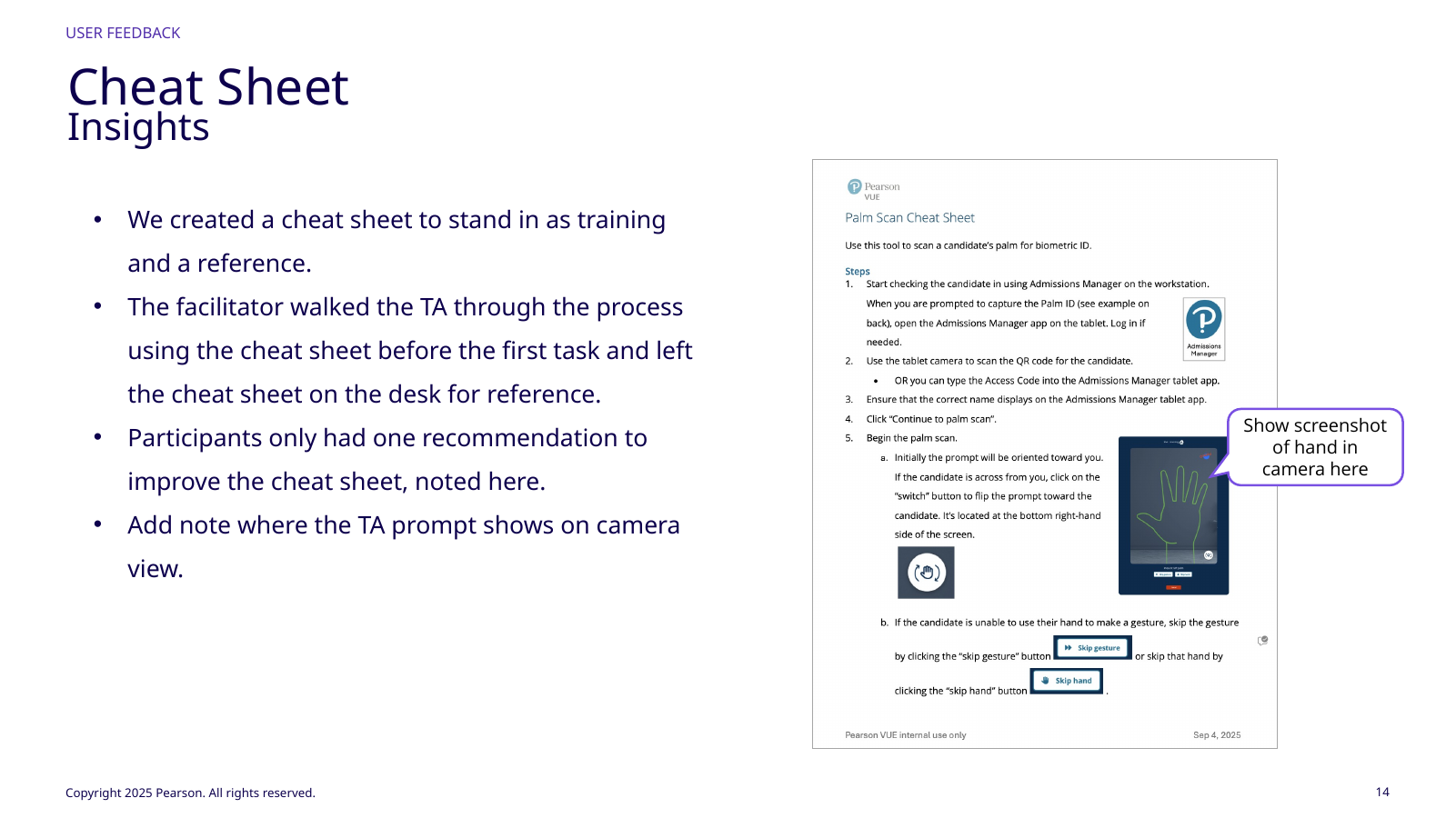
Training was part of the product. A lightweight cheat sheet during testing showed which steps became intuitive after a brief introduction and which still required reference, separating unfamiliar technology from weak interaction design. The cheat sheet stood in for formal training so we could distinguish behavior that was merely new from interaction that remained unclear. The goal was not zero training, but avoiding disproportionate training or memory for one biometric step.
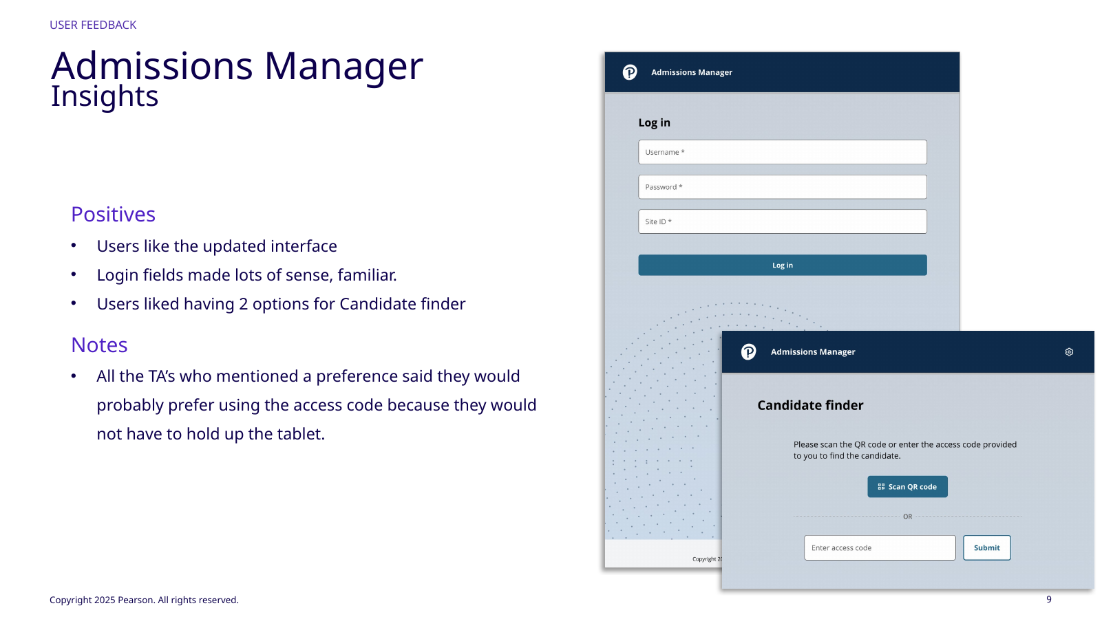
TAs found the UI familiar and liked both candidate finders.Four experienced participants at two Richmond PPCs.Cheat sheet tested minimal training needs.
// 03Technical + operational constraints
In a secure test center, “offline” and “mobile” do not mean what they mean in a consumer app.
Pearson Professional Centers do not allow Wi-Fi in the test environment; they rely on Ethernet and local/site infrastructure. The tablet therefore had to work within controlled connectivity rather than a consumer mobile model.
The technical design used Angular, Ionic, and Capacitor on Android, with palm capture crossing a Capacitor plugin, Android SDK, Flutter layer, and C++ biometric engine. Managed Pearson and partner-owned devices also have different distribution and update constraints. The design also had to account for managed Pearson devices versus partner-owned devices, which carry different deployment and update constraints.
I did not own those engineering layers, but I designed around their real failure states: login/configuration, candidate lookup, scan initiation, positioning, capture success/failure, local information, and return to admissions. There is no meaningful Wi-Fi fallback in a PPC, so recovery had to respect the actual infrastructure.
DEVICEAndroid tabletLower‑cost, flexible hardware compared with the retired desktop constraint.NETWORKControlled test‑center environmentNo Wi‑Fi assumption; workflow must fit site infrastructure.VENDORRedrock biometric stackSpecialized capture capability integrated into Pearson Admissions Manager.OPERATIONSFast candidate turnoverThe TA has to complete the step and immediately continue the check‑in sequence.
// 05In‑person usability
The software mostly worked. The physical workstation was the bigger design problem.
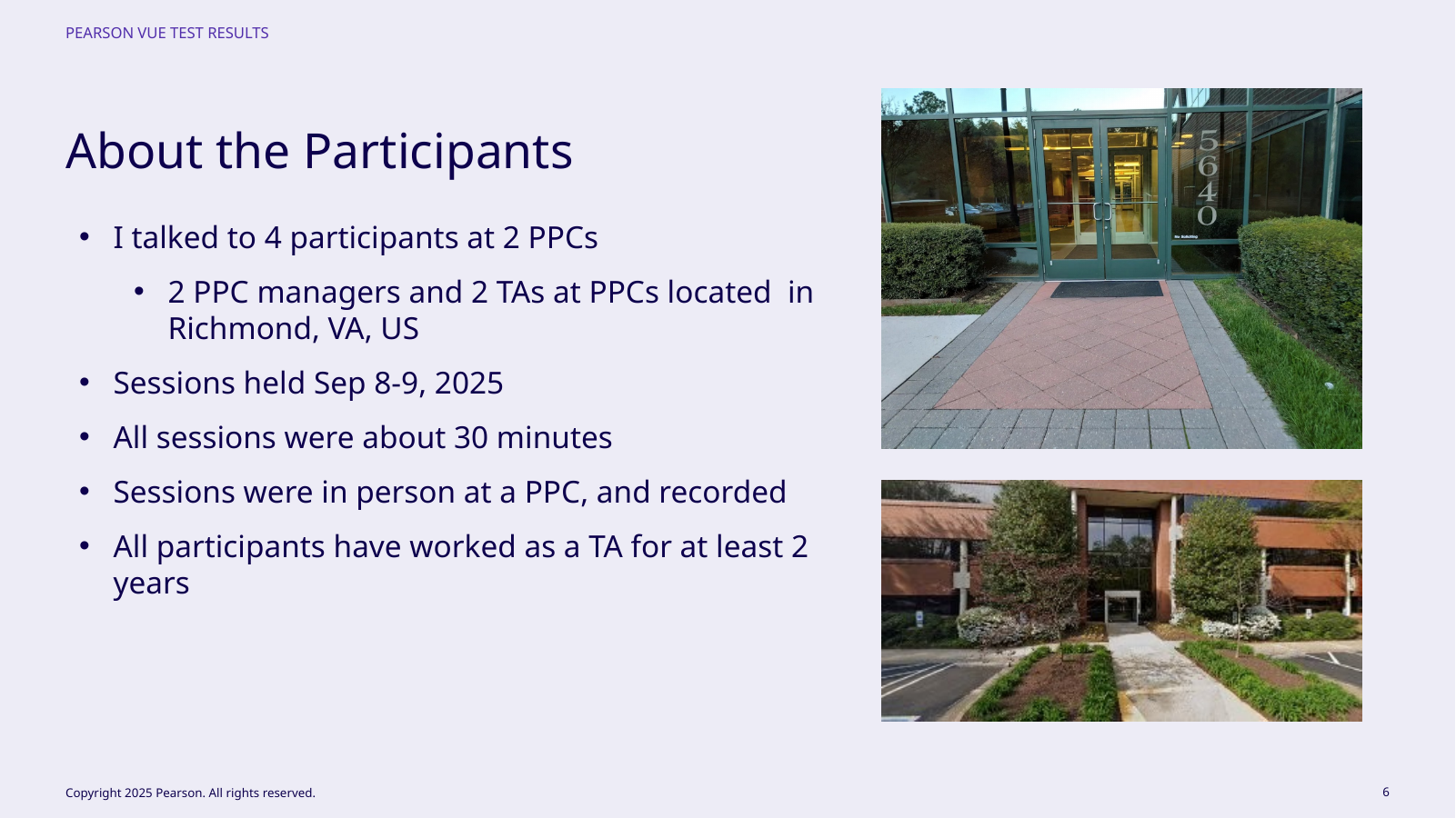
The source study included four experienced participants, two PPC managers and two TAs, at two Richmond, Virginia centers. All had at least two years of TA experience; sessions were in person, recorded, and about 30 minutes.
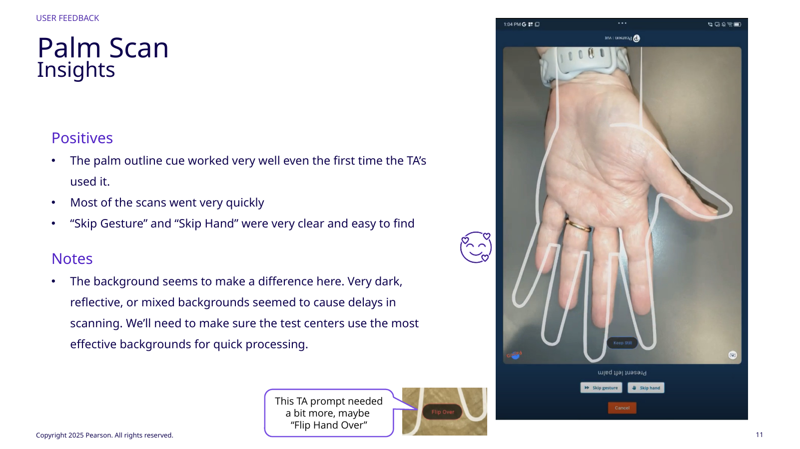
We tested login, Palm ID twice, skipping a hand for disability, confirmation, and moving to the next candidate after a brief cheat-sheet introduction. Login and candidate information were clear; users liked both finder options and tended to prefer access code. The palm outline worked on first use, most scans were quick, and “Skip Gesture” / “Skip Hand” were easy to find.
Dark, reflective, or mixed backgrounds could delay scanning. One prompt needed clearer “Flip Hand Over” language, “Palm Captured” needed stronger hierarchy, and TAs did not want candidate information left visible between people.
Outline worked; backgrounds and orientation prompt needed work.Completion needed stronger hierarchy and cleaner exit.
“Put the tablet on a stand. Make it look less like we are just taking a picture of their hand with an iPad.”
TA usability feedback
// 06Physical UX
The most important recommendation was not a screen change. It was a stand.
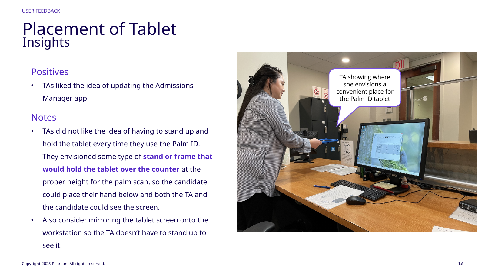
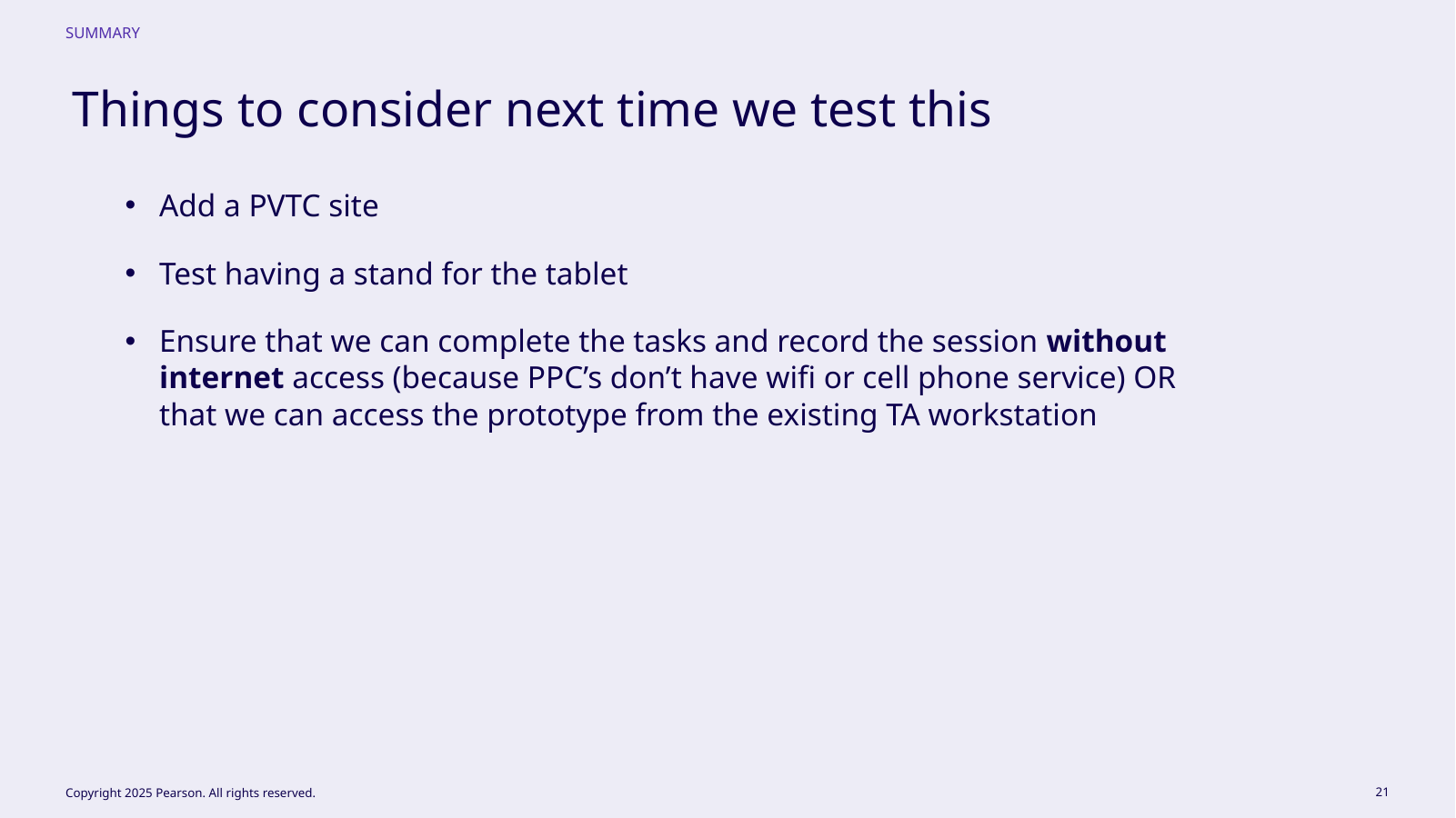
TAs did not want to stand and hold the tablet for every capture. They proposed a stand or frame at the correct scan height so the candidate could place a hand below it while both people saw the screen; mirroring the tablet to the workstation was another option.
That finding changed deployment readiness. A pilot needed working code and capture accuracy plus a usable station configuration and effective scan backgrounds. A screen that saves clicks is not efficient if it creates repeated ergonomic work. A stand could also stabilize capture geometry and make the interaction feel intentional to candidates while giving the TA and candidate the same view.
FIELD FINDING
Design the workstation around the repeated motion.
A tablet stand can remove an ergonomic burden, stabilize the capture geometry, make the experience feel more intentional to candidates, and give both people a consistent view of the same state.
TAs demonstrated preferred tablet placement.
// 07Validated direction
The prototype and usability work were completed and the solution was approved for development and an initial pilot.
Prototype testing was complete, recommended changes were identified, and the solution was approved for development and an initial small test-center pilot.
I do not present that as broad production rollout. The validated outcome was confidence that the interaction fit admissions, Redrock’s technology could be expressed clearly, and remaining risks, especially physical placement and environment conditions, were concrete enough to test in pilot.
4Experienced PPC participants
2In‑person test centers
PilotApproved next delivery gate
Pilot questions: site type, stand, connectivity.
// TradeoffsConstraint · limitation · next test
The direction is strongest when its limits stay visible.
Tradeoff
What had to be balanced
More guidance can slow an experienced administrator. Progressive instruction keeps the critical capture cues visible without turning every attempt into training.
Limitation
What remains unresolved
The next pilot was approved, but a completed pilot and production performance are not claimed.
Next test
What I would learn next
Validate the end-to-end flow with production-like hardware, offline handling, and repeat capture conditions.
// Reflection
The device is part of the interface when people have to hold it.
The study reframed the problem from how palm capture should look to how a station should work hundreds of times a day. Ergonomics, placement, background conditions, shared visibility, and transitions between candidates became part of the interface.
It also reinforced my role with specialized vendors: understand the biometric capability and constraints deeply enough to shape a trustworthy interaction, coordinate design boundaries, and make the integrated workflow work without claiming ownership of the biometric engine.