← All work
Enterprise Asset Manager · Pearson VUE · Enterprise SaaS

Five role tiers and sixteen opportunities became a phased three-year direction designed around real operational work.

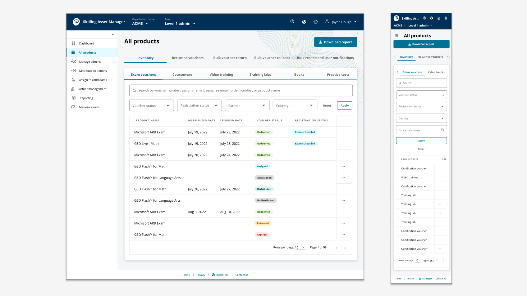
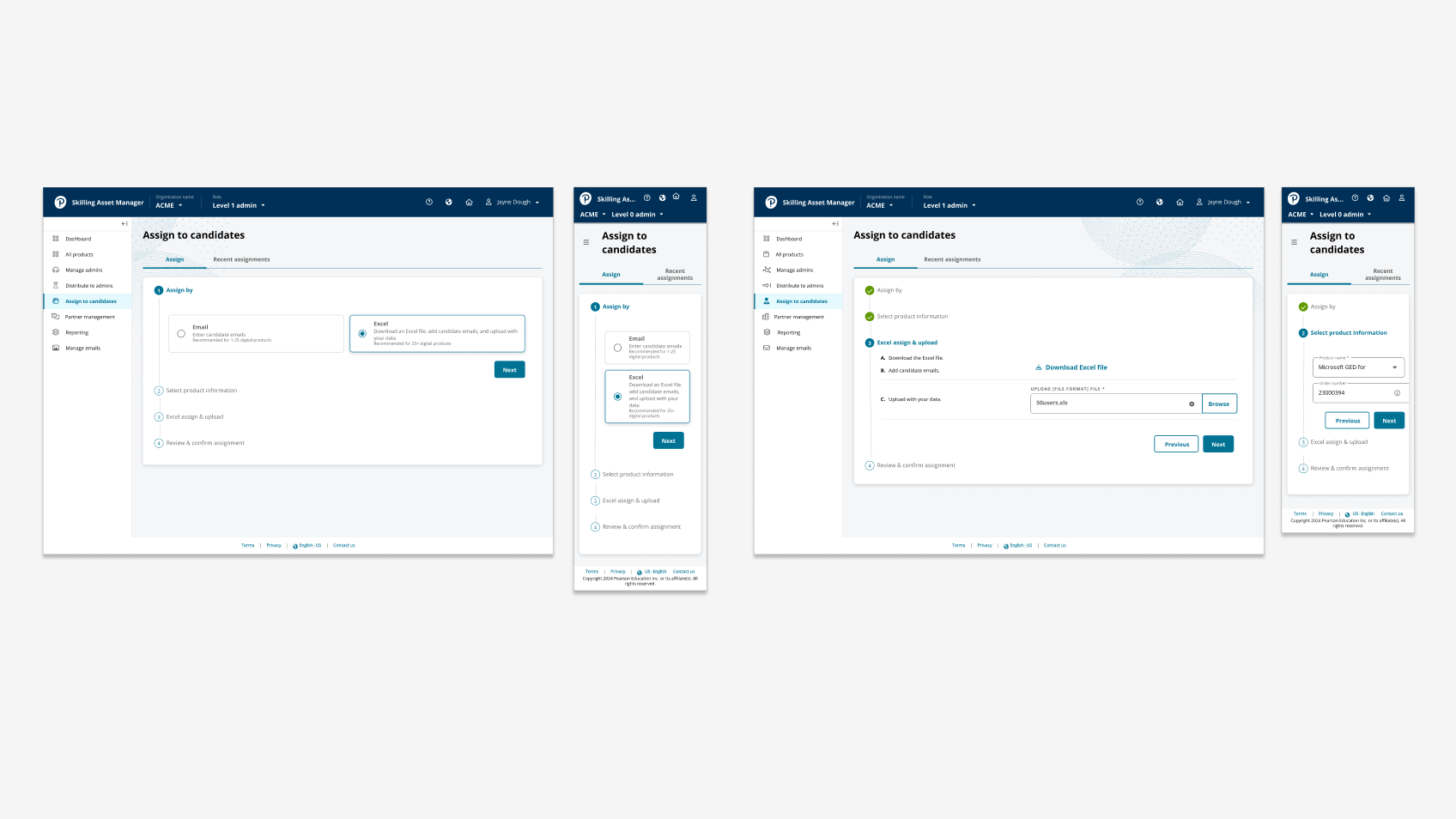
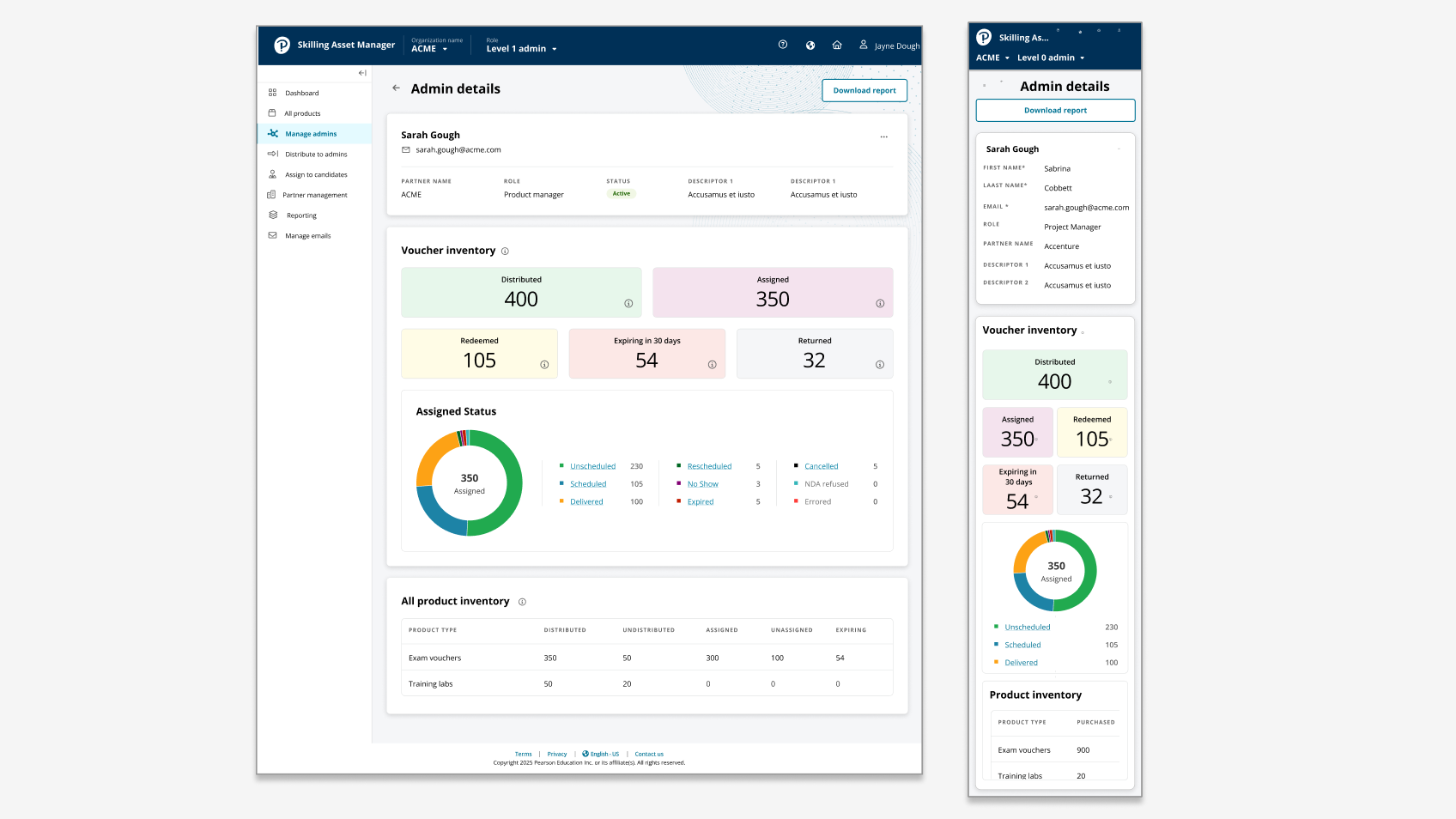
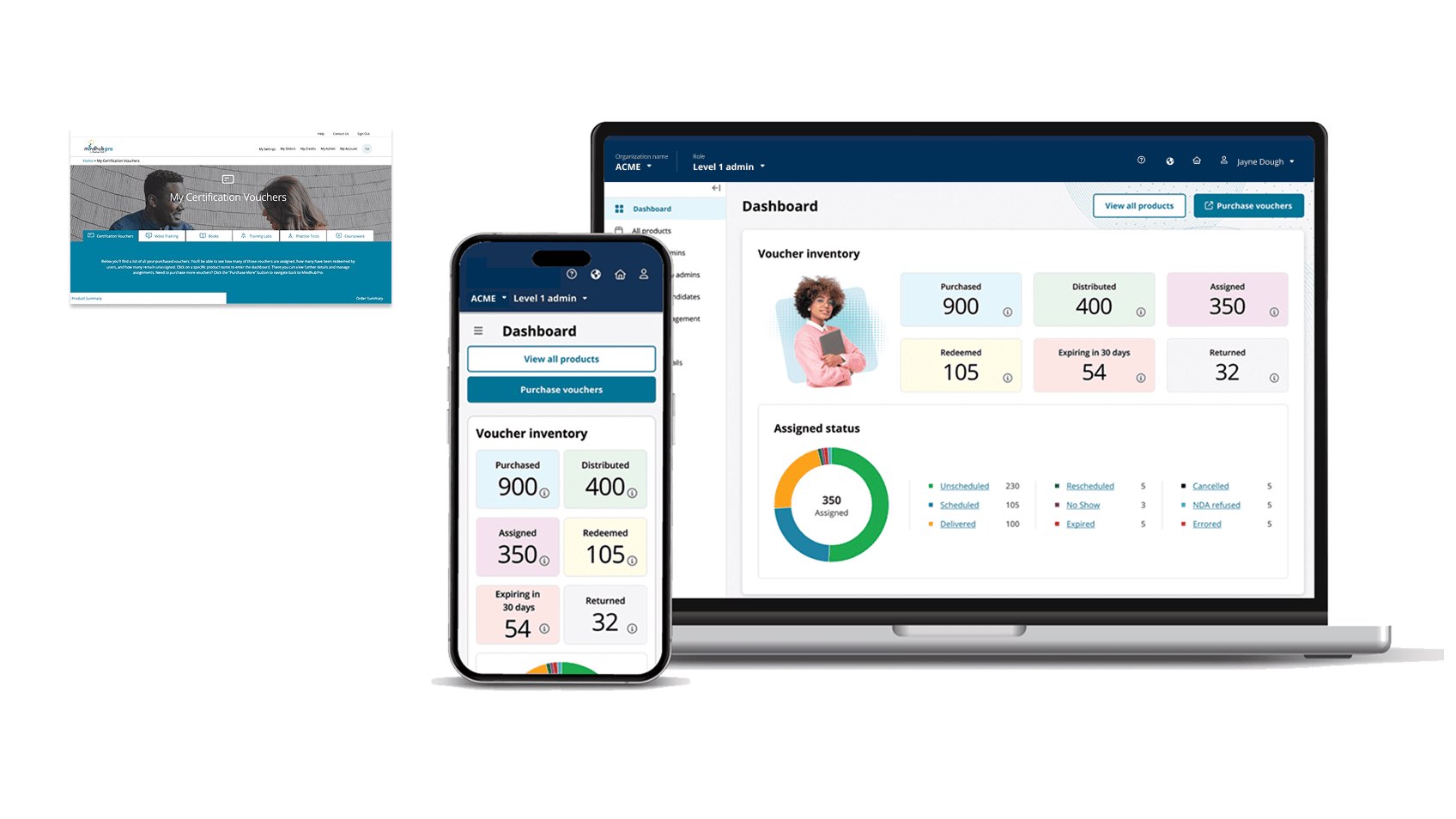
The Enterprise Asset Manager supported voucher and digital-asset programs for Microsoft, Amazon, and Apple. I led product design from discovery and workflow architecture through prioritization, prototype, usability refinement, delivery, and implementation quality. The role-tiered redesign reduced administrator task time by approximately 50%.

Enterprise SaaSRole-based IAMulti-tenant platforms
// BEFORE / AFTER

From fragmented asset administration to a role-tiered marketplace MVP.

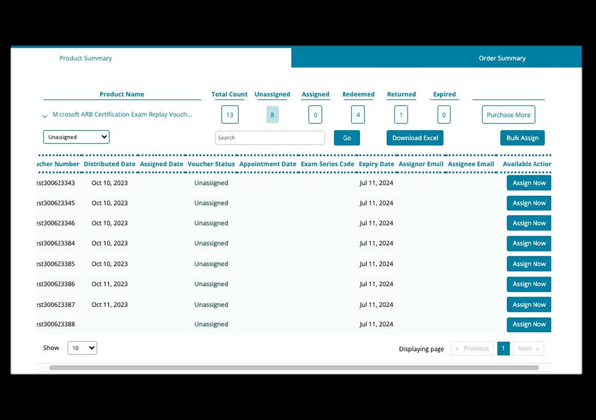
Fragmented enterprise asset administration
Role-tiered enterprise asset platform
BeforeAfter
// RoleSenior Product Designer · IC
// ScopeResearch · IA · prototype · prioritization
// SurfaceEnterprise SaaS · desktop web
// ClientsMicrosoft · Amazon · Apple
// UsersFive operational role tiers
// StatusDelivered · phased product direction
50%Reduction in time-on-task
for administrative workflows
16Prioritized opportunities
(6 CX · 8 UX · 2 UI)
PhasedThree-year
product direction
01

An asset flows down through five role tiers, and failures move with it.

A voucher is bought by an enterprise, distributed through a partner channel, allocated by an org admin, assigned by a site admin, and finally redeemed by a candidate. The same asset appears differently to each tier. The same screen needs to make sense to all five.

FIGURE 01 // Role-tier hierarchy

Five role tiers, one asset, four bidirectional flows

Vouchers and assets flow downward through the tier hierarchy. Requests, redemptions, and recovery actions flow back up. The action-led dashboard surfaces the next thing each tier should do.

Role-tier hierarchy from channel sales down to candidate, showing voucher and asset flows downward and request, redemption, recovery, and reporting flows upward. Five horizontal role tiers stacked vertically. Each tier shows responsibilities. Arrows on the left show asset/voucher flow downward; arrows on the right show request/redemption/recovery flow upward. An action-led dashboard sidebar is annotated. // HIERARCHY ROLE TIER SURFACE PATTERN ASSETS · VOUCHERS · ENTITLEMENTS · FLOW DOWN REQUESTS · REDEMPTIONS · RECOVERY · REPORTING · FLOW UP TIER 01 · CHANNEL SALES Books enterprise deal · sets entitlement Surface: revenue dashboard · deal pipeline · entitlement provisioning Friction: pass / fail visibility across the channel TIER 02 · DISTRIBUTOR Distributes vouchers to org accounts Surface: voucher inventory · allocation queue · bulk operations Friction: voucher waste, two-way request workflow TIER 03 · ORG ADMIN Allocates entitlements to sites + cost centers Surface: org tree · allocation rules · reporting Friction: admin visibility of candidate progress TIER 04 · SITE ADMIN Assigns vouchers to candidates Surface: candidate roster · assignment + recovery · localized help Friction: localization, action-led dashboard need TIER 05 · CANDIDATE Redeems voucher · sits for exam Outcome surface: schedule, prep, sit, result → feeds back to Tiers 3, 2, 1 // Action-led dashboard sidebar (all tiers)
Operational tier End user (candidate) Recovery + reporting upward
// READ AS

The hierarchy is not a permissions tree, it is a coordination model. Every tier needs to see what's happening one tier down (to know what to do next) and one tier up (to know what was allocated). The action-led dashboard sidebar surfaces "your next move" for each tier, calibrated to that tier's authority.

02

Three clients, five role tiers, one platform.

Microsoft, Amazon, and Apple all ran large enterprise exam programs. Each program had different procurement workflows, role names, and success metrics. The platform had to serve all three without becoming a stack of bespoke surfaces. The hard tradeoff was tailoring enough to be valuable while generalizing enough to remain maintainable.

The largest operational pain points appeared across all three programs: voucher waste, opaque pass/fail visibility, two-way request flow friction, admin visibility into candidate progress, insufficient localization in site-admin workflows, and a strong stakeholder ask for an action-led dashboard per role.

03

Seven stakeholder interviews, sixteen opportunities, three buckets.

I ran seven stakeholder interviews spanning product management, customer success, professional services, account management, and the three client programs themselves. Synthesis surfaced 16 opportunity areas, split across three discipline buckets: 6 CX (cross-team coordination, ops, success metrics), 8 UX (workflow, IA, surfaces), 2 UI (design system, accessibility).

Recurring themes emerged that cut across all 16 items: voucher waste, pass / fail visibility, admin visibility into candidate progress, two-way request workflow, action-led dashboard, IA, localized help, and a shared design system. These were the pressure points all three programs felt.

"We need to see, at a glance, which vouchers have moved and which haven't. Not a report I run on Thursday. A number I see when I log in Monday." Stakeholder interview, distributor program
Enterprise asset platform discovery synthesis
04

Business value × user value × effort, and the matrix to argue from.

Sixteen opportunities were too many to ship at once and too many to debate without structure. The rubric, business value × user value × effort, let me plot them onto a 2×2 matrix that gave product, engineering, and client success a shared picture to argue from. Below is the matrix as it stood at the end of research.

FIGURE 02 // Opportunity matrix

The 16 opportunities, plotted by value vs effort

Color-coded by discipline. The upper-left quadrant marks the highest-value, lower-effort priorities. Bubbles are sized by stakeholder demand.

Two by two prioritization matrix plotting sixteen opportunities by combined business plus user value (vertical axis) and effort (horizontal axis), color coded by CX, UX, and UI disciplines. A 2x2 matrix with high/low value vertically and high/low effort horizontally. Sixteen circles are plotted in the four quadrants. Six are CX (red), eight are UX (ink), two are UI (amber). The upper-left high-value low-effort quadrant contains the roadmap floor. // PRIORITIZATION MATRIX · 16 OPPORTUNITIES VALUE (BUSINESS × USER) → EFFORT → ROADMAP FLOOR · DO NOW DO NEXT · INVEST QUICK WIN DEFER CX1 Voucher waste alerts CX2 Pass/fail dashboard UX1 Action-led sidebar UX2 Two-way request UX3 Admin visibility UX4 IA cleanup UI1 Design tokens CX3 Cross-program reporting CX4 Procurement integration UX5 Bulk operations UX6 Localization (8 langs) UI2 A11y refresh UX7 Empty states UX8 Microcopy pass CX5 Custom client themes CX6 White-label admin 6 CX 8 UX 2 UI // circle size = stakeholder demand
// READ AS

Seven opportunities emerged as high value and lower effort. Five belonged in the do-next group, three were quick wins alongside larger work, and one pair was deferred. The matrix did not make the decision; it made the cross-functional conversation possible.

Enterprise asset platform prioritization and roadmap
05

Six decisions that turned priorities into role-aware product surfaces.

01

Action-led dashboard sidebar for every tier.

Each role sees a personalized "your next move" sidebar grounded in that tier's authority. Distributors see voucher allocation, and site admins see candidate assignment. The component is shared, but the UI is calibrated to each tier.

02

Voucher waste surfaced as a number, not a report.

Allocated-but-not-redeemed vouchers show on the dashboard as a single number with a one-click recovery path. The number drops as you act.

03

Two-way request workflow with synchronized state.

Requests up the hierarchy and allocations down are reflected on both ends in real time. The distributor sees the org admin's request as it arrives.

04

Admin visibility into candidate progress without permission creep.

Admins see aggregate progress + flagged exceptions, not individual candidate detail. Privacy by default.

05

Localized site-admin workflows.

Eight languages launched. Help copy, button labels, error states, and date / number formatting all anchored to the site admin's declared locale.

06

Design tokens unifying three client visual identities.

One token system, three brand themes layered on top. Microsoft, Amazon, Apple programs each look like themselves; engineering ships one component library.

Enterprise asset administrator controls
06

What each tier sees, owns, and hands off.

TierSeesOwnsHands off
Channel salesPipeline · revenue · entitlementDeal closure · entitlement amountProvisioning → distributor
DistributorInventory · org pool · waste alertsAllocation to org accountsPool → org admin
Org adminSite tree · cost centers · usagePer-site allocation · rulesAllocation → site admin
Site adminRoster · per-candidate stateVoucher assignment · recoveryVoucher → candidate
CandidateVoucher · schedule · prepRedemption · exam sittingResult → reporting chain
07

Tested per tier and delivered in phases.

// VALIDATION · FINDING → RESPONSE → STATUS
// MethodPer-tier prototype testing
// Cadence5 stages · Discovery → Delivery
// Time-on-task−50% vs baseline
// ProgramsMicrosoft · Amazon · Apple
// Finding// Design response// Launch
Sidebar "next move" copy too generic for distributor tier.
Tier-specific verb library + parameterized recommendations.
Implemented
Voucher-waste recovery flow needed bulk operations.
Added select-all + bulk recovery dialog with confirm step.
Implemented
Two-way request state sync was confusing during the network-lag edge case.
Added explicit state badges (sent, received, allocated, denied) with timestamps.
Implemented
Localization missed culture-specific number formats.
Token system extended to cover thousands separator + currency placement.
Implemented
Cross-program reporting (CX3) needed deeper investment.
Phased to year 2 of roadmap; phase 1 ships per-program reporting parity.
Roadmap
08

50% less time on the same work.

The redesigned role-tiered workflows reduced administrator task time by approximately 50%. The work also gave the team a reusable vocabulary for five role tiers, the asset lifecycle, sixteen opportunities, and phased delivery. The matrix structured the conversation; the shared product direction structured delivery; and the action-led dashboard made the model visible.

// THE LESSON I CARRY FORWARD

Enterprise software wins when the next action is one click from the dashboard. Everything else is reporting.

09

Patterns that traveled with me.

// PATTERN

Role-tiered hierarchy

Five tiers and four flows provide the model I use when an asset moves through an organization.

// PATTERN

Value × effort × demand 2×2

The matrix became a shared artifact across product, engineering, and client success.

// PATTERN

Action-led dashboard sidebar

Each role gets a "your next move" prompt, so the next click is visible without searching.

// PATTERN

Token system + branded themes

One component library supported three brand layers, which gave engineering a shared system and clients a distinct experience.

Next case study · Biometric Admissions

Biometric Admissions

Offline-capable, certificate-pinned tablet design for high-security admissions with palm biometric capture, ID validation on LAN, and recovery paths for every failure mode.

Read case study
// Have a complex product problem?

Get In Touch