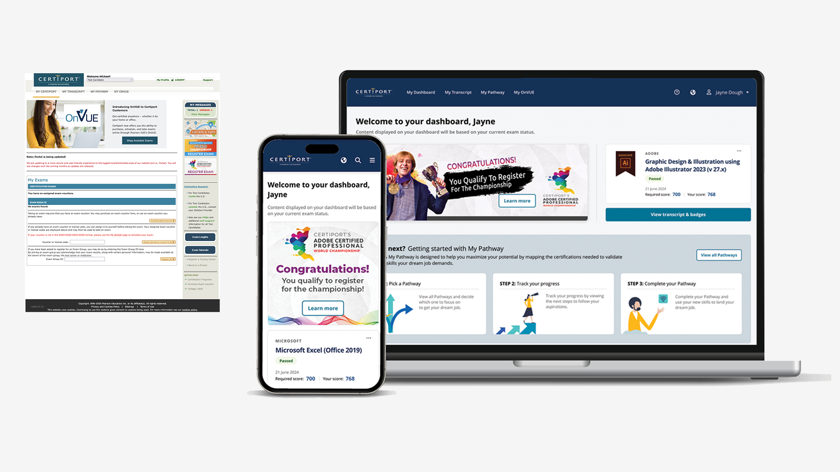
Certiport North Star·Candidate-first platform direction
A candidate-first North Star built on an extensible foundation for what could come next.
I co-led Certiport’s three-year North Star and, as Sole Product Designer, turned the candidate experience into a tested Figma prototype and phased roadmap. The foundation could extend to later personas and states; broader shipped onboarding and self-service work reduced friction about 65% at 200K+ new students monthly.
Certiport North Star · Tested direction + roadmap
// My roleAll UX/UI · end to end
// ResearchCross‑functional sprint + 9‑user study
// DeliveryIncremental shipping in progress
// Program proof~65% lower friction · 200K+ new students/month
Visual executive summary
Product states, ownership, and evidence at a glance.
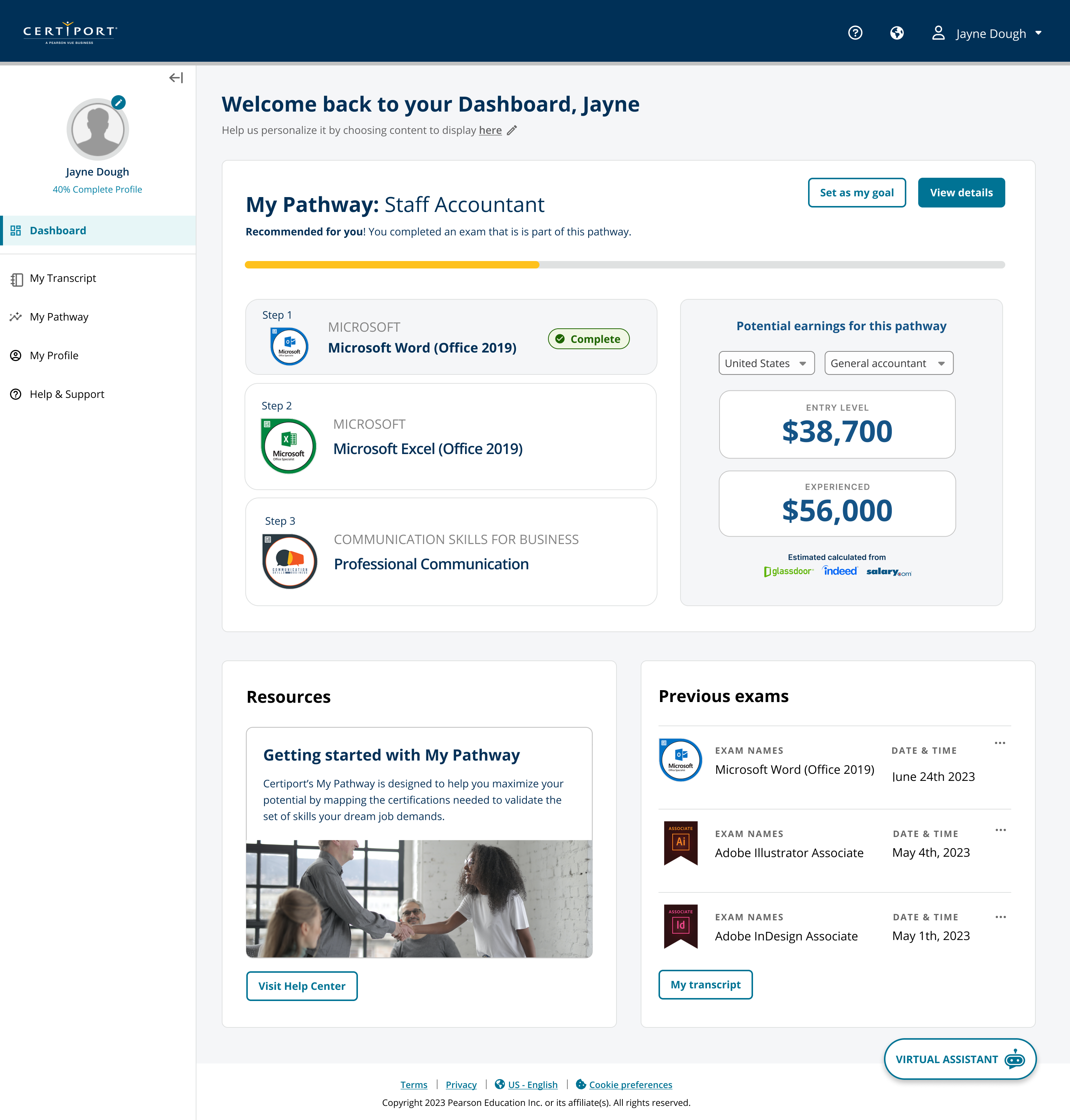
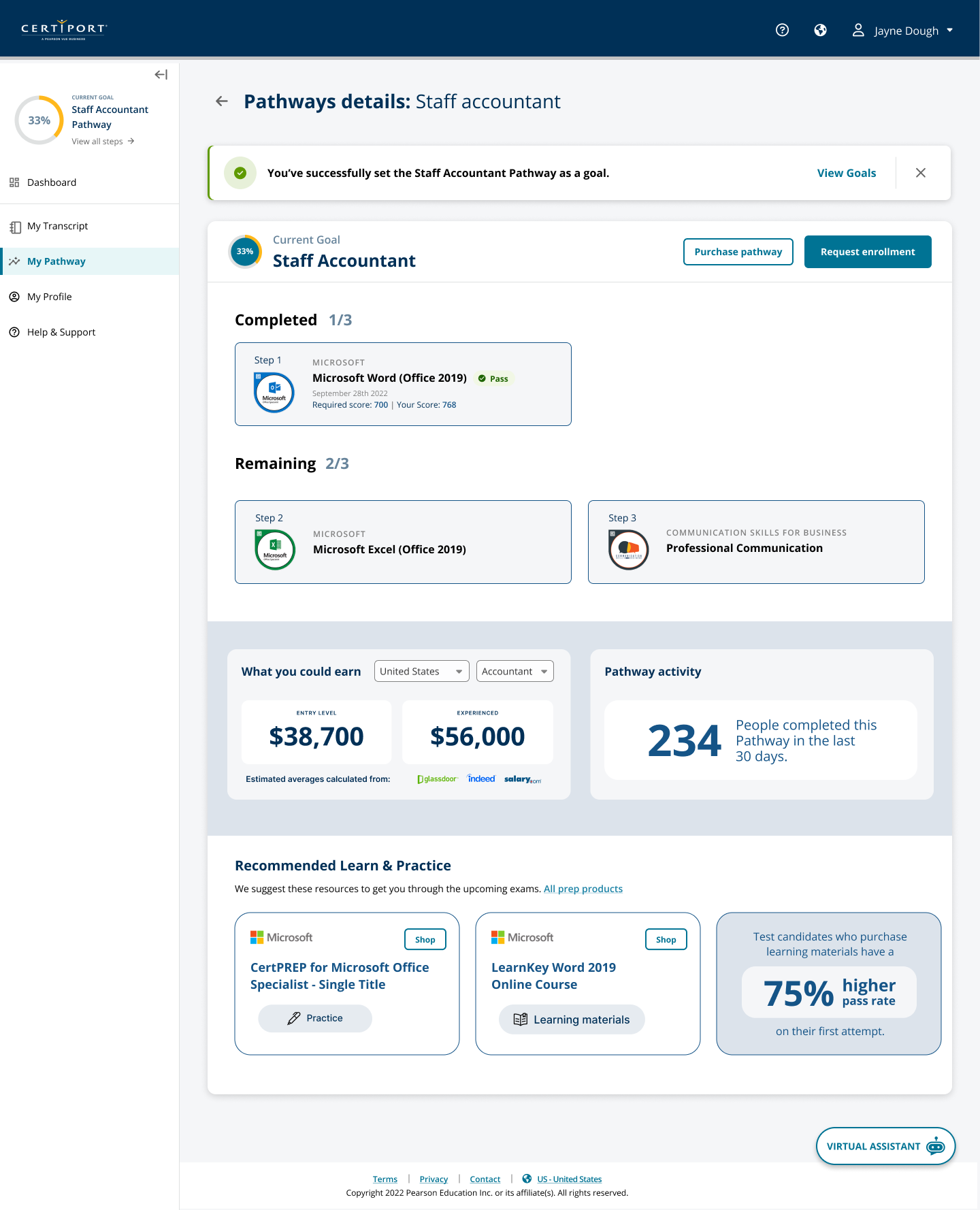
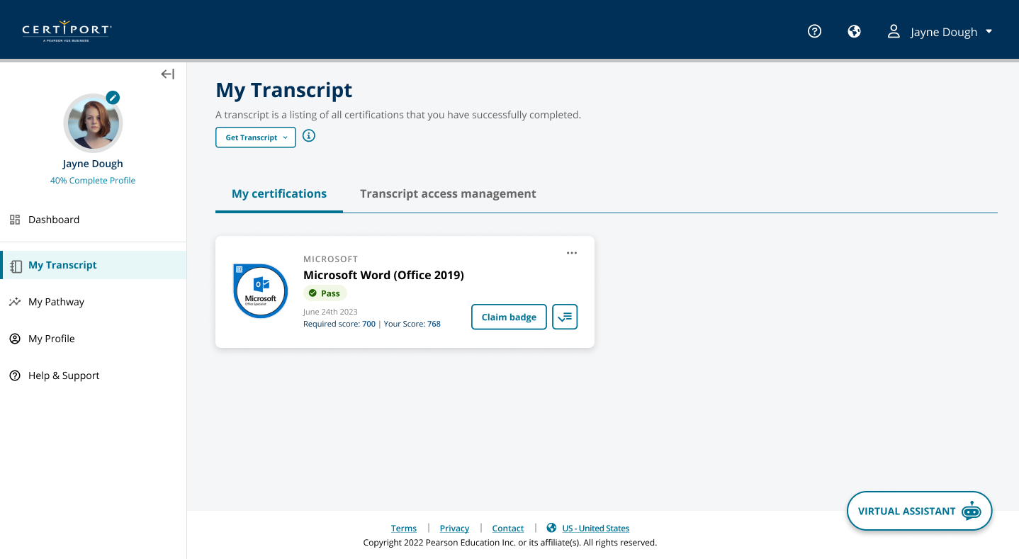
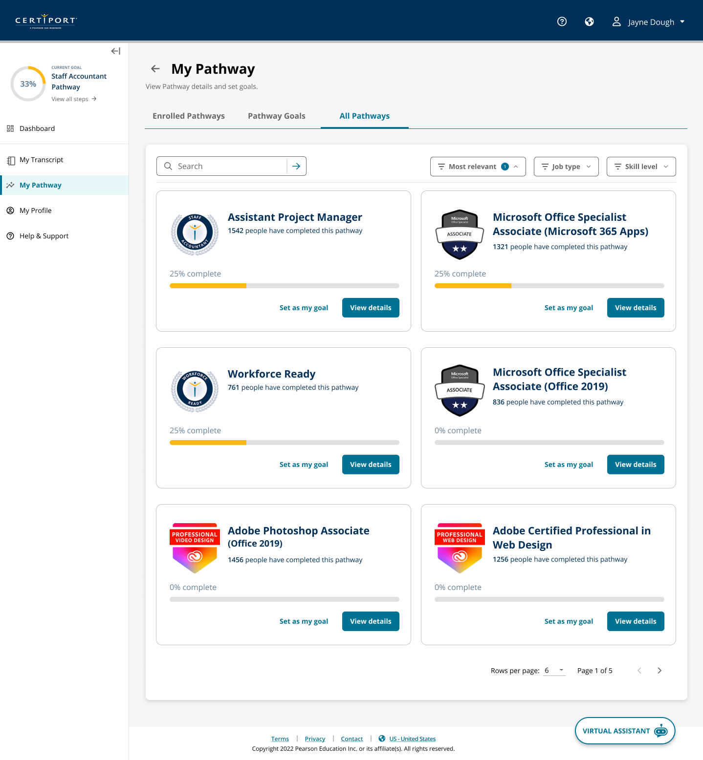
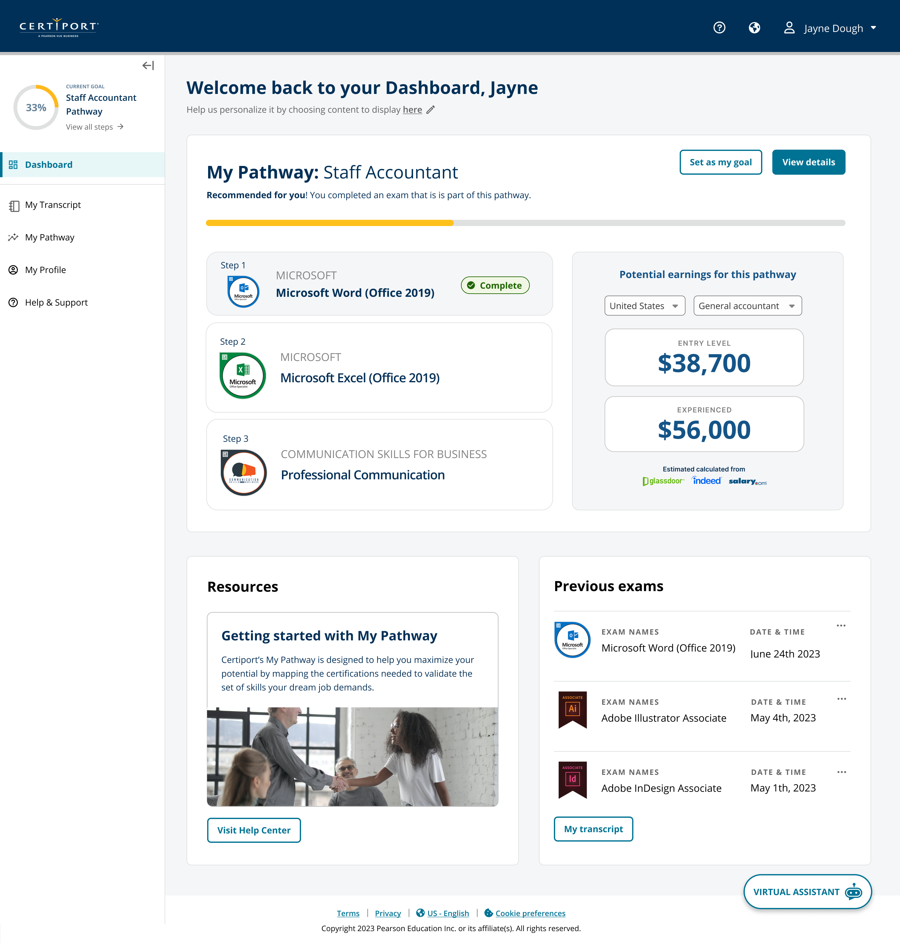
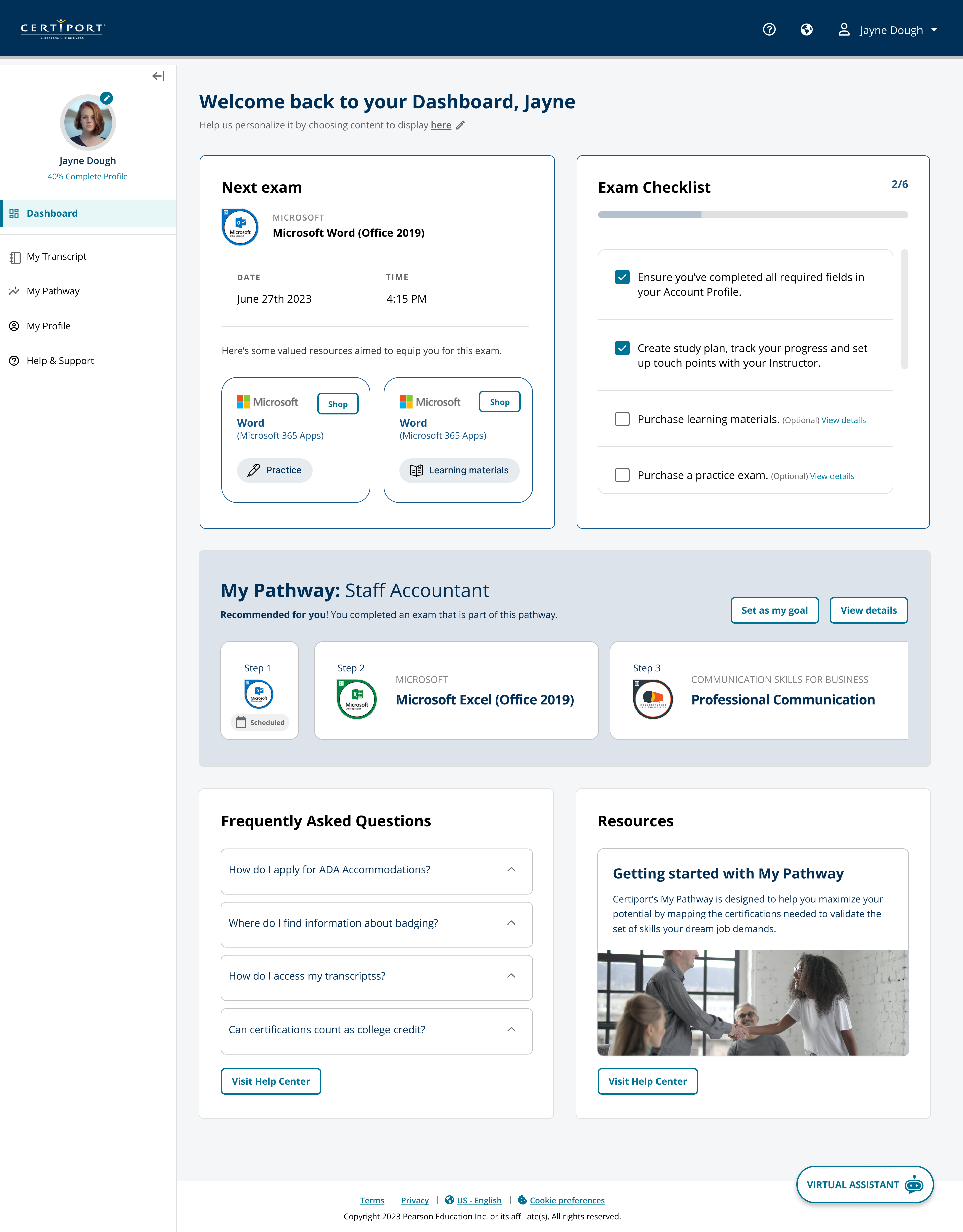
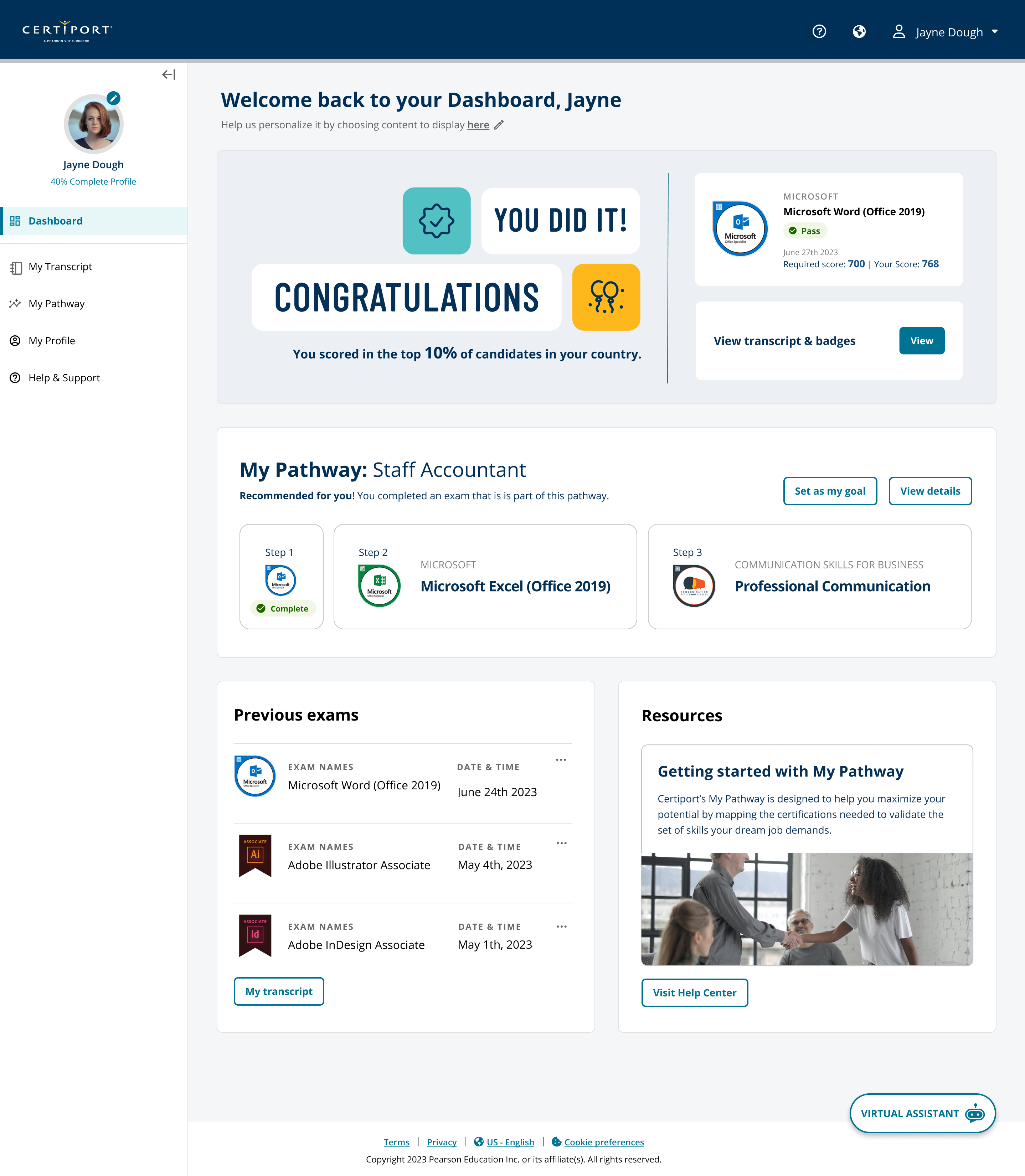
Home · next taskPathway · progress + preparationRecord · credentials + next steps
OwnershipSole Product Designer; co-led three-year North StarContributionJourney synthesis, sprint, prototype, usability, phased roadmapCollaboratorsProduct, participants, engineering, business leadershipDecision authorityLed design; prioritization and roadmap were shared
// 01Context
The portal had accumulated product complexity faster than candidate clarity.
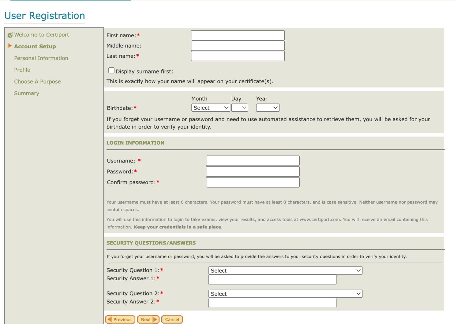
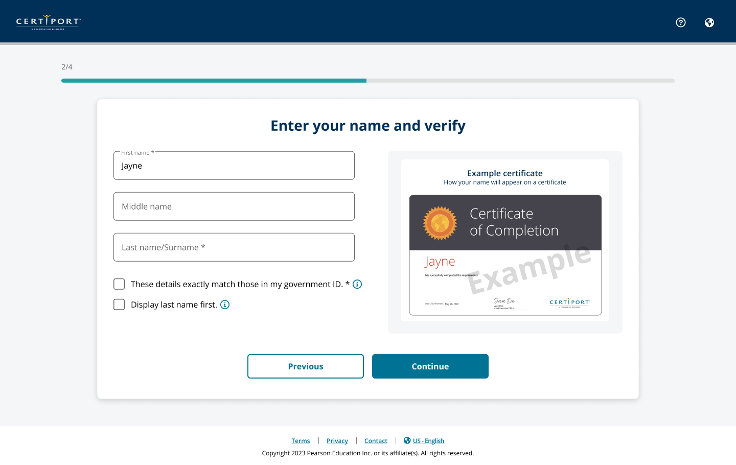
Candidates were using a platform shaped by years of organizational and technical growth: cumbersome registration, limited mobile access, text-heavy content, low return engagement, and tasks split across experiences that reflected the organization more than the candidate journey.
The goal was broader than a visual refresh: faster account creation, easier booking and preparation, stronger return engagement, clearer achievements, and links between certifications, education, and career progress.
The backend was deeply entangled, so I used the North Star as both future-state design and sequencing tool. New dashboard, pathway, and registration concepts had to create value while legacy services still existed. I owned the UX/UI, workshop synthesis, prototypes, usability revisions, and preparation for incremental implementation, grounding the IA in durable concepts such as progress, next action, achievement, and preparation rather than backend structure.
Testing told us where to simplify the model rather than add explanation.
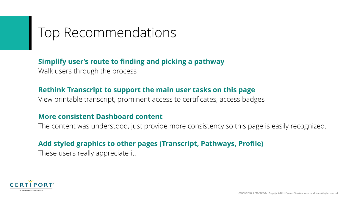
Testing pushed us to remove concepts rather than explain them. Students understood pathways but stumbled over “set as goal” versus “enroll,” so the workflow needed fewer steps. Transcript users chose “access management” when basic view/download actions were unclear, so hierarchy had to change. Inconsistent dashboard modules weakened orientation, so the visual and structural system needed stronger consistency.
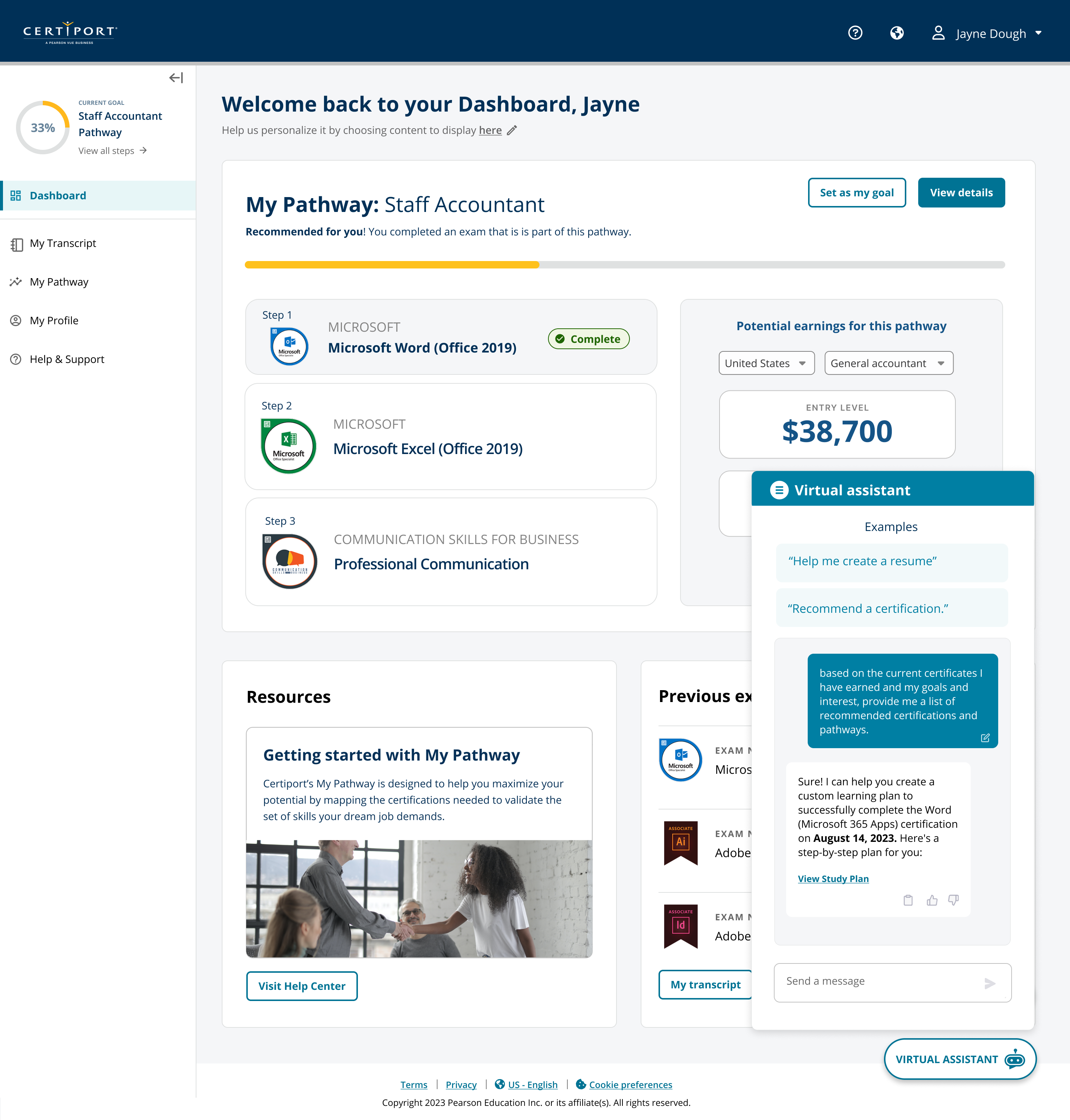
The virtual assistant showed that usefulness and discoverability are separate: a helpful tool at the bottom of a long page is still easy to miss. We explored a more persistent entry point without letting chat dominate.
Positive feedback was not automatic approval to ship every concept unchanged. The North Star existed to sequence implementation; some ideas could move directly while others depended on backend services that had to be untangled first.
01
Simplify pathway commitment
Preserve the progression model users loved while removing unnecessary distinction between setting a goal and enrolling.
Evidence: pathways scored well; the 3‑button/3‑action decision was the confusing part.
02
Design transcript around candidate jobs
Make viewing, downloading, printing, certificates, and related learning more prominent than administrative access management.
Evidence: users were successful but used the wrong tab because it was the only visible alternative.
03
Make dashboard modules feel like one product
Standardize structure and visual treatment so useful data does not undermine orientation.
Evidence: users loved the content yet sometimes thought a module was a different page.
// 02Design sprint
We used the sprint to make decisions—not to perform a design‑process ritual.
The engagement included CX, support, product, marketing, international, technology, research, and design around one question: how might we make the candidate portal seamless while creating stronger business value?
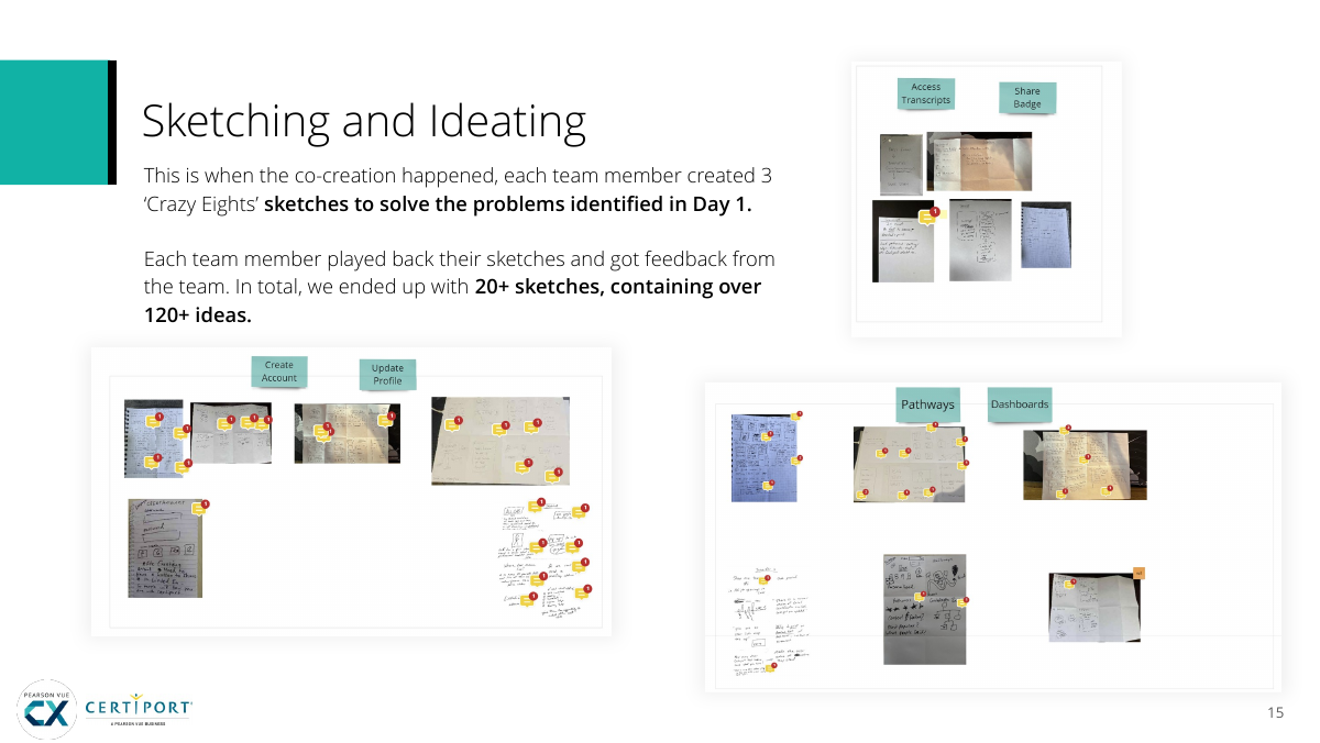
Day one broke that into account creation, profile, dashboard, pathways, support, and badging. Day two produced 20+ sketches with 120+ ideas. I translated the strongest concepts into medium-fidelity UI so the team could critique the same experience.
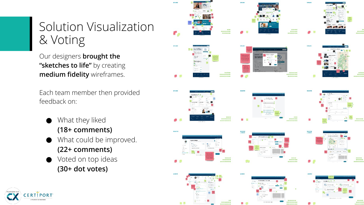
Structured critique produced 18+ positive comments, 22+ improvement comments, and 30+ dot votes before storyboard and prototype. The sprint’s purpose was to expose assumptions, make them tangible, and send only the strongest ideas into testing.
DAY 1
Map
Align on the problem, goals, experts, user journey, and six target problem areas.
DAY 2
Sketch
Generate multiple solutions rather than allowing the first plausible idea to become the design.
DAY 3
Decide
Bring concepts into UI, critique, vote, and select the interactions worth testing.
DAY 4
Prototype
Create a coherent future‑state candidate journey rather than disconnected feature mockups.
DAY 5
Test
Put the concept in front of recent students and learn where our internal logic broke down.
Sprint: 20+ sketches, 120+ ideas.Concepts became UI for concrete critique.
// 03Product direction
The portal needed to answer “what should I do next?” before “where in the site am I?”
A task-first dashboard became central because candidates return for a reason: an upcoming exam, result, transcript, pathway step, or preparation task.
I shifted the experience from section-first navigation toward next actions and progress across appointments, certifications, learning, achievements, and pathways. Pathways showed progression instead of a static catalog; transcripts prioritized view, download, print, share, certificates, and learning options after an unsuccessful test.
Virtual-assistant and study-plan concepts were evaluated as contextual support for the task at hand, not as technology features to add for their own sake.
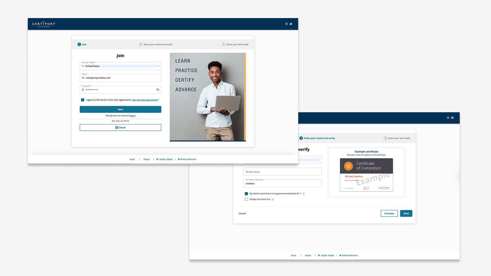
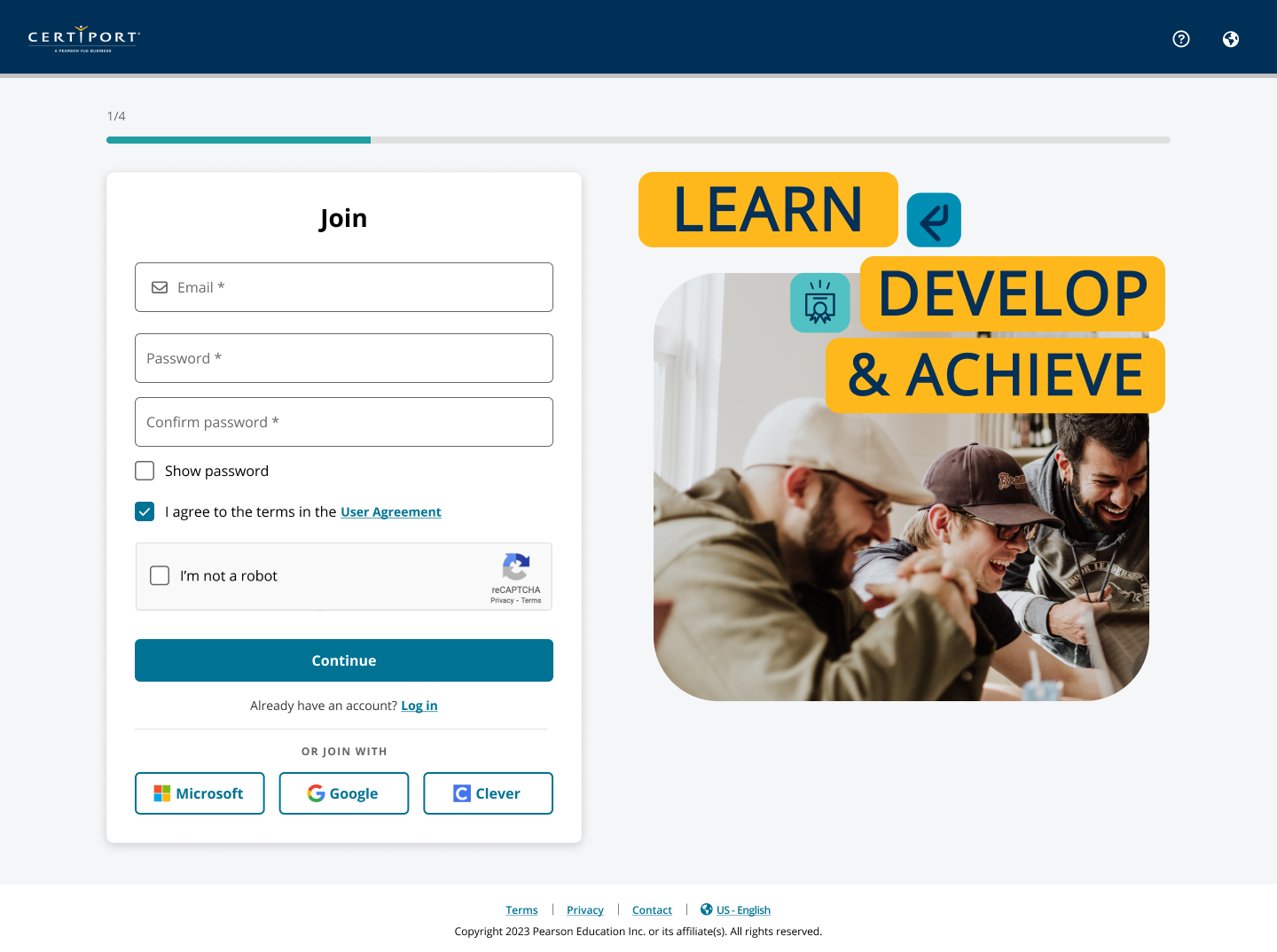
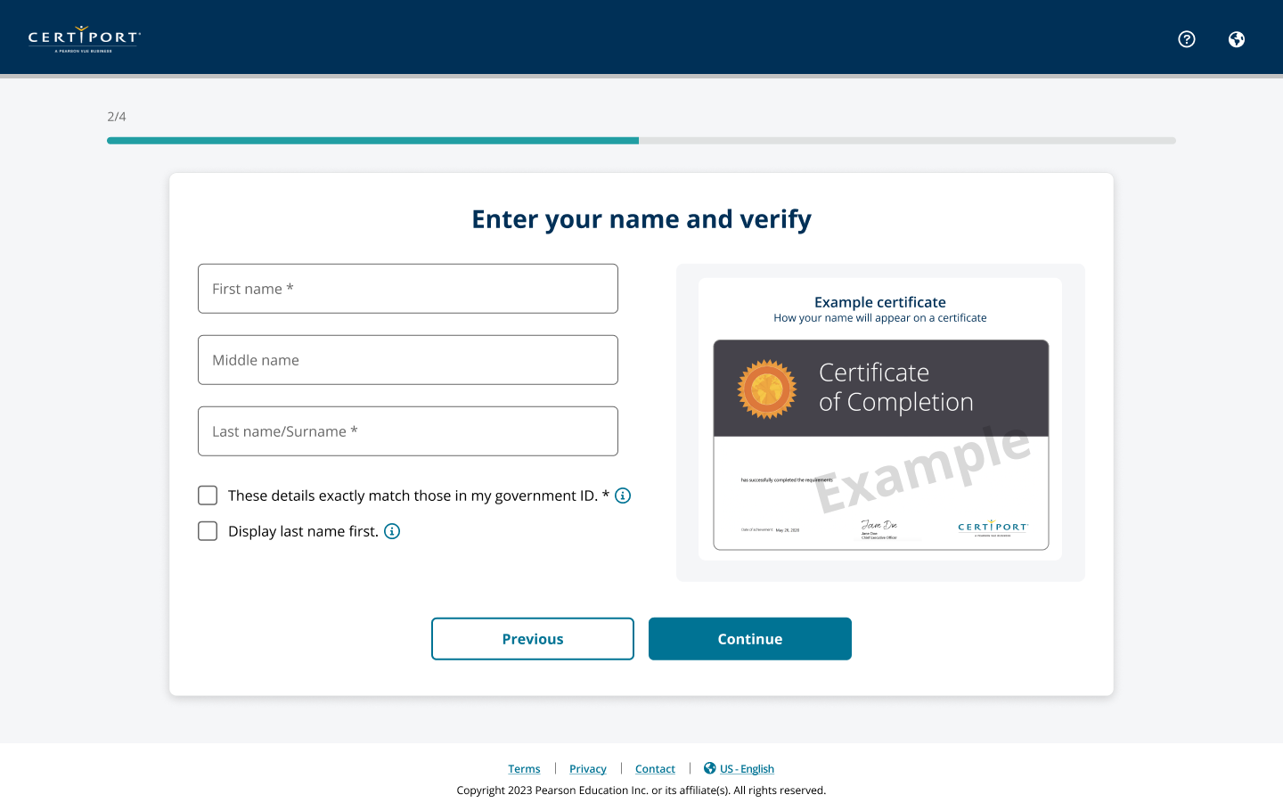
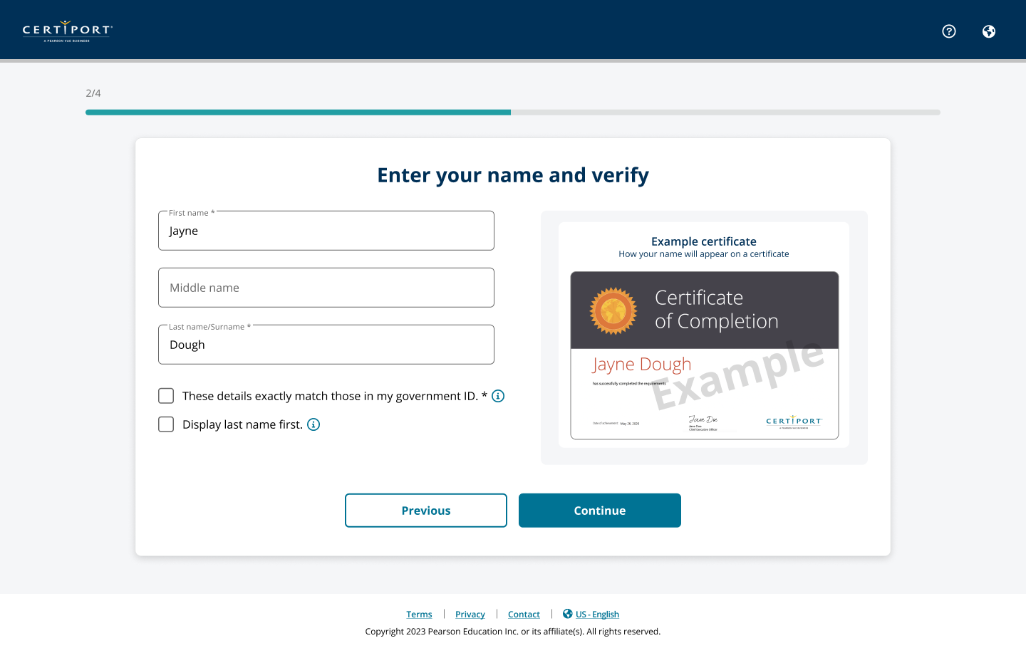
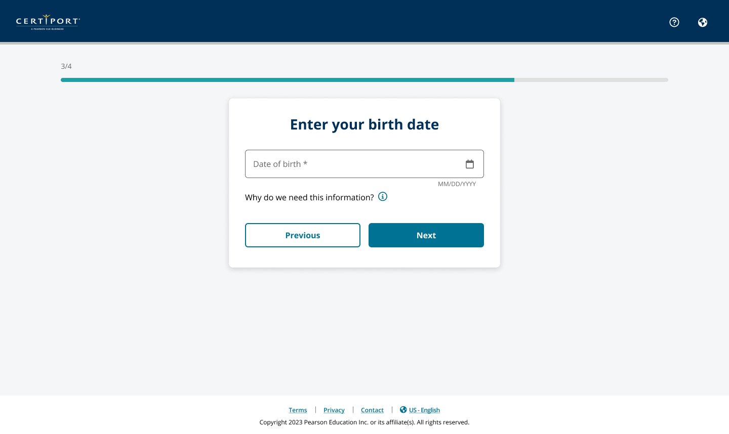
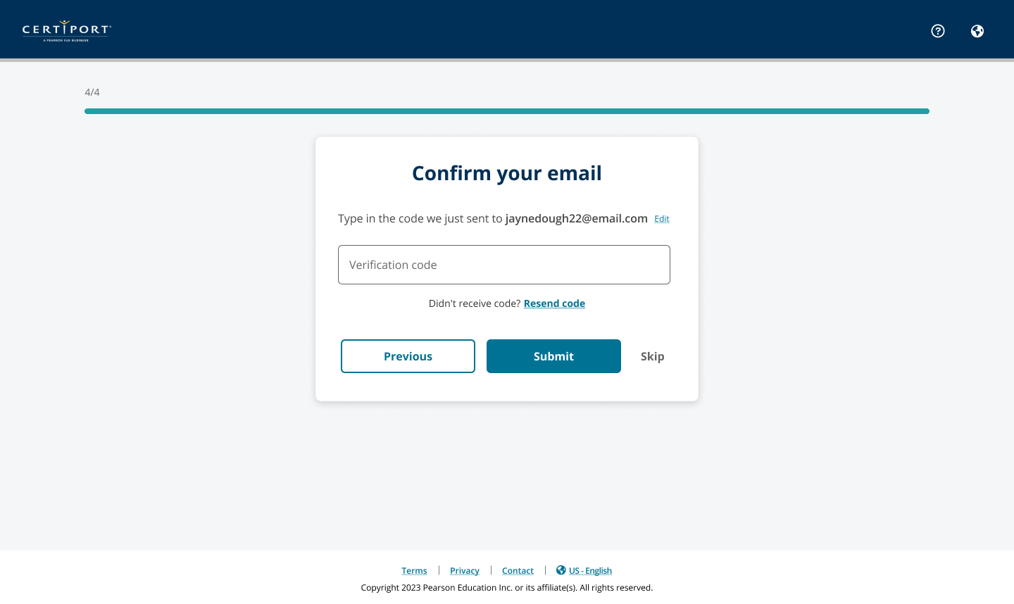
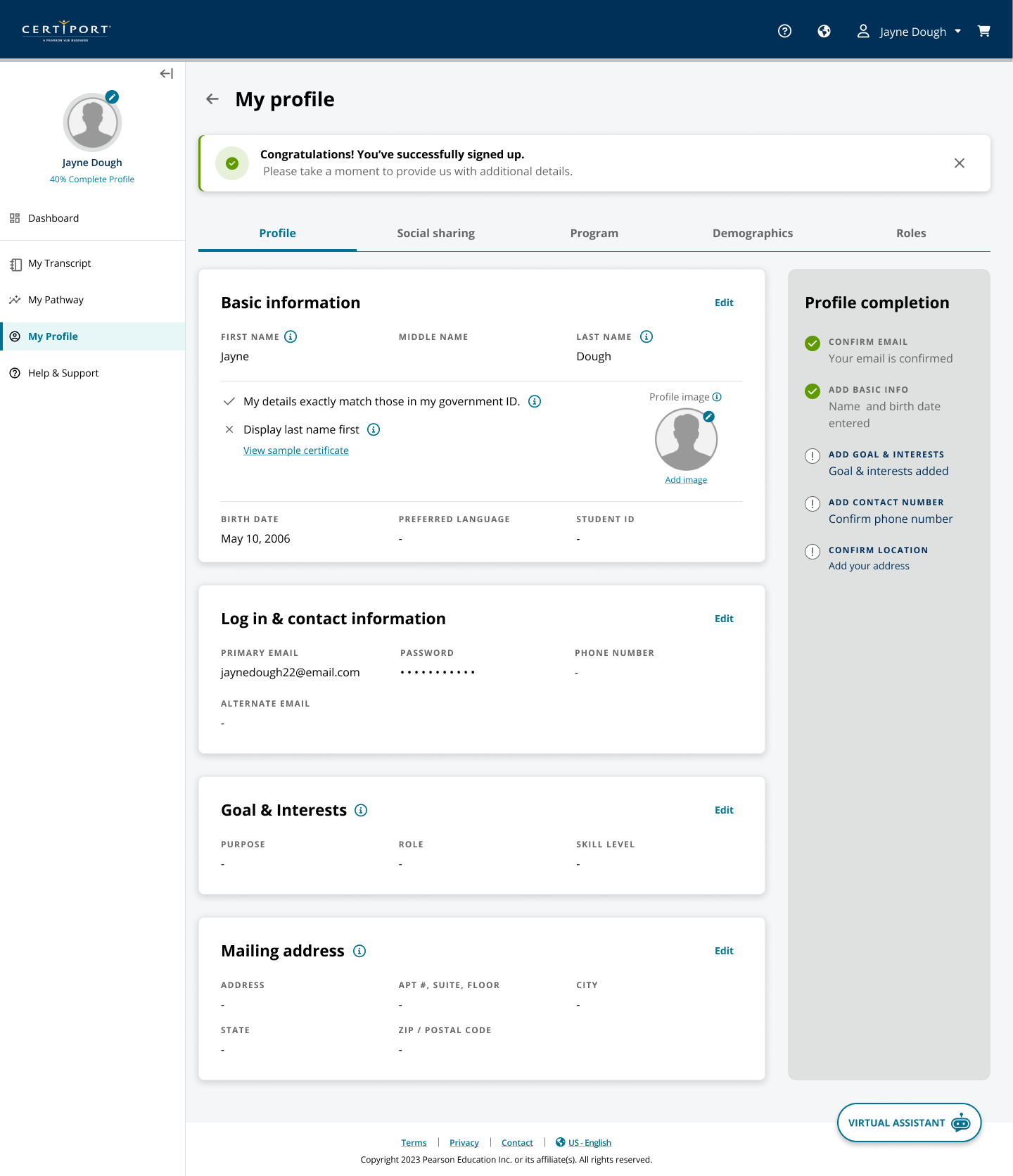
Pathways support exploration after progression is understood.Clearer, focused account creation.
// UI evidence12 additional product states
More of the candidate portal
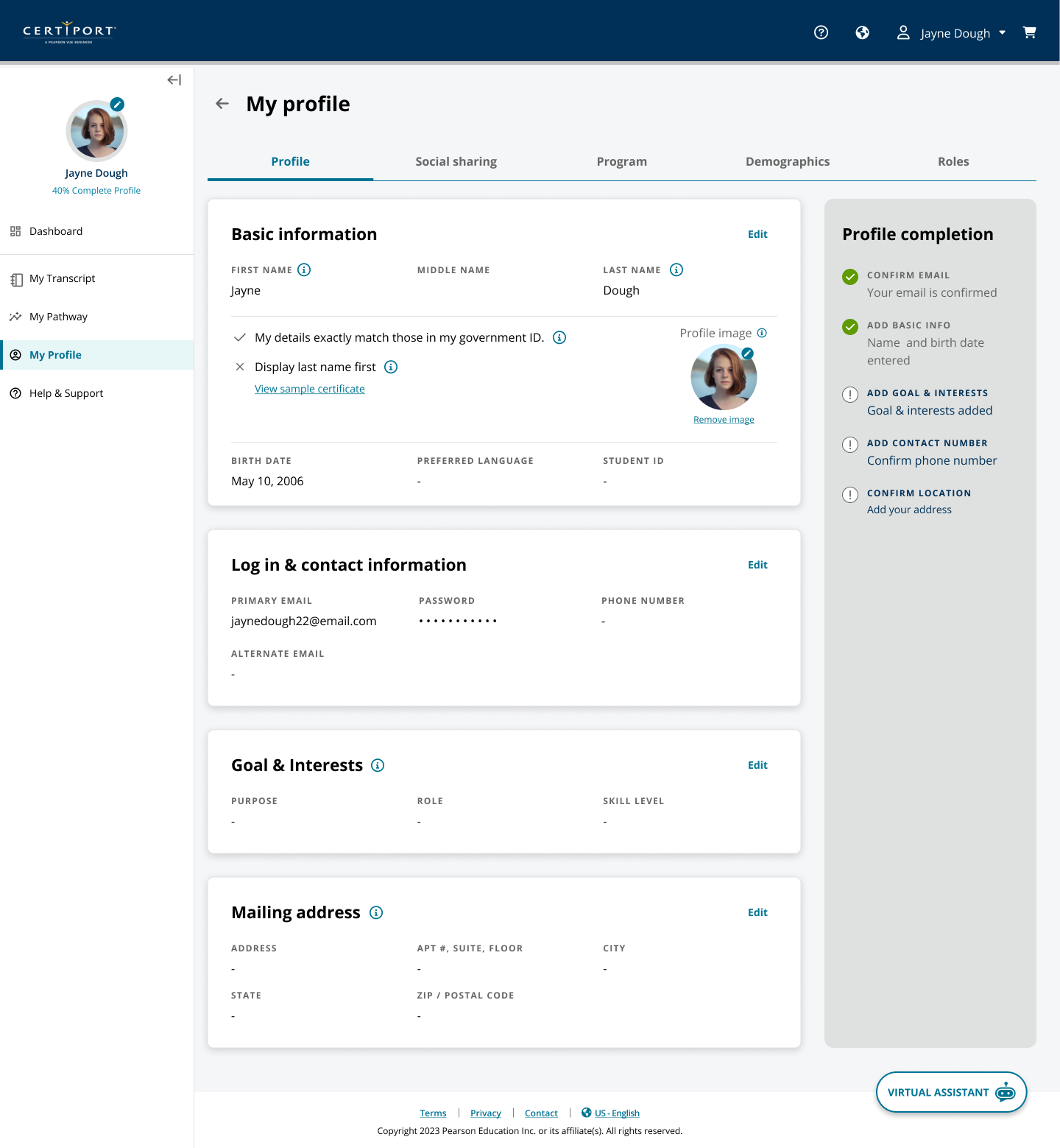
Account, profile, dashboard, and post-exam UI states from the North Star portal direction.
Nine students validated the direction—and showed exactly where our internal model was still too complicated.
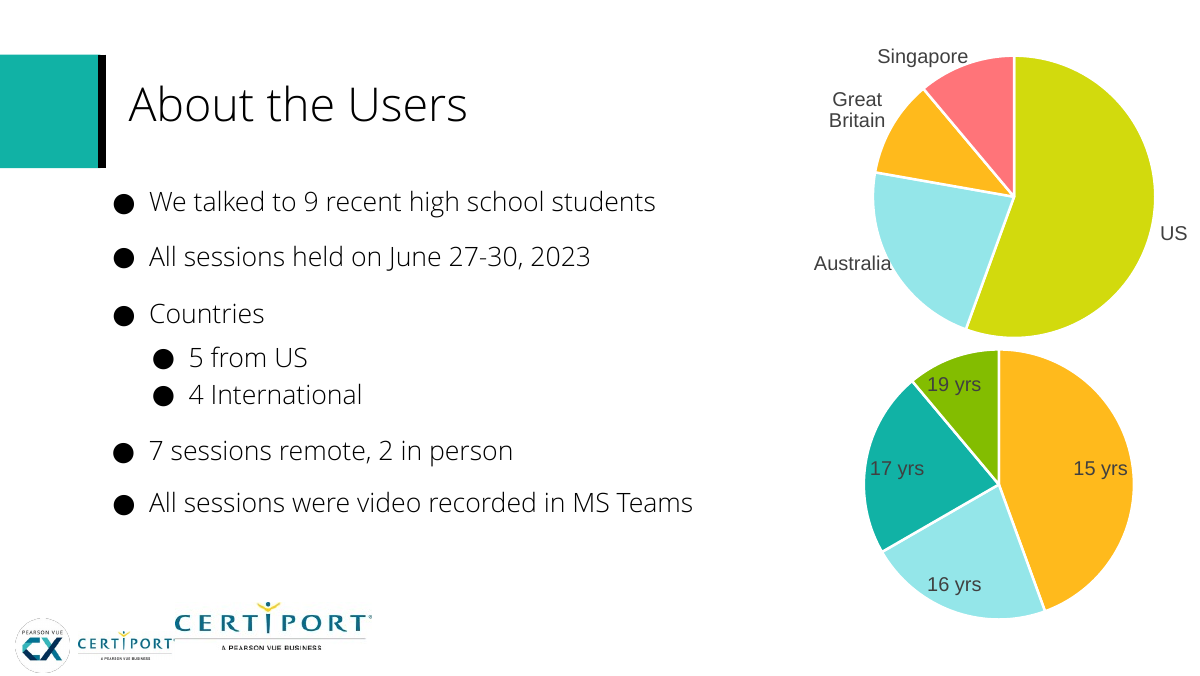
We tested nine recent high-school students: five in the U.S. and four across Australia, Great Britain, and Singapore; seven sessions were remote and two in person. We evaluated concept value, usability, and student expectations.
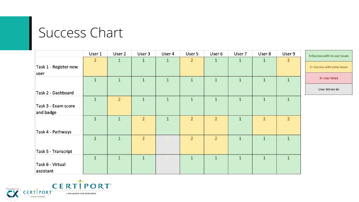
Registration and visual language tested well. Students understood pathways as links between certifications and professional goals, valued the virtual assistant, and liked study planning, transcript access, job earnings, and visible progress.
The problems were specific: dashboard modules sometimes felt like different pages; transcript access management overshadowed view/print tasks; pathway actions such as goal, enroll, and continue added administrative complexity; one participant wanted more study-plan flexibility; and the useful virtual assistant was easy to miss.
9Recent students
5 / 4U.S. / international
4.5 / 5Overall pages
U.S. + international students; remote + in-person.Testing measured complete tasks, not visual preference.
Ratings: Registration 4.5; Dashboard 4.2; Pathways 4.3; Transcript 4.1; Study plan 4.7; overall 4.5.
// 06From North Star to production
The backend could not move as quickly as the experience, so the design had to survive incremental shipping.
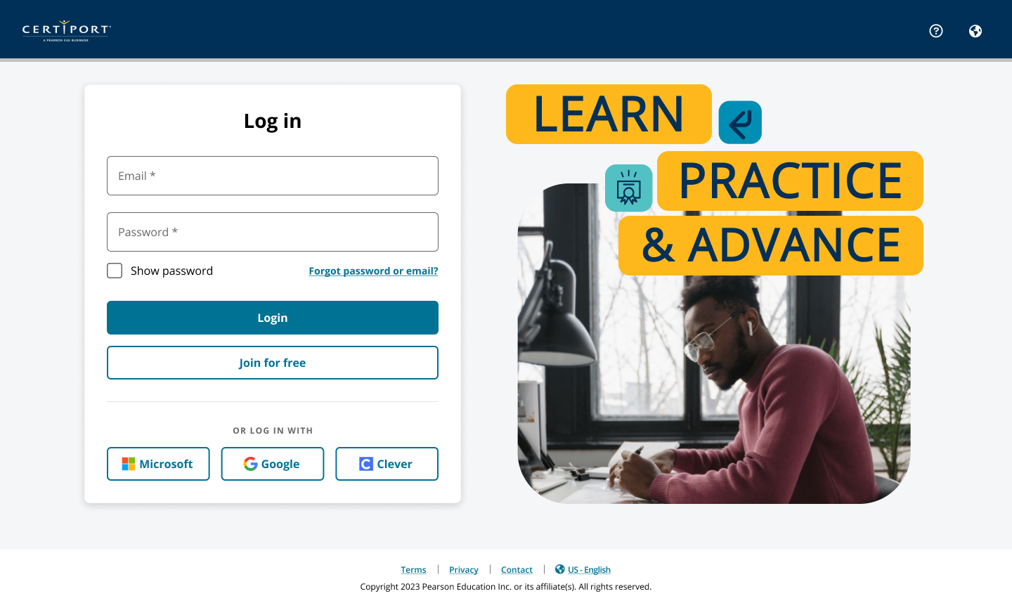
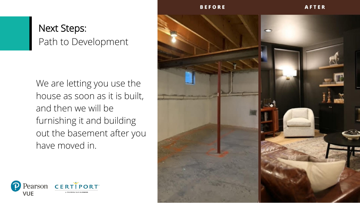
The North Star did not launch as one replacement because the backend is deeply entangled. New registration/login, dashboard, and pathways have shipped while other areas continue through phased modernization.
Each slice had to work alone and still point toward the future. Registration could not assume a new transcript service, the dashboard had to coexist with older destinations, and pathways could introduce progression before adjacent experiences changed. The North Star gave enterprise modernization a target while users lived through the transition.
Staged path from tested vision to development.
Current delivery status: registration/login, dashboard, and pathways have launched. Other North Star capabilities remain part of an incremental modernization rather than being represented here as already shipped.
// 07Outcome
A clearer candidate platform with evidence behind both the vision and the implementation sequence.
The broader certification-platform program is associated with about 65% lower user friction and supports 200K+ new students per month; the portal study separately provides direct usability evidence for the North Star.
The important portal result is that the vision survived users and implementation constraints. Students understood the core concepts, exposed over-modeled workflow, and gave the team confidence to move the strongest areas into phased delivery.
~65%Lower friction · broader program
200K+New students / month
4.5 / 5Overall tested pages
// TradeoffsConstraint · limitation · next test
The direction is strongest when its limits stay visible.
Tradeoff
What had to be balanced
Focusing first on candidates created clarity but required the foundation to remain extensible without implying every future persona was already designed.
Limitation
What remains unresolved
The North Star itself was a tested direction and roadmap. Broader program metrics should not be read as outcomes from the prototype alone.
Next test
What I would learn next
Validate later role-specific states as they enter the roadmap instead of assuming the candidate hierarchy transfers unchanged.
// Reflection
A North Star is useful only if it can guide the messy middle.
The sprint let us imagine a coherent future, the user study forced us to simplify it, and the backend forced us to sequence it.
Candidates responded well to ambitious ideas such as pathways, contextual support, and study planning when each served a clear next action. Complexity appeared when we exposed internal distinctions users did not care about. I would use the same pattern again: define the future early, validate the model, then make each release a credible slice of that future rather than an unrelated patch.