AI could find the moment. Reviewers still had to own the judgment.
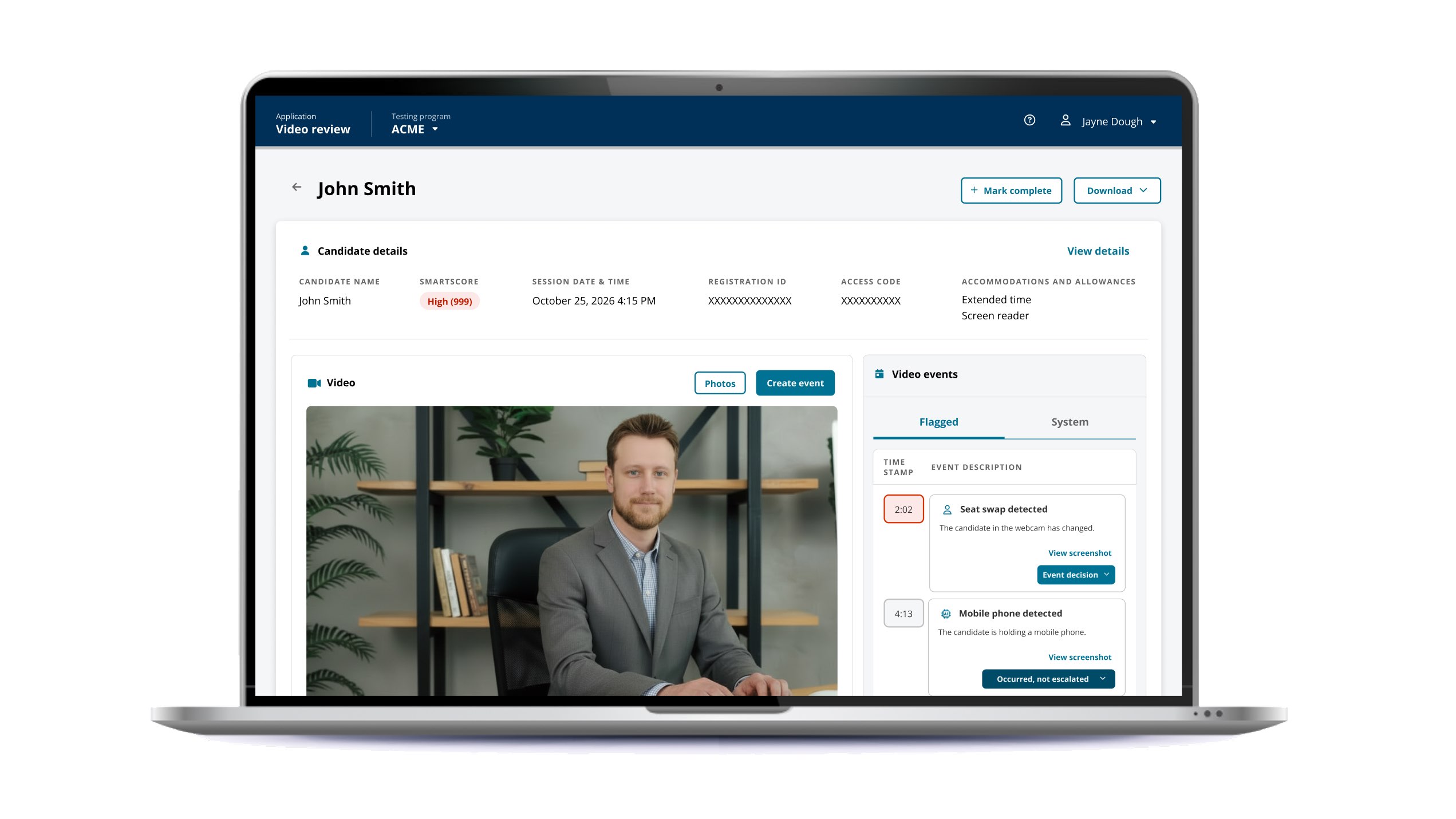
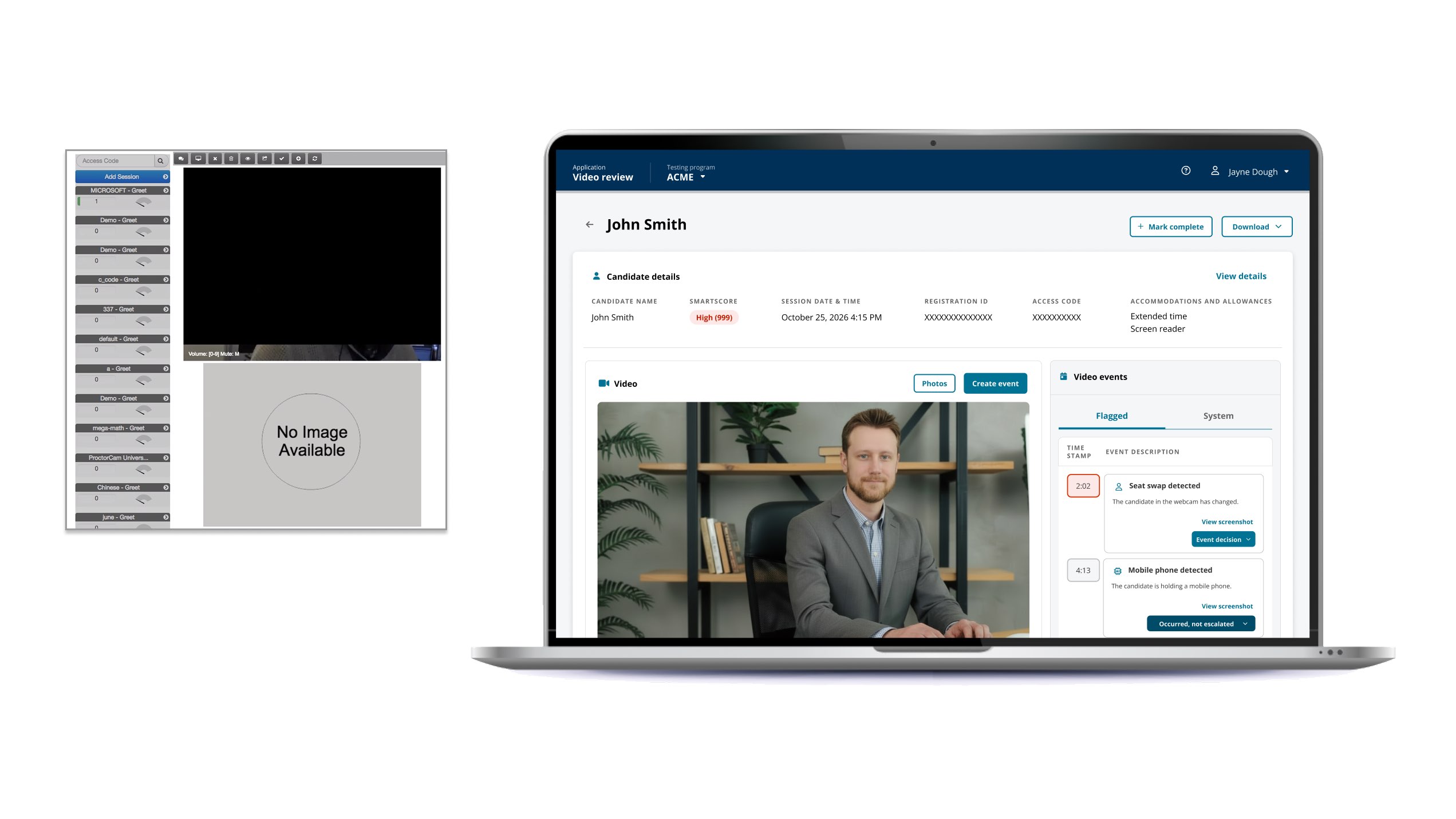
I designed a 0→1 review application for a lower-cost remote-proctoring modality where AI identifies suspicious moments and human reviewers decide what happened. The goal was faster, more confident, accountable review without hiding uncertainty or breaking the evidence trail.
Smart Review · Shipped workflow
// My roleUX/UI · Lead IC
// Product0→1 reviewer app
// ResearchWalkthrough + usability study
// Outcome~10× faster review
Visual executive summary
Product states, ownership, and evidence at a glance.
A new modality changed the economics of proctoring—and created a new kind of design problem.
AI-Assisted Review Workstation had no legacy reviewer UI. We were defining how AI, video evidence, human judgment, and downstream exam decisions should work together.
Automated signals could reduce the video a person inspected, but I kept the boundary explicit: the model narrows attention; the reviewer owns the decision.
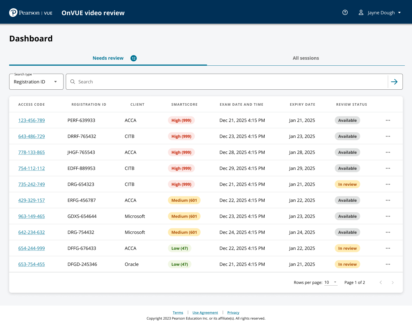
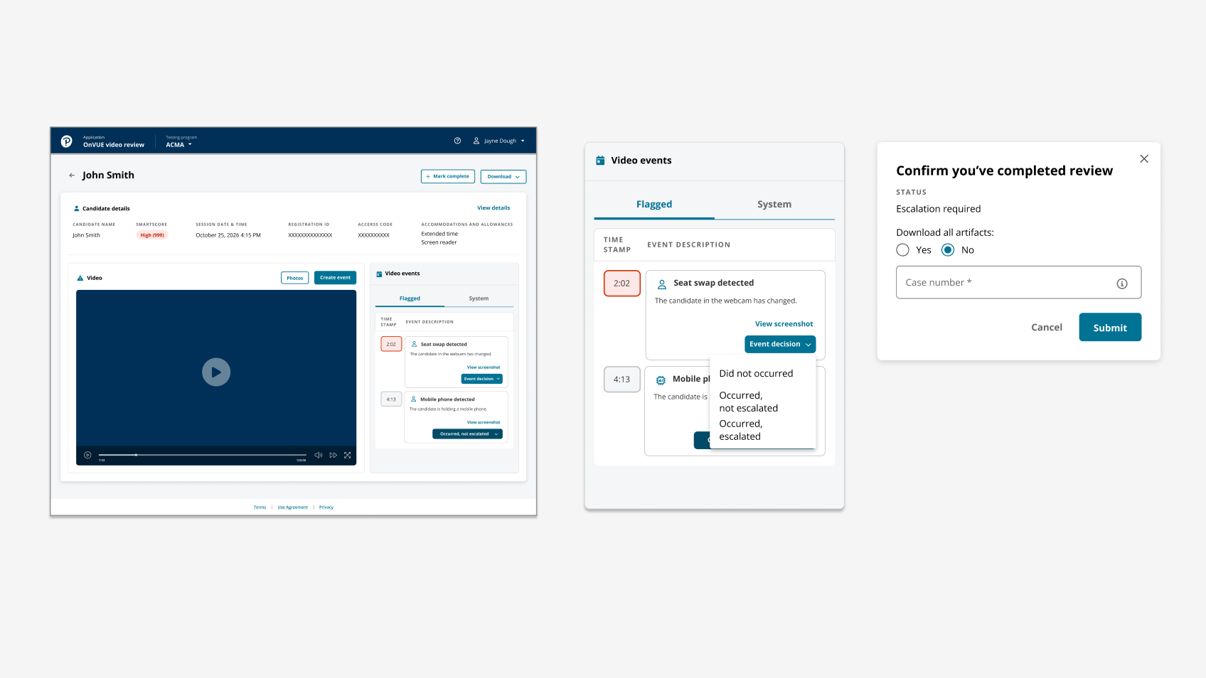
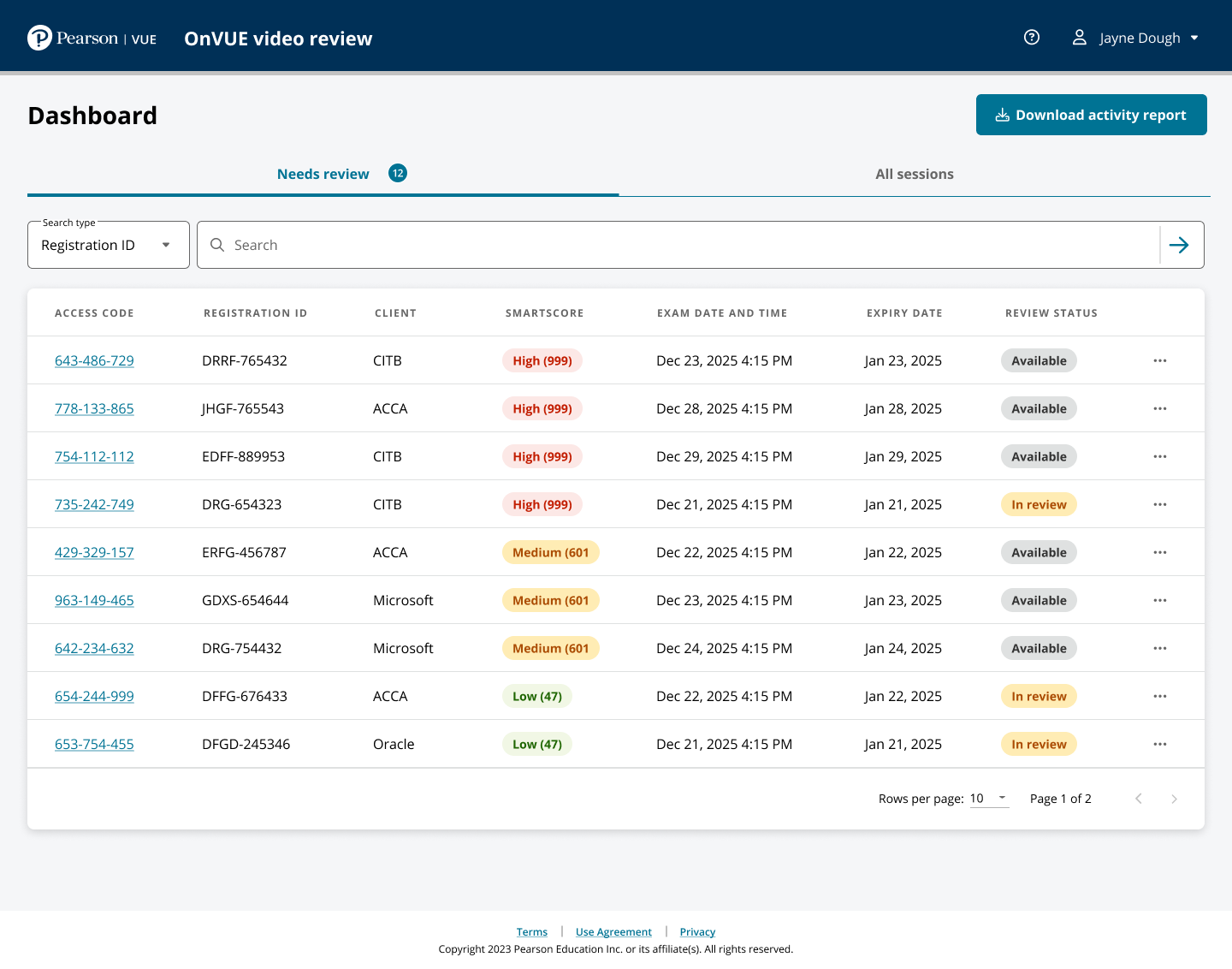
That required a reviewer to find sessions, understand flags, jump to the right moment, inspect evidence, add missed events, and conclude explicitly, while managers and investigators retained later visibility. My ownership covered the end-to-end UX/UI, queue, review interaction, decision states, evidence handling, manager needs, prototypes, usability iteration, handoff, and QA.
The model also had to respect existing escalation language, defensible evidence, PII download restrictions, retention timing, and future client access. I treated the session as the design object: risk signals, events, evidence, decisions, timestamps, status, and ownership could then support different roles without changing what a decision meant. Some roles could view PII but not download it, retention timing affected how long evidence remained actionable, and future client access meant internal shortcuts could not become permanent assumptions.
InputAI/risk signalsFlags and post‑session risk help focus attention.Human taskInterpret contextReviewers determine what the evidence actually means.DecisionClear · revoke · escalateOutcomes remain explicit human actions.TraceAuditable recordWho reviewed what, when, and why remains recoverable.
// 02Product thesis
The interface had to make AI useful without making it authoritative.
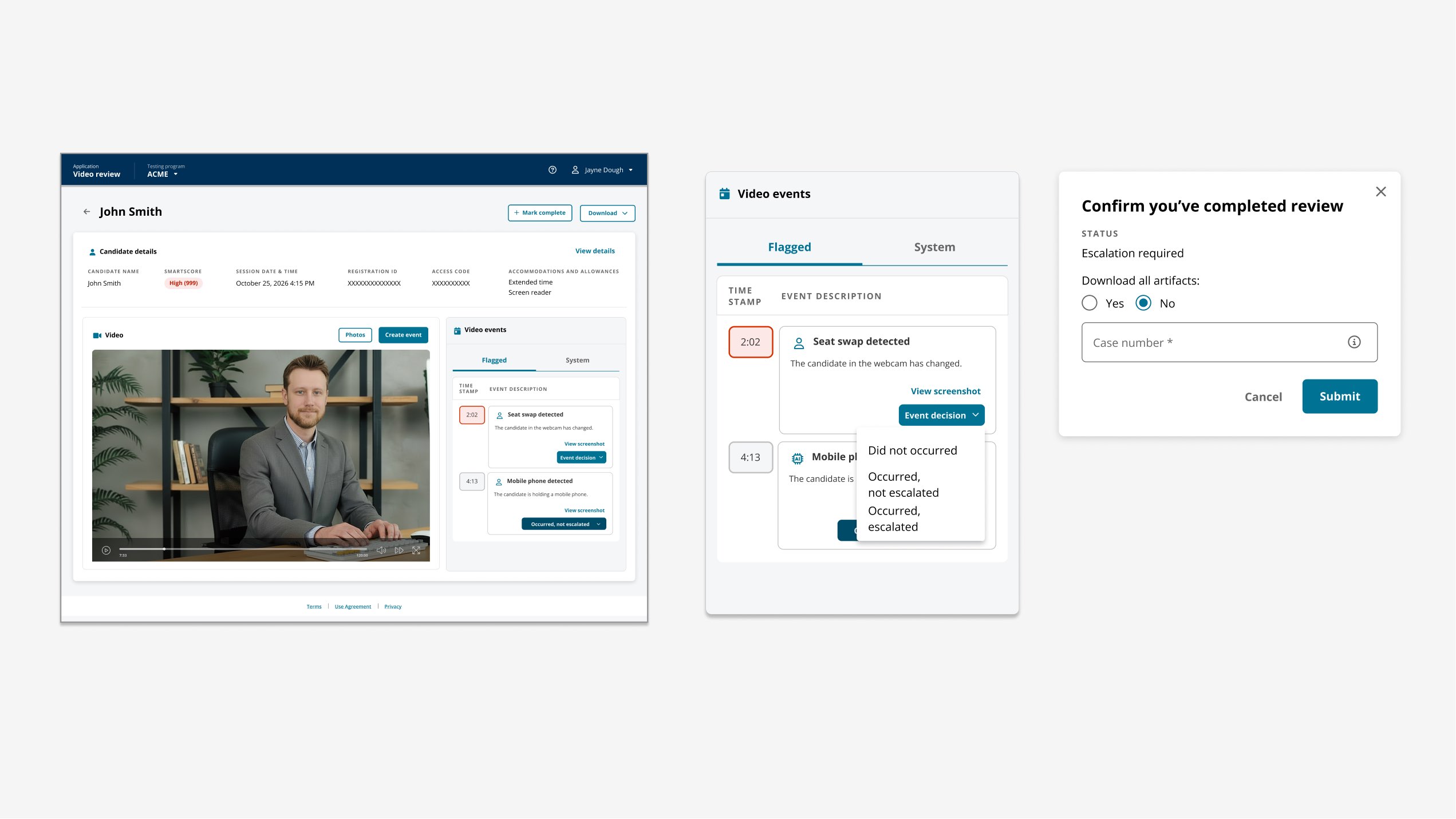
Every AI flag was a pointer into evidence, not a verdict. Reason, timestamp, frame, event type, and video context stayed connected so reviewers did not reconstruct a case across tools or translate an opaque score.
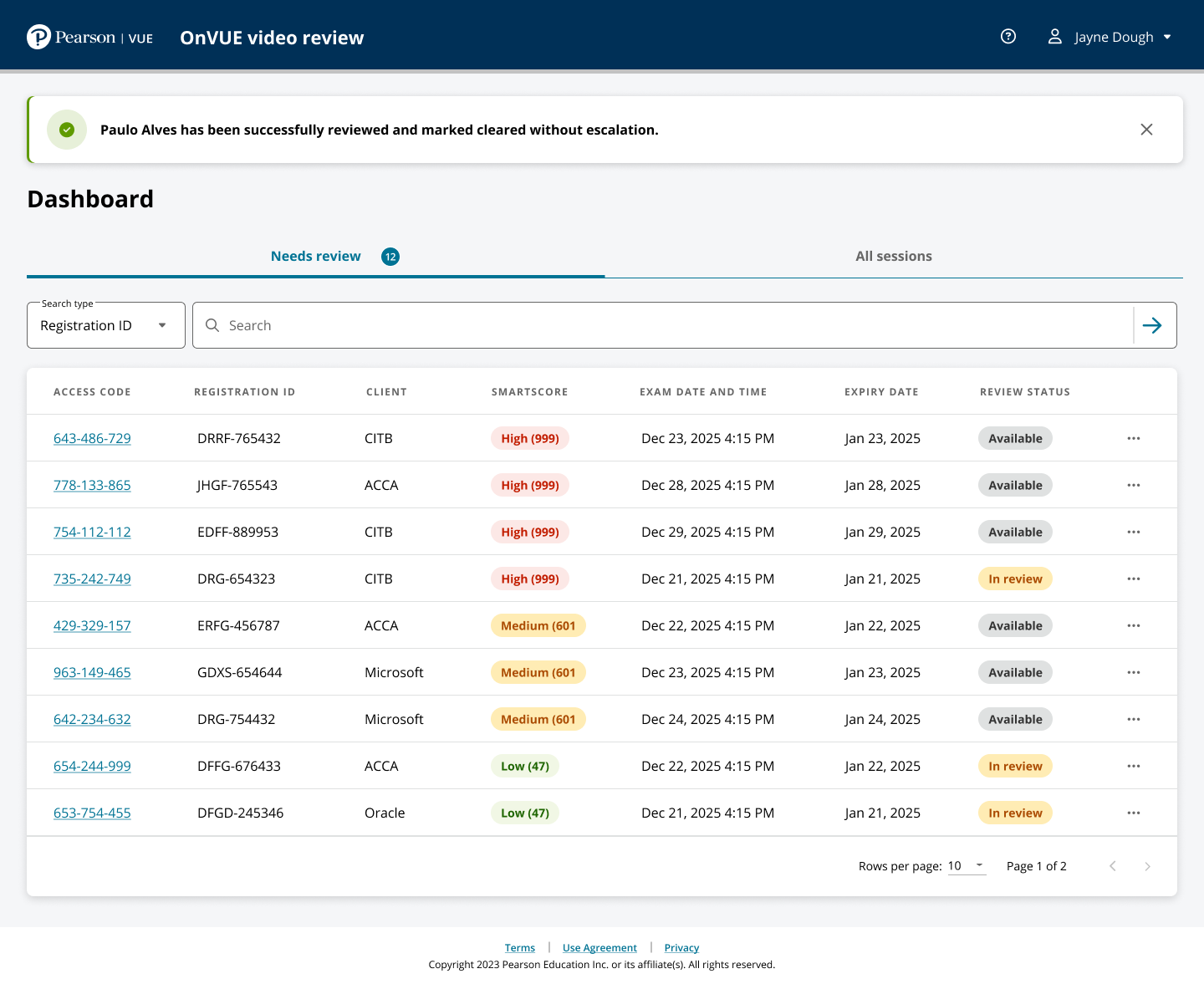
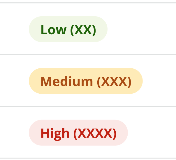
The interface also made post-judgment state explicit: unreviewed, did-not-occur, did-occur, escalation-driving, completed, and revoked are operationally different.
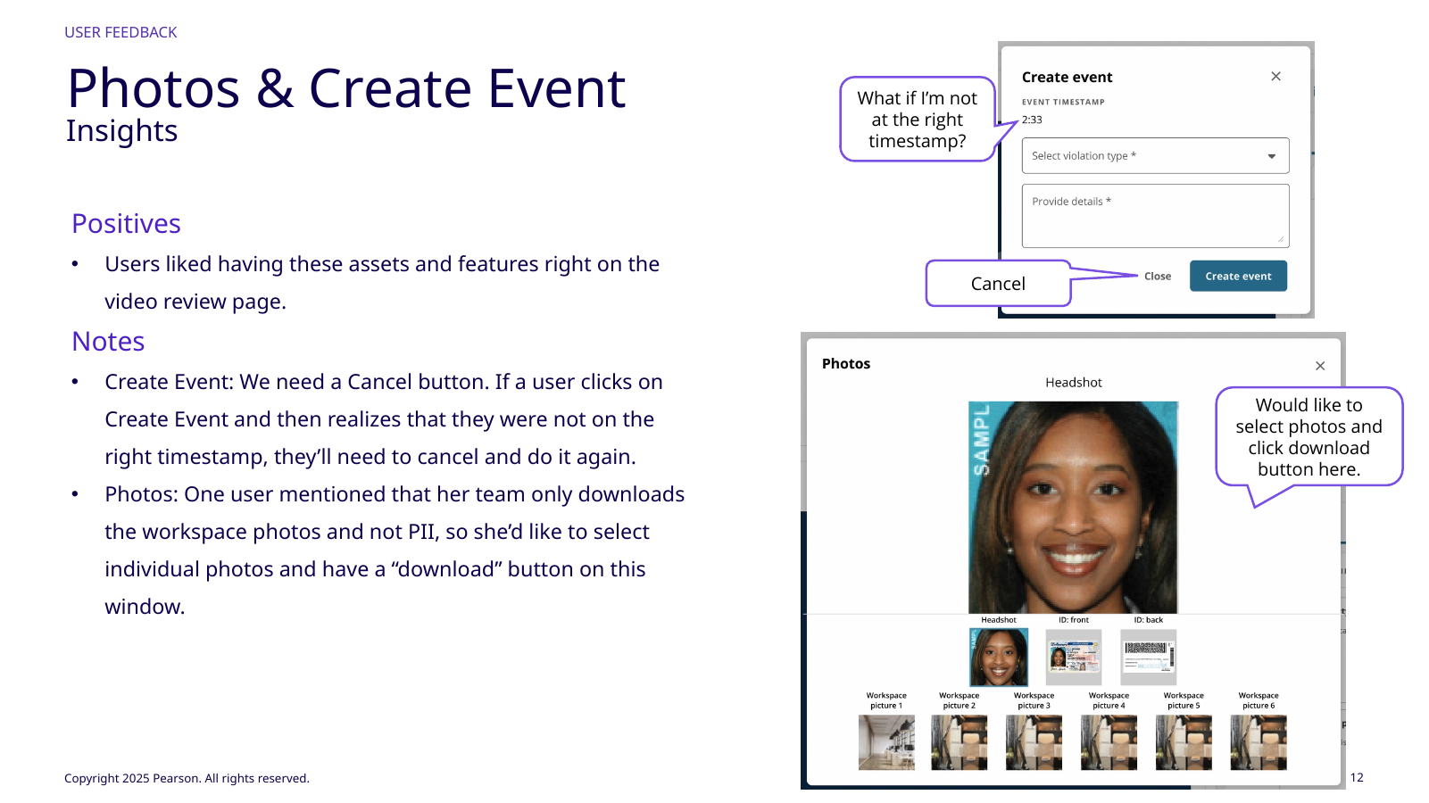
I kept video large for subtle behavior, showed accommodations and allowances that could change interpretation, and kept photos available for identity/workspace context. The goal was less context switching without an overloaded evidence dump. Accommodations and allowances stayed visible because they could change whether suspicious-looking behavior was actually permitted; photos remained available when identity or workspace context mattered.
I translated the research into workflow decisions, not a feature checklist.
Research produced many requests; four decisions carried the core experience.
01
Event → exact video moment
A flag or manually created event acts as a direct path into its timestamp. Reviewers can inspect the moment and surrounding context without searching from minute zero.
Why: repeated in both research rounds. It removes work on every reviewed event.
02
Evidence remains attached to the signal
Reason, timestamp, screenshot, event category, video, accommodations, and session context stay together. The UI reduces the mental join work the reviewer would otherwise perform.
Why: reviewers repeatedly praised having artifacts together and the flagged reason visible beside the moment.
03
Decision states are visually explicit
The product distinguishes unreviewed, did‑not‑occur, did‑occur, escalation‑driving, completed, and revoked states rather than relying on subtle text labels.
Why: experienced reviewers wanted to know at a glance what still required judgment.
04
PII handling follows role constraints
Downloads are not assumed to be the default action. Some reviewer roles cannot download PII, while others only do it exceptionally. The interaction has to respect those operational rules.
Why: a speed improvement that weakens data handling is not a successful operational design.
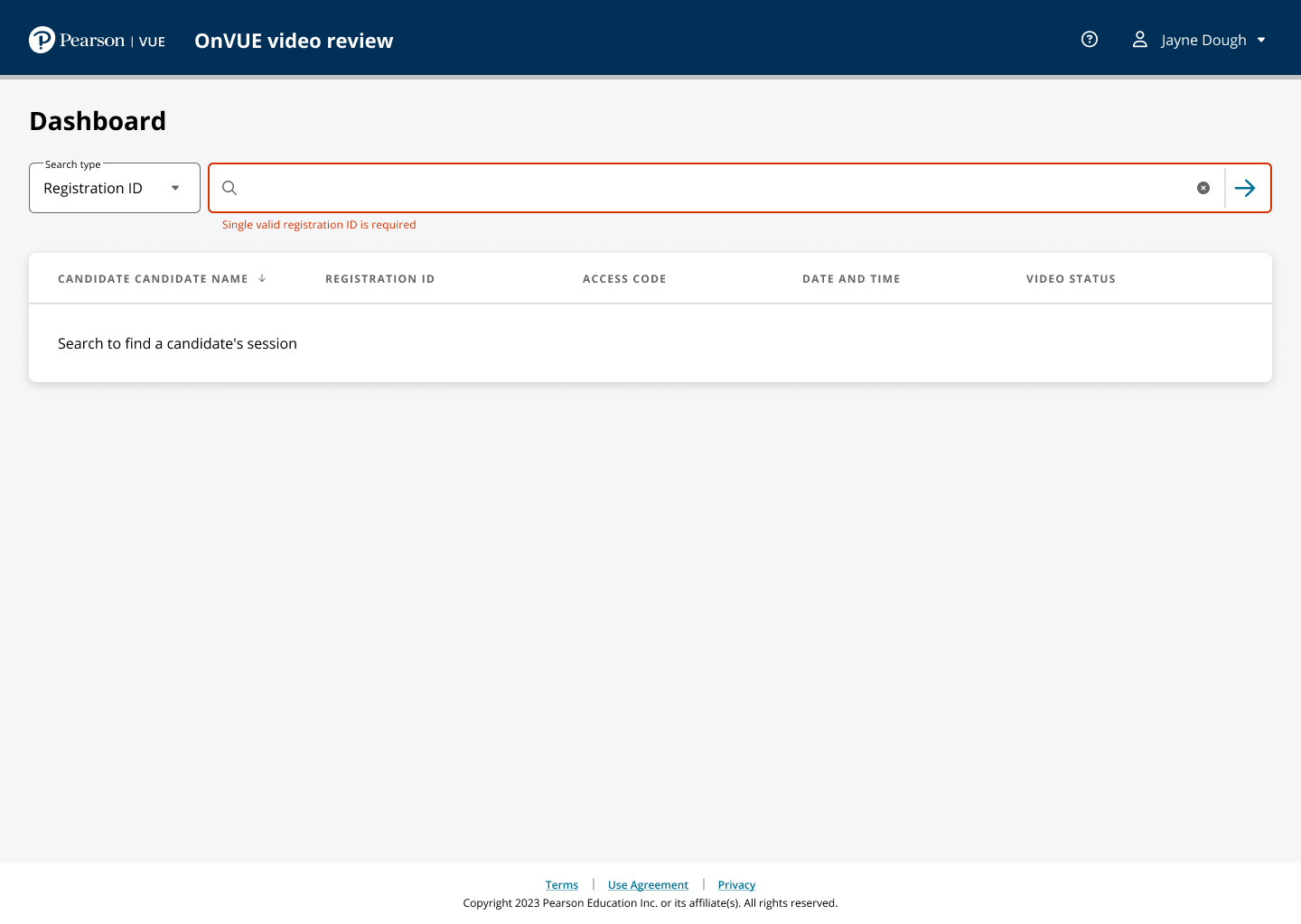
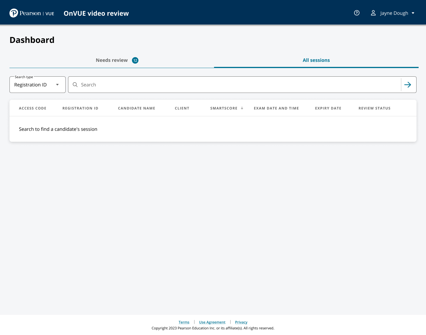
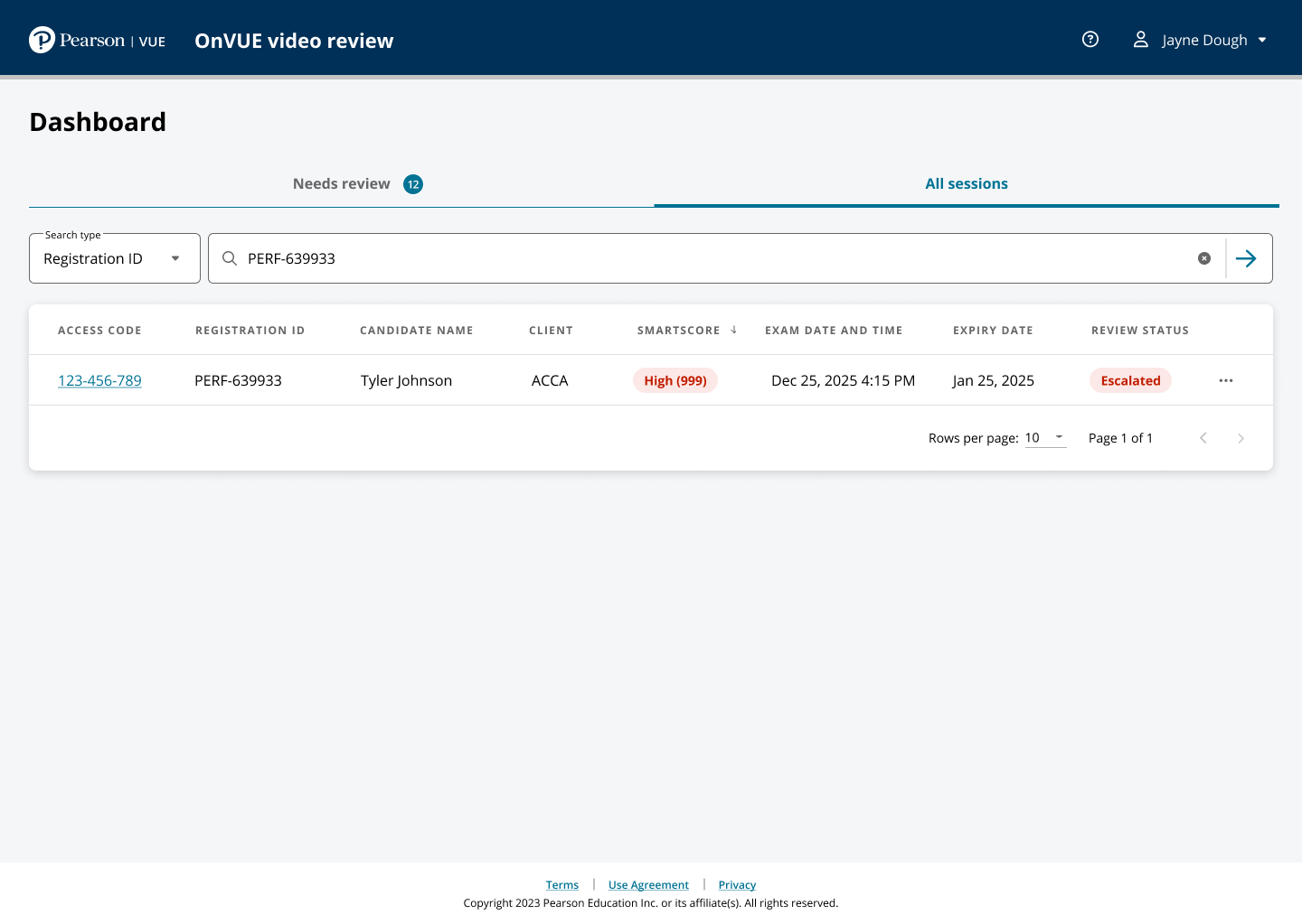
Clear and escalation share structure, not meaning.Search and error states remain recoverable.
// 03Initial walkthrough
The first research round exposed the highest‑leverage interaction before the workflow was finished.
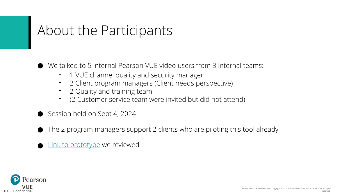
The first round walked an early review direction with five experienced internal users across quality/security, client program management, and quality/training; two program managers represented clients already piloting the tool.
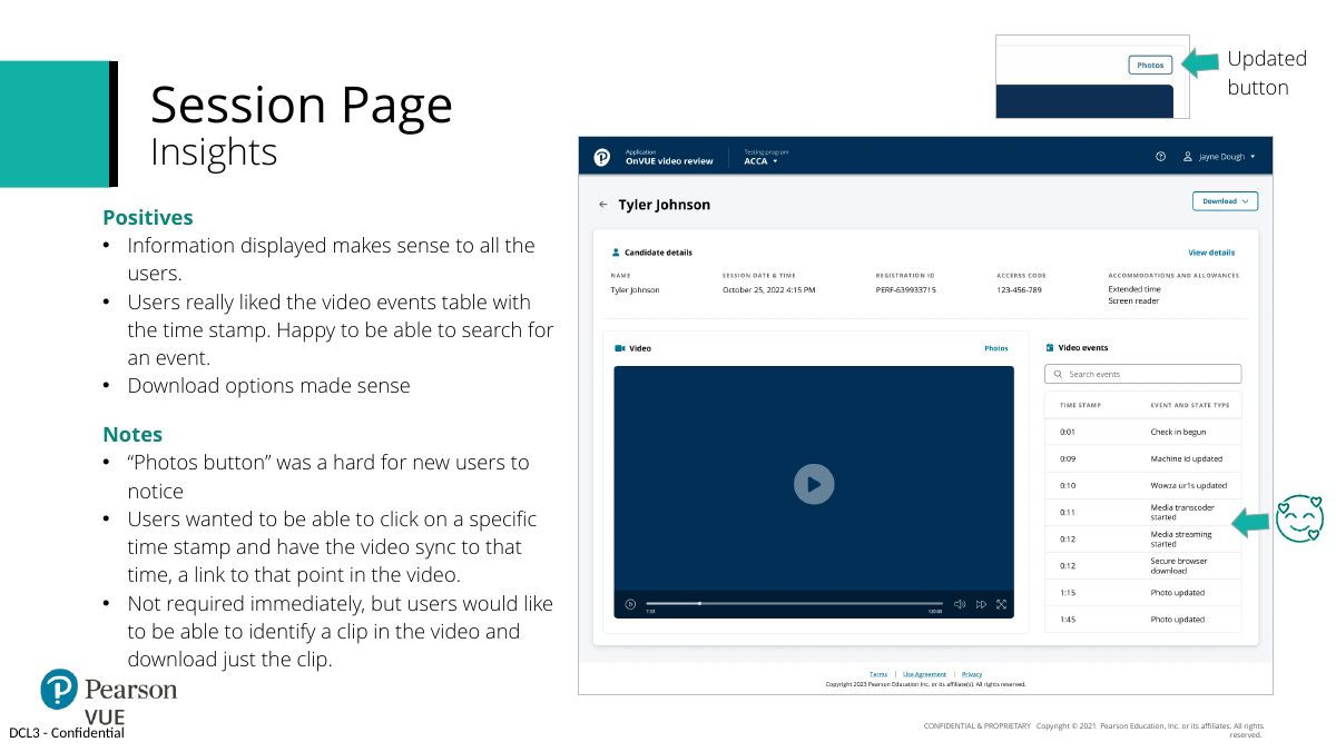
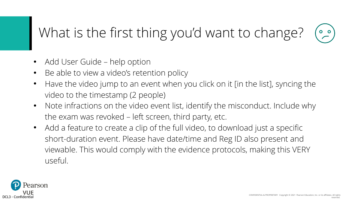
Users valued searchable events, activity log, downloads, candidate detail, and “one-stop shopping” session evidence. Their clearest repeated request was event-to-video navigation. They also wanted clearer retention, more visible photos, reason/infraction context, short evidence clips, and reliable self-help. Users also wanted reason or infraction context in the event list, stronger photo discoverability, clearer retention information, short evidence clips, and dependable self-help for new users.
That changed priority: the event list became navigation into evidence, not just metadata, removing repeated search work from every review.
Five users across three teams reviewed early direction.Users requested event-to-video sync.Top requests: navigation, retention, evidence context, self-help.
“One stop shopping”—all of the details about the session in one place.
Walkthrough feedback · paraphrased from study summary
// UI evidence12 additional product states
More of the review workstation
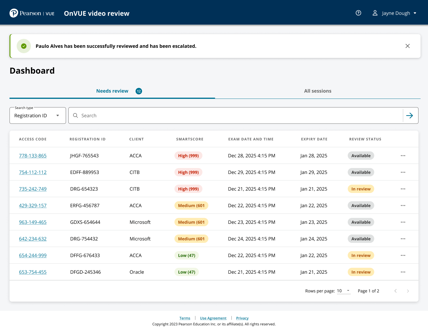
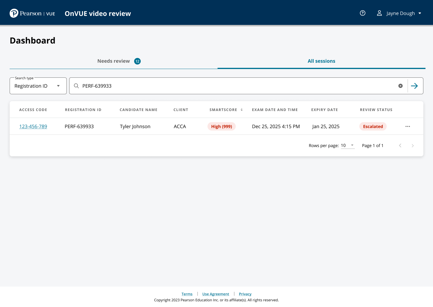
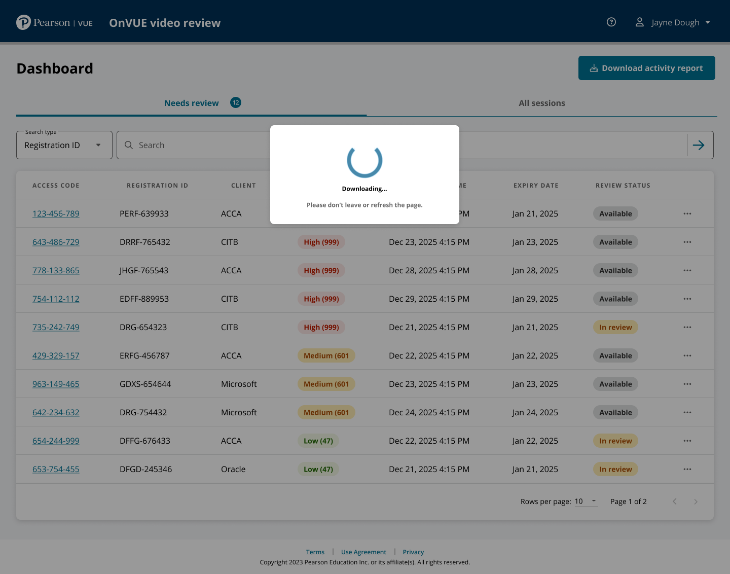
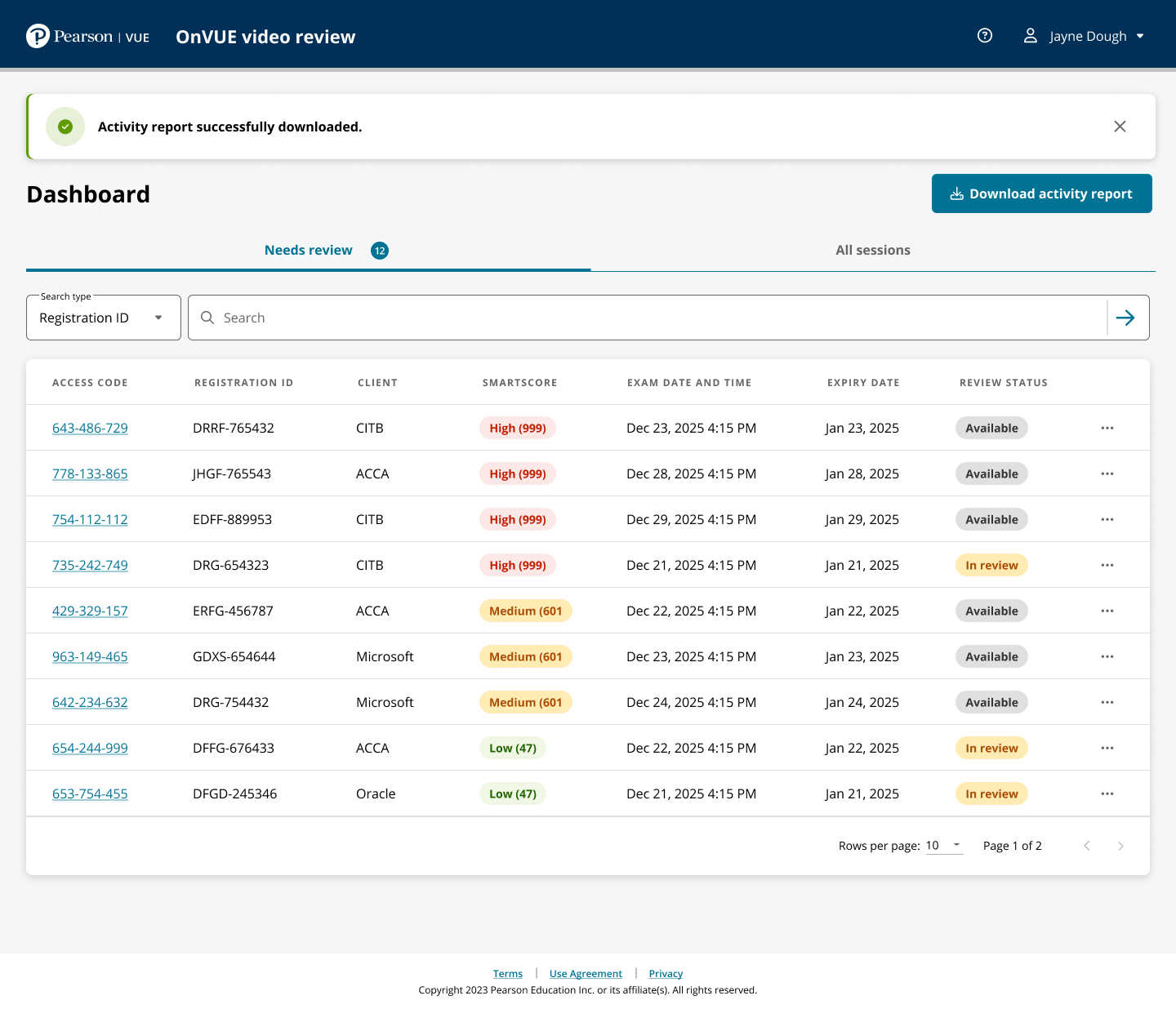
Queue states, decision states, status feedback, and interface components from the working review product.
A second round tested the complete review workflow with people who knew the work deeply.
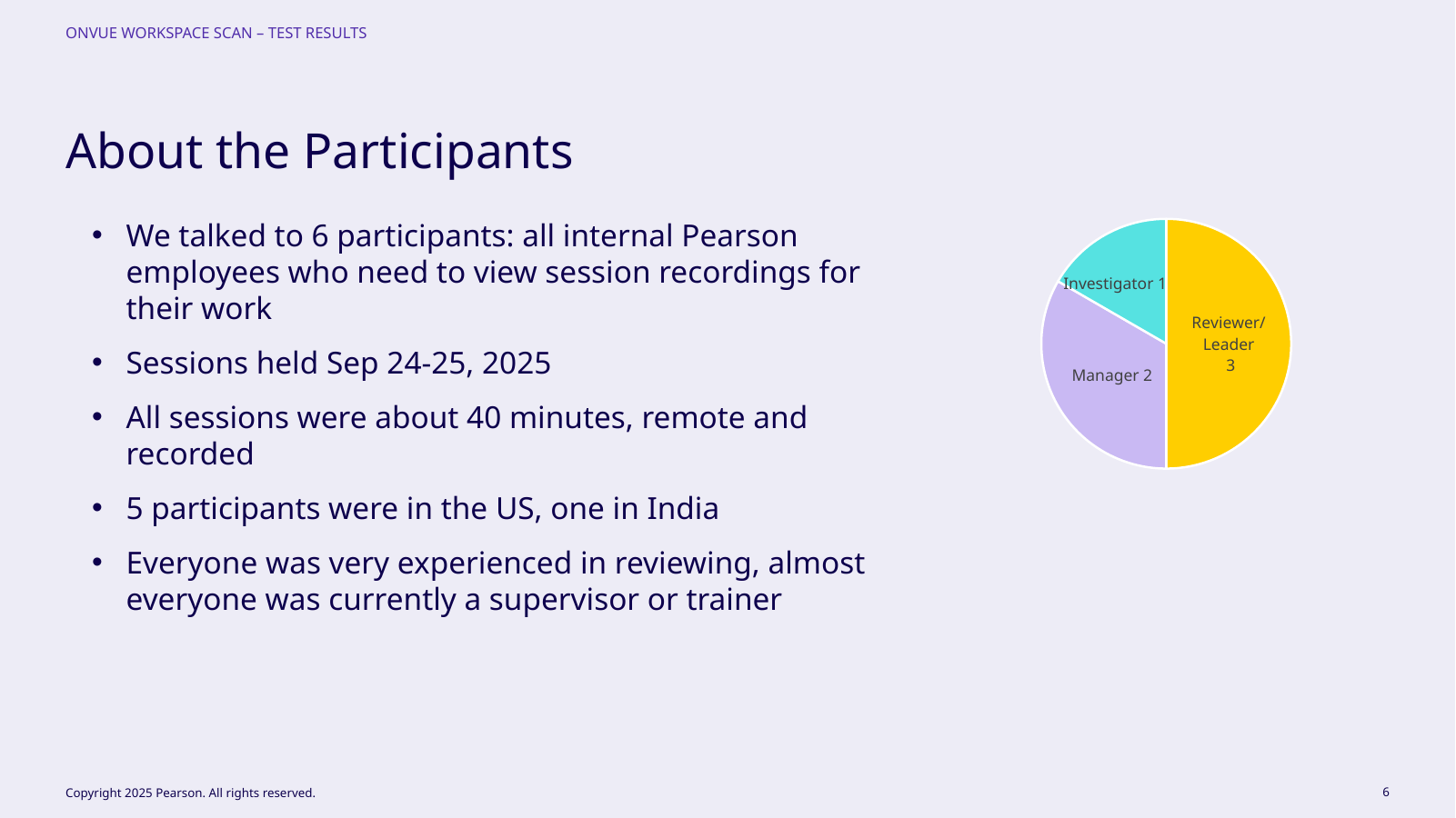
Six experienced participants, three reviewer/leaders, two managers, and one investigator, completed roughly 40-minute remote sessions; nearly all were current supervisors or trainers.
We tested dashboard use, AI flags, adding events, revoke, complete/clear, and already-reviewed sessions, looking for hesitation, lost context, and state misinterpretation.
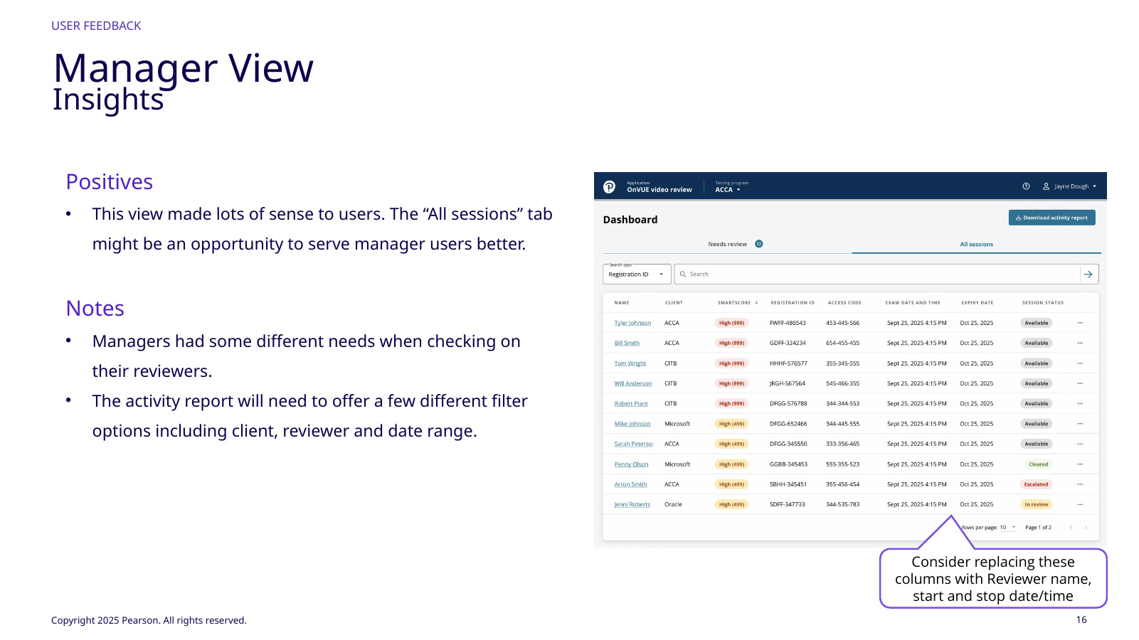
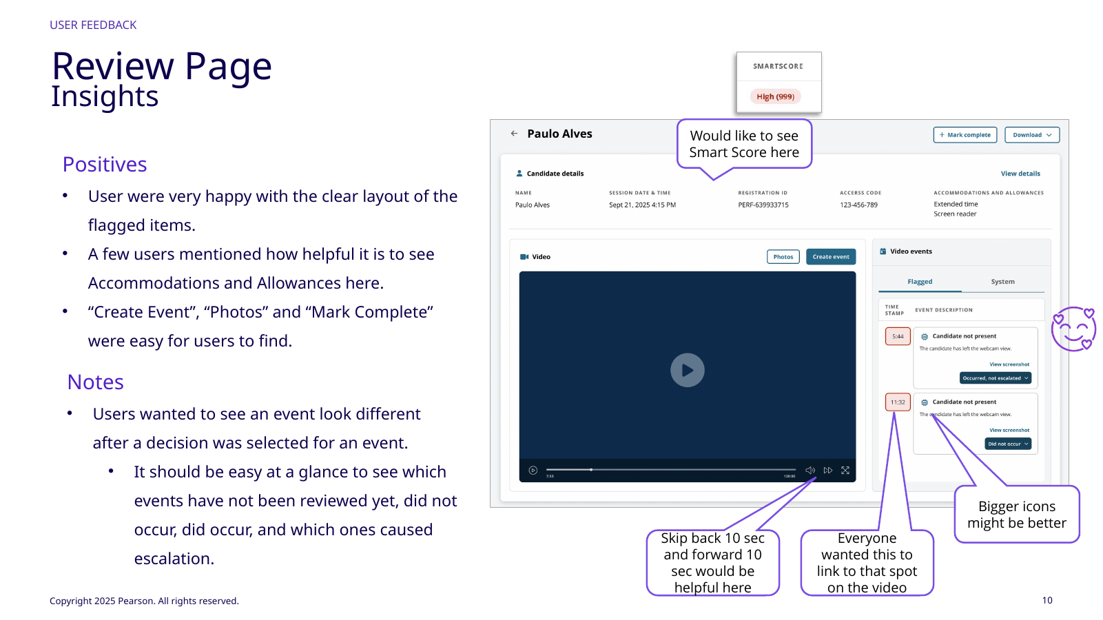
Reviewers liked the large video, clear flags, accommodations/allowances, photos, Create Event, and attached reason/screenshot; the dashboard was clean and close to their needs. Remaining issues were faster queue opening, clearer post-decision states, skip-back/forward, revoke/escalate language, safer PII-download defaults, escalation provenance, and a manager view centered on reviewer activity. The second round also exposed terminology differences around revoke versus escalate, which mattered because status language had to match operating practice after the reviewer acted.
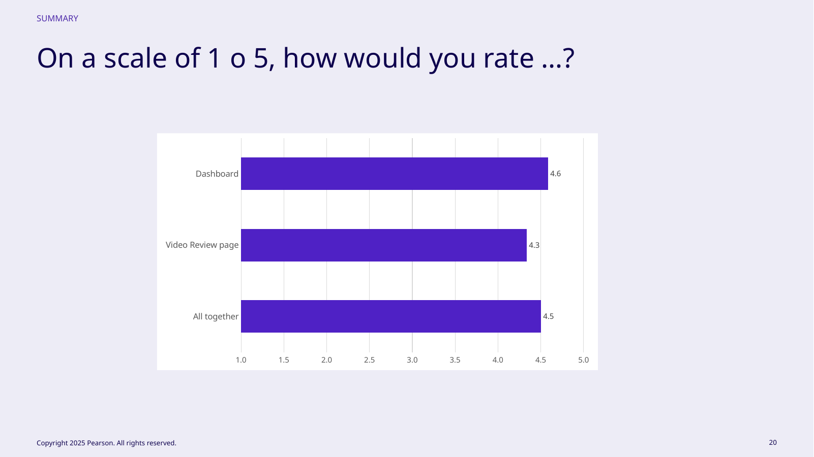
4.6 / 5Dashboard
4.3 / 5Video review
4.5 / 5Overall
Reviewers, managers, and an investigator participated.Review scored well; feedback focused on state clarity/navigation.Ratings validated direction and refinements.
Iteration happened during testing. A direct link from the dashboard into the review page was added partway through the study after the same need surfaced repeatedly. That is the kind of change I look for in usability work: small implementation cost, repeated user signal, and direct reduction in operational friction.
// 06Designing for different accountability
The same evidence meant different things to reviewers, managers, and investigators.
Reviewers, managers, and investigators touched the same session but had different jobs. Reviewers needed fast correct decisions; managers needed reviewer identity, start/end time, and client/reviewer/date filters; investigators needed evidence after the decision. Managers specifically asked for activity reporting by client, reviewer, and date range, while reviewers needed the primary screen to stay centered on evidence and judgment.
I kept management data out of the primary reviewer workspace and extended the shared information model instead. Role policy also governed downloads: being able to view a photo did not automatically grant the right to download it.
Completed sessions remained inspectable with appropriate disabled actions, reviewer identity, and escalation cause so review state stayed auditable after the task ended.
Review state had to survive beyond the review screen.
Completed sessions remain inspectable, with disabled actions where appropriate and visible information about who reviewed the session and what drove escalation. Auditability is not a separate compliance feature—it is the continuation of the interaction model.
// 07Outcome
Faster review without handing the decision to the model.
The workflow made AI-assisted review approximately 10× faster while preserving human final judgment and a traceable review record.
I keep that approved throughput metric separate from usability scores. The studies show experienced users understood and valued the workflow; the 10× metric describes operational improvement.
~10×Faster AI‑assisted review
HumanFinal judgment retained
TraceableEvidence + decision history
// TradeoffsConstraint · limitation · next test
The direction is strongest when its limits stay visible.
Tradeoff
What had to be balanced
Faster triage could create automation bias. The design keeps the model subordinate to visible evidence and an explicit human action.
Limitation
What remains unresolved
Future manager and reporting concepts are shown as direction, not represented as shipped capabilities.
Next test
What I would learn next
Measure where reviewers override or correct model signals and use those moments to improve both workflow and model feedback.
// Reflection
With AI products, the judgment model is part of the UX.
The defining decision came before layout: AI would identify evidence, not own the outcome. That let the interface optimize what reviewers see, how quickly they reach it, how judgment changes state, and how others understand the decision later.
Research also showed that enterprise speed often comes from removing reconstruction work. Event-to-video navigation is mechanically small but saves effort on every event. I would keep reviewer efficiency and manager reporting separate while connecting them through the same session model.