How a legacy desktop biometric admissions workflow became a tablet-based pilot - designed for offline operation, certificate-pinned trust, and across-the-counter ergonomics, then validated with practicing Test Administrators inside live test centers.
A high-stakes admissions workflow modernizing from desktop to tablet, without breaking trust at the moment of identity capture.
Test-center admissions is the gate between a candidate and a high-stakes certification exam. The Test Administrator (TA) verifies identity, captures a biometric, admits the candidate. Get it wrong and the candidate either takes an exam they shouldn't, or gets turned away from one they should.
The legacy admissions tool was a Java desktop application - hardened for accuracy and auditability, but inflexible by design. The strategic goal was a tablet-based replacement that could move with the TA across the counter, capture palm biometrics inline with admissions, and serve as the first concrete step toward broader test-center modernization.
I led product design for the tablet pilot - end-to-end UX across authentication, candidate lookup, biometric capture, accessibility accommodations, and scan confirmation.

Fixed-workstation patterns under extreme operational and security constraints.
Trust-critical UX for a workflow that fails publicly when it fails.
I framed the design around three commitments. The TA's confidence is the system's UI - if the TA hesitates, the candidate hesitates. Recovery has to be at least as easy as success - skip-hand, skip-gesture, retry, and accessibility accommodations had to be first-class flows. Across-the-counter ergonomics matter more than screen aesthetics - the tablet is held by one person and looked at by two.
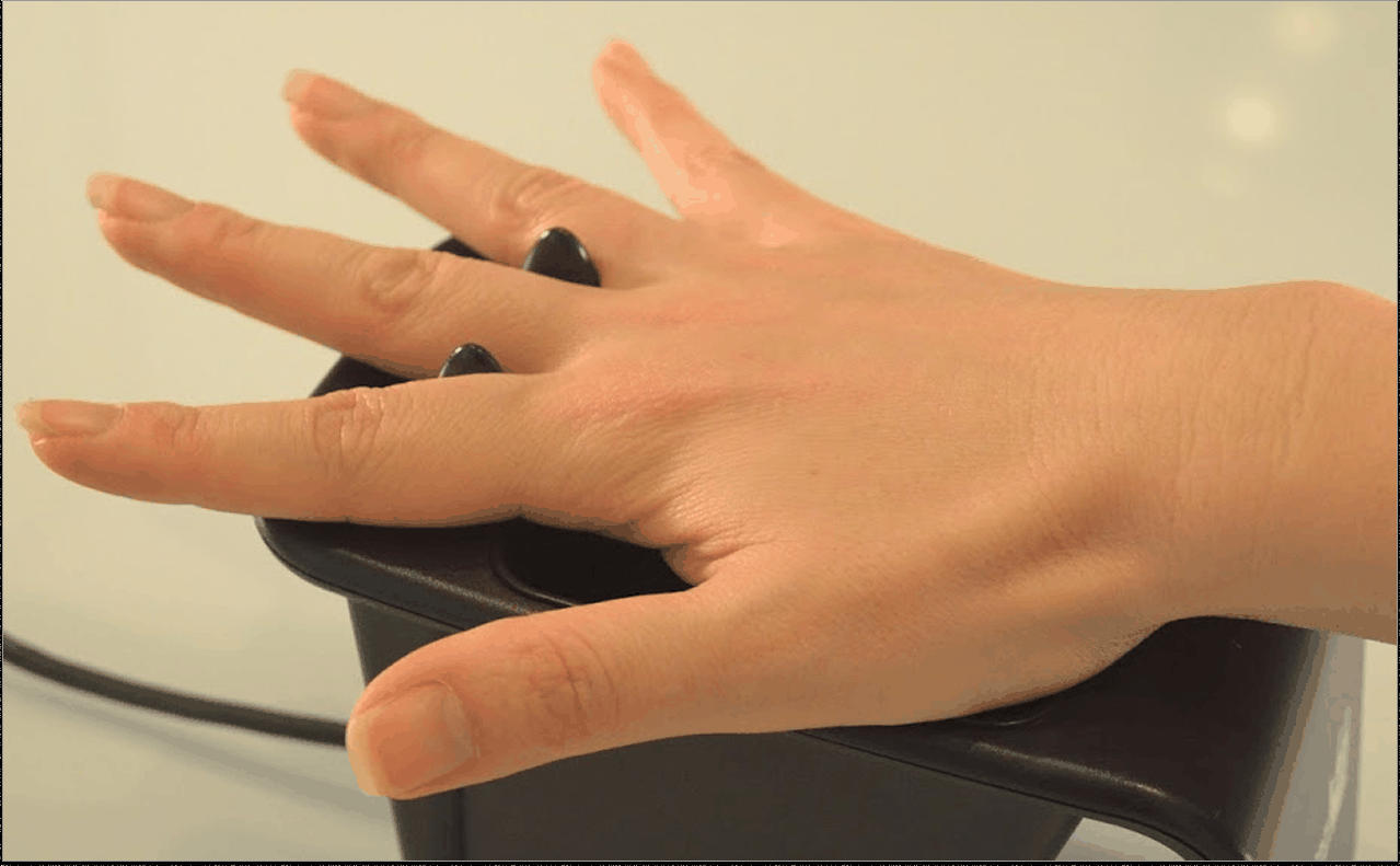
The technical platform: an Angular front end wrapped with Ionic for native-feeling UI controls and Capacitor for native device access - cross-platform parity with an Android-first rollout. A third-party palm-biometric SDK handled the capture and processing; my design work mediated between TA-facing prompts and the biometric pipeline.

No Wi-Fi, no shortcuts, no silent failures.
From admissions login through palm scan to confirmation.
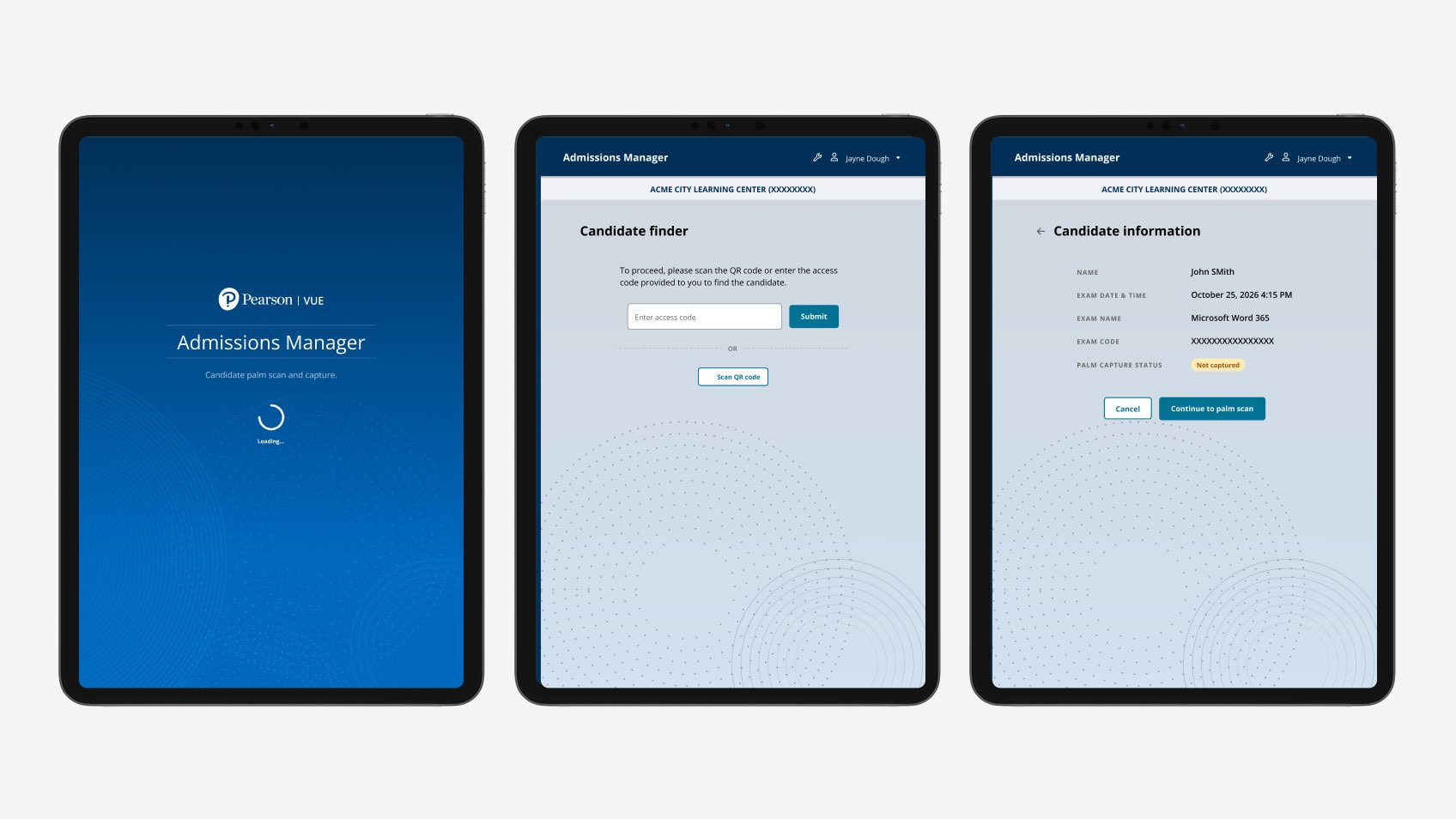
1. Two paths into a candidate session, surfaced equally. TAs can scan an encrypted QR code from the legacy admissions terminal or enter a 4-digit access code. Validation participants preferred the access code path - it doesn't require lifting the tablet to scan.
2. A confirmation step before the scan begins. The TA confirms candidate identity in a familiar pattern borrowed from the legacy tool - keeping the cognitive jump small for migrating TAs.
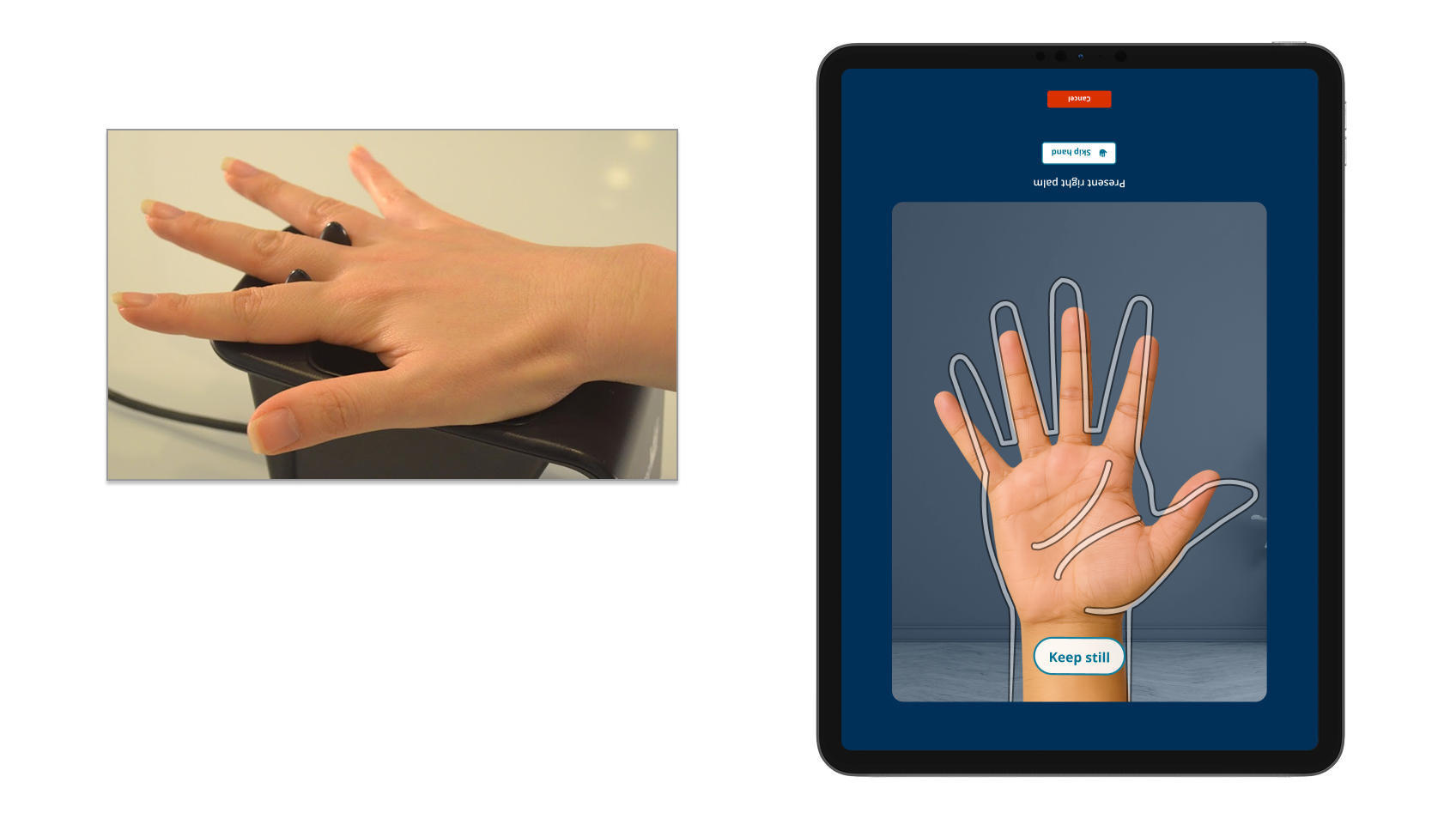
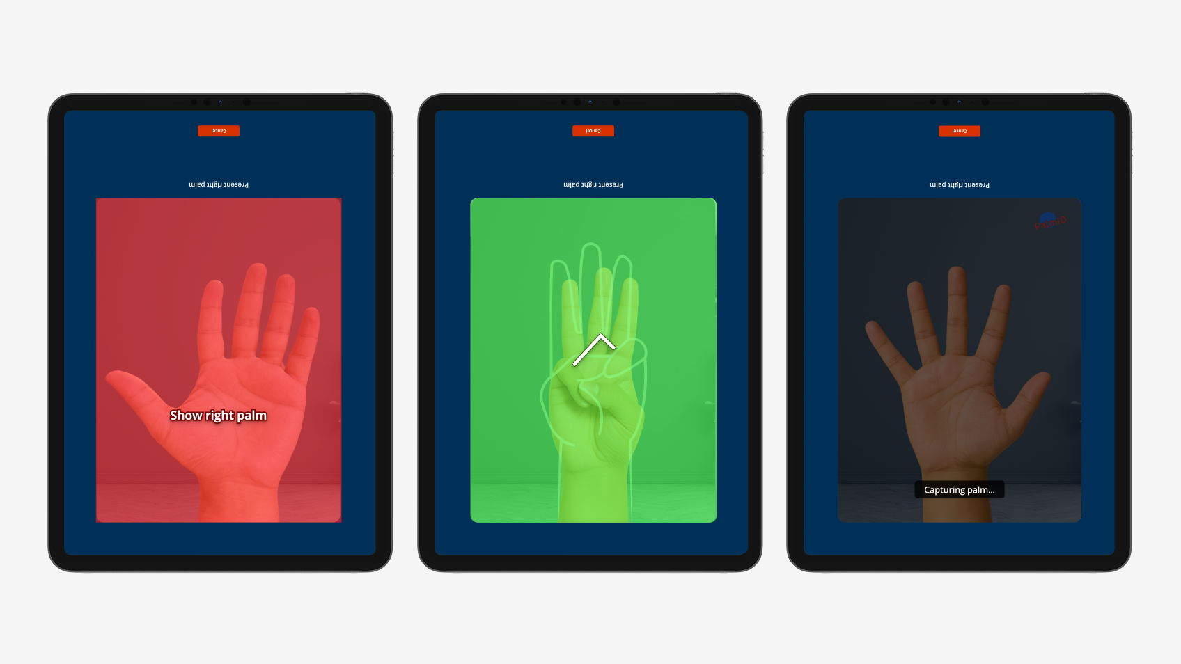
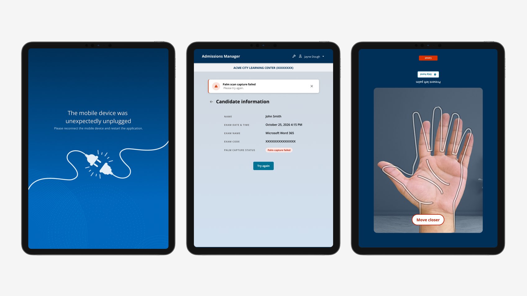
3. A live palm-outline cue during capture. The most validated single design element - TAs picked it up the first time, with no training. A translucent hand outline turns "hold your hand up" into a visible target.
4. Skip Gesture and Skip Hand as first-class accessibility flows. Candidates with hand differences or temporary injuries need to be admitted without forcing a capture that won't succeed. Both skip flows surface directly on the capture screen.
5. Capture-quality coaching tied to environmental factors. Validation surfaced an environmental dependency - dark or visually mixed backgrounds slow capture. Prompts coach the TA when the system detects a difficult background.
6. A scan-confirmation screen that auto-clears between candidates. Validation showed TAs didn't want a candidate's confirmation lingering on screen - "Palm Captured" was promoted to the dominant element, with a clear "Done" action returning to the queue.
Validation in production environments - small N, high signal.
September 2025 in-person validation: 4 practicing test-center staff (2 site managers, 2 TAs) across 2 company-managed test centers, all with 2+ years TA experience. Sessions were 30 minutes, run on-site, and recorded.
What worked: The updated interface landed immediately. The palm-outline capture cue worked first time, no training needed. Skip Gesture and Skip Hand were used during the session without facilitator prompting. The access-code candidate-finder path was preferred over QR scan because it doesn't require lifting the tablet.
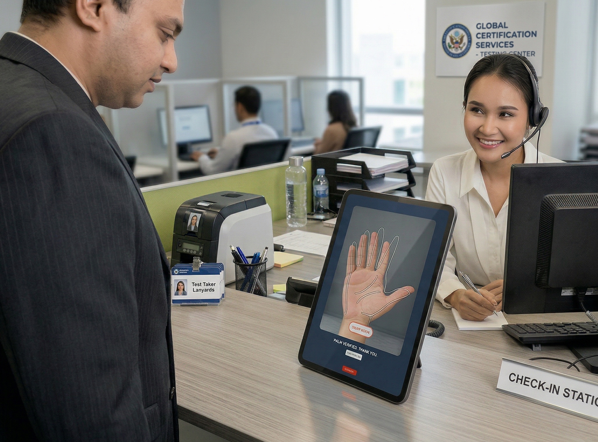
What needed to change: The dominant feedback - tablet ergonomics. Every participant raised the same concern: TAs don't want to stand and hold the tablet for every scan. The strongest recommendation was a fixed tablet stand at counter height, with the candidate placing their hand below and both parties able to see the screen. The "Palm Captured" confirmation needed visual prominence. Confirmation screens shouldn't linger between candidates. TAs were habituated to right-hand-first from the legacy tool; the prototype defaulted to left.
One TA captured the cumulative friction concisely: "It looks like the new tool has more work to it. No real advantage, though maybe newer technology, but now I have to hold the device." The honest read: until the ergonomics are solved, the workflow is moving sideways. That feedback shaped the priority of the next iteration.

From pilot-ready to operationally ready.
Trust-critical workflows are designed for the failure modes, not the demo flow.
The prototype scanned palms beautifully in a quiet conference room. The same prototype, used by a real TA at a real counter with a real candidate in front of them, surfaced a hardware-furniture problem we hadn't anticipated. The demo flow is a poor proxy for operational reality. Four TAs at two sites surfaced more actionable signal than a 50-person remote panel would have - because they used the prototype where they actually do their work.
The other lesson: constraints are the design. Offline-first, certificate-pinned, audit-graded, managed-device, signed-application - none of those started as design priorities; all of them ended up shaping the experience more than any single screen-level decision. Senior product design in trust-critical domains is partly the work of internalizing constraints deeply enough that they stop feeling like obstacles and start feeling like the shape of the right answer.